Green web design is the practice of building websites that use less energy per visit without sacrificing clarity, usability, or business results. It focuses on reducing page weight, limiting unnecessary scripts, and delivering content efficiently. Done well, it also improves speed, stability, and mobile experience.
Most websites get heavy over time. Teams add trackers, plugins, fonts, animations, and high-resolution media until every page view costs more electricity than it needs to. Green web design reverses that drift with a disciplined approach that treats performance as a product feature and sustainability as a measurable outcome.
This guide shows you how to build a low-carbon website using practical design and development steps. You will learn what makes sites carbon-heavy, what changes deliver the biggest impact, how to measure progress, and how to keep your site lean as it grows.
What Website Carbon Has To Do With Real-World Energy
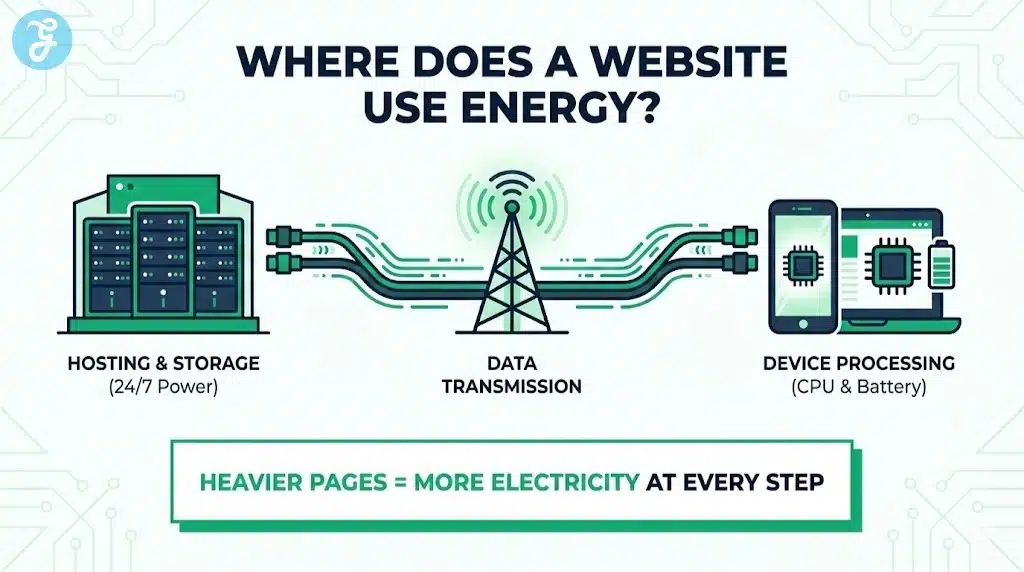
A website is not just code. It runs on hardware that consumes electricity, and it moves data across networks that consume electricity. Your pages also force user devices to do work, especially when scripts run heavily on the main thread.
Even if your site feels simple, the delivery chain is always physical. The main parts include:
- Data centers that host and serve content
- Networks that transmit data between regions and devices
- User devices that download, decode, execute, and render
A heavier page makes each part work harder. That extra work becomes more electricity consumption, which often becomes more emissions depending on the energy mix.
Why “Digital” Can Still Be Wasteful
Digital services can reduce emissions when they replace higher-carbon activities. Still, they can also create new demand and new waste. Streaming in ultra-high definition, autoplay video, and script-heavy experiences can multiply energy use quickly.
You do not need to guess. If your pages are large and slow, they almost always waste energy. Green web design starts by treating page weight and computation as costs that you actively manage.
What Green Web Design Actually Means
Green web design is not a “green-looking” interface. It is a set of decisions that reduce resource use per page view. It prioritizes efficiency, accessibility, maintainability, and durability.
A site built with green web design usually aims for:
- Fewer bytes transferred per visit
- Fewer requests per visit
- Less JavaScript execution on the device
- Less reliance on third-party scripts
- Better caching and reuse of assets
- More resilient performance on low-end devices and weak networks
It is also about longevity. A maintainable site that avoids constant rebuilds and broken plugins tends to stay efficient longer.
The Outcomes That Matter Most
If you want a simple definition, focus on outcomes you can measure:
- Smaller pages
- Faster time to usable content
- Lower CPU work on the client
- Higher cache effectivenes
- Fewer regressions over time
When these improve, sustainability usually improves too.
Why Google Often Rewards The Same Improvements
Search engines want results that satisfy users. Users want pages that load quickly, feel stable, and respond instantly. When your site improves speed and usability, you often improve the signals that matter for search visibility.
This is not about chasing a single ranking trick. It is about building a high-quality delivery experience. Green web design helps because it pushes you toward:
- Faster rendering on mobile
- Fewer layout shifts and broken interactions
- Cleaner structure that crawlers can parse reliably
- Better engagement because users do not get frustrated
Even when rankings do not change immediately, efficiency improvements often raise conversion rates and reduce ad spend waste.
Start With A Baseline That Teams Can Understand
Before you optimize, you need a baseline. Without it, teams argue over opinions. With it, teams ship improvements.
A useful baseline includes a few metrics you can track per template type. Track them for your homepage, category pages, article pages, product pages, and landing pages.
The Baseline Metrics To Capture
- Total transferred size per page
- Total request count per page
- Largest assets by weight
- JavaScript bundle size and unused code percentage
- Third-party script inventory
- Cache hit rate for static assets
- Server response time and time to first byte
A Simple Baseline Table
| Page Type | Transfer Size | Requests | JS Size | Third-Party Scripts | Notes |
| Homepage | |||||
| Article | |||||
| Category | |||||
| Landing Page | |||||
| Product Page |
Fill this table once, then repeat it monthly. Green web design becomes easier when you can see trends.
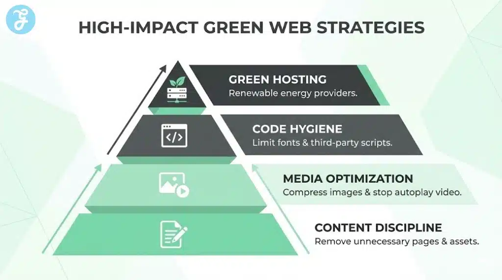
Green Web Design Begins With Content Discipline
The biggest carbon reduction is the feature you do not ship. Content discipline means you challenge every asset and interaction. You keep only what supports user intent and business goals.
Ask a few hard questions:
- Does this element help the user decide or understand?
- Does this tracker change decisions, or does it just collect data?
- Does this animation explain something, or does it decorate?
- Does this high-resolution media improve outcomes enough to justify cost==
You can still build a beautiful site. You just build it intentionally.
High-Value Design Decisions That Reduce Weight
- Prefer clear typography and spacing over heavy graphic treatments
- Avoid carousels that load multiple images and scripts upfront
- Use static visuals unless motion adds real meaning
- Keep layouts predictable so your CSS stays smaller
- Limit “template sprawl” so you do not ship new components for every page
These choices reduce future bloat and make performance predictable.
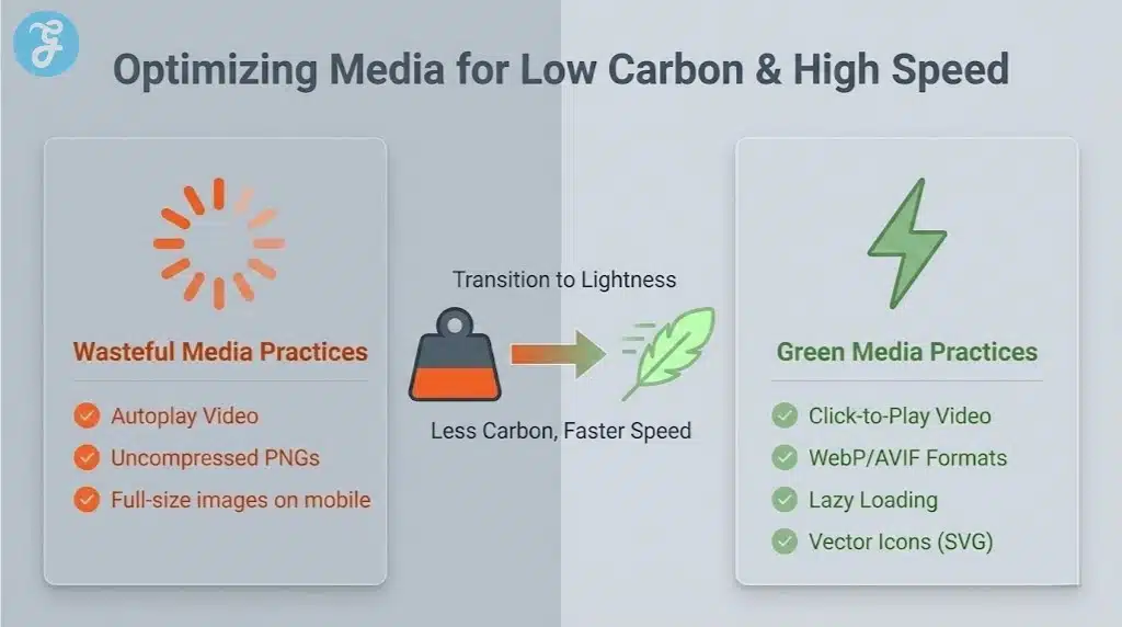
Image Optimization That Delivers The Fastest Wins
Images are often the largest portion of a page. Optimizing them usually produces the biggest immediate drop in page weight.
A common mistake is uploading a large image and relying on CSS to shrink it. That still downloads the full file. You should generate and serve the correct size instead.
Practical Image Rules That Work
- Serve images close to their actual display dimensions
- Use responsive images so devices fetch the right size
- Compress images aggressively while protecting readability
- Lazy load below-the-fold images
- Avoid decorative images that do not add meaning
Image Format Strategy Table
| Content Type | Preferred Approach | Why It Helps |
| Photographs | Modern compressed formats | Smaller files at similar quality |
| Icons | Vector assets | Tiny size and crisp scaling |
| Illustrations | Vector when possible | Good clarity with low weight |
| UI graphics | Optimized raster or vector | Avoids large unnecessary bitmaps |
A Short Image Optimization Checklist
- Audit your top 20 pages and list the heaviest images
- Create size variants for common breakpoints
- Enforce upload rules in your CMS
- Add automated compression in your pipeline
- Replace decorative images with CSS or vector shapes when possible
If you do only one optimization pass this month, do images first.
Video Without The Carbon Shock
Video can educate and convert. It can also become the biggest hidden cost on your site if it autoplay loops or loads aggressively.
A sustainable video strategy keeps control in the user’s hands. You deliver a poster image first, then load the video only when needed.
Better Video Patterns
- Use click-to-play instead of autoplay
- Choose sensible defaults for resolution and bitrate
- Keep videos short and task-focused
- Avoid background videos that do not add information
- Provide captions and transcripts to improve accessibility and reduce repeat playback
Video Decision Table
| Use Case | Best Default | What To Avoid |
| Hero section | Static image or lightweight loop only when necessary | Autoplay full video |
| Product demo | Click-to-play with compressed encoding | Loading video on page load |
| Tutorial | Chapters and lower default quality | Long videos with no navigation |
| Testimonials | Poster-first, short clips | High-bitrate clips as default |
This is a key green web design idea: you do not remove value, you remove waste.
The JavaScript Problem And Why It Drains Devices
JavaScript adds interactivity, but it also creates CPU work on user devices. Heavy scripts can block the main thread, delay input response, and cause heat and battery drain on phones.
Many sites ship JavaScript that users do not need. They load it because the framework makes it easy, or because third-party tools inject it.
Signs You Have Too Much JavaScript
- Pages feel slow even after loading completes
- Scrolling stutters on mid-range phones
- Buttons respond late after taps
- The page shifts as scripts hydrate or re-render
- You load large bundles for pages that are mostly text
High-Impact JavaScript Reductions
- Remove unused libraries and dependencies
- Split bundles so pages load only what they need
- Prefer server rendering for content-heavy pages
- Replace heavy widgets with lightweight components
- Reduce animation libraries and heavy UI kits
At this point, bring the focus back. Green web design works best when you treat JavaScript as a scarce resource, not a default layer.
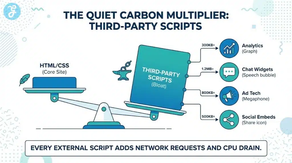
Third-Party Scripts Are The Quiet Carbon Multiplier
Third-party scripts can add more weight than your own code. Analytics, ad tech, social embeds, chat widgets, A/B testing tools, and heatmaps often load on every page. Many of them run continuously.
Every third-party script adds network requests, payload size, and background CPU work. Some also degrade privacy and increase compliance risk.
A Practical Third-Party Policy
- Keep one primary analytics tool
- Load optional tools only on relevant pages
- Remove scripts that do not change decisions
- Prefer lightweight embeds and previews
- Audit tag managers monthly
Third-Party Audit Table
| Script Type | Common Waste Pattern | Better Approach |
| Analytics | Multiple overlapping tools | One primary tool with clean events |
| A/B testing | Runs on every page | Load only on target templates |
| Chat widget | Heavy bundle always loaded | Trigger on user action or key pages |
| Social embeds | Full embed libraries | Use lightweight previews |
| Ads | Many networks firing | Limit partners and optimize delivery |
Third-party reductions often improve speed immediately. They also reduce long-term complexity.
Fonts: A Small Choice That Becomes A Big Load
Fonts feel like a branding detail, but they can create many downloads. Each weight and style can be a separate file. Two font families can become a dozen files quickly.
A disciplined font strategy preserves design while reducing transfer and rendering work.
Font Optimization That Keeps Brand Quality
- Use one font family where possible
- Limit weights to what you truly use
- Consider variable fonts if they reduce files
- Use font loading strategies that avoid blocking content
- Consider system fonts on content-heavy sections
Font Approach Comparison Table
| Approach | Strengths | Tradeoffs |
| System fonts | Fast and zero downloads | Less distinct branding |
| One web font, few weights | Balanced brand and speed | Requires strict design discipline |
| Multiple families and many weights | Flexible styling | Heavy downloads and slower rendering |
A practical green web design rule is simple: use typography well, not excessively.
Design For Simplicity Without Sacrificing Quality
Simplicity is not the same as plainness. You can create a premium feel with fewer assets by using layout, spacing, and hierarchy.
Design decisions that reduce carbon often help readability too. Users get to the point faster and scroll with less friction.
Low-Carbon Design Principles
- Prioritize information hierarchy over decoration
- Reduce needless motion and large background effects
- Keep components reusable across pages
- Use whitespace and typography to create polish
- Avoid heavy carousels and sliders as default
Quick Design Checklist
- Can you remove one section from your template without losing meaning?
- Can you replace a graphic with text and spacing?
- Can you reduce the number of unique components on a page?
- Can you cut one font weight across the site?
Small choices repeated across the site produce large savings.
Hosting And Delivery: Efficiency That Scales With Traffic
Hosting does not fix a heavy site, but it amplifies the benefits of a lean one. Good delivery reduces repeated downloads and speeds up response times.
A strong delivery setup includes compression, caching, and a content delivery network. It also includes sensible cache headers so returning users do not re-download assets.
Hosting Improvements That Usually Pay Off
- Enable compression for text assets
- Serve static assets from a CDN
- Set cache headers for long-lived asset
- Reduce server response time through backend optimization
- Use modern protocols where supported
Delivery Efficiency Table
| Improvement | What It Does | Why It Helps |
| Compression | Shrinks HTML, CSS, JS | Less data transfer per visit |
| CDN caching | Serves content closer to users | Lower latency and network cost |
| Cache headers | Prevents unnecessary re-downloads | Less repeat traffic waste |
| Faster backend | Improves response time | Fewer stalls and retries |
| Asset versioning | Enables long cache lifetimes | Better cache hit rates |
If your site has high traffic, these gains compound quickly.
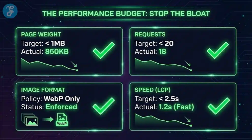
Build A Performance Budget So Bloat Stops Returning
Many teams optimize once, then slowly lose progress. A performance budget prevents that by setting limits and making regressions visible.
A budget can include maximum page weight, maximum request count, maximum JavaScript size, and limits on third-party scripts. When a team tries to exceed the budget, the build should flag it.
Performance Budget Table
| Budget Item | Suggested Starting Target | What To Do If It Breaks |
| Page transfer size | Set per template | Optimize images and remove scripts |
| Request count | Reduce third-party calls | Combine assets and remove trackers |
| JS bundle size | Keep lean by splitting | Remove unused dependencies |
| Fonts | Limit families and weights | Consolidate or move to system fonts |
| Third-party scripts | Cap by template | Load only where needed |
This is the operational heart of green web design. You stop waste before it ships.
Measurement That Works In Real Teams
You do not need perfect carbon calculators to make progress. You need consistent checks that relate directly to engineering choices.
Track improvements per template. Watch trends over time. Share results in the same dashboard teams already use.
The Metrics That Predict Lower Carbon
- Total bytes transferred per page
- Number of network requests
- JavaScript execution cost and long tasks
- Cache hit rate and repeat visit efficiency
- Time to usable content on mobile
Monthly Audit Checklist
- Review the heaviest pages and top assets
- Audit tag manager changes and new scripts
- Check image sizes and compression drift
- Review font usage and new weights
- Confirm caching still works as intended
At around this stage, use the focus keyword again in a practical way. Green web design is not a project you finish, it is a habit you maintain.
Accessibility And Sustainability Reinforce Each Other
Accessible sites often perform better because they rely on semantic structure and predictable interactions. They also respect user settings like reduced motion, which can lower CPU work and improve comfort.
Accessibility improvements that often support green web design:
- Semantic HTML that reduces unnecessary wrappers
- Fewer script-dependent interactions
- Clear navigation and headings that reduce confusion
- Reduced motion options that remove expensive effects
When you design for real users across devices and constraints, you naturally reduce waste.
Common Green Web Design Mistakes That Reduce Trust
Some sites claim sustainability but ship heavier pages. Others add badges and dashboards without reducing weight. These mistakes hurt credibility and performance at the same time.
Watch out for these patterns:
- Adding “green” visuals while keeping large assets and heavy scripts
- Loading many trackers in the name of data-driven growth
- Using large animation libraries for small effects
- Shipping multiple page builders and plugins that overlap
- Autoplaying video as a design default
If your site remains slow and heavy, the sustainability message will not hold up.
A Step-By-Step Implementation Plan
A phased plan helps teams move quickly without chaos. Each phase builds on the previous one.
Phase 1: Audit And Baseline
- Capture baseline metrics per template
- List all third-party scripts and where they load
- Identify the top 20 heaviest assets
- Review fonts and the number of files shipped
- Confirm caching behavior and server response times
Phase 2: Quick Wins
- Resize and compress images
- Replace autoplay video with poster-first patterns
- Remove unused trackers and scripts
- Reduce font weights and families
- Enable compression and correct cache headers
Phase 3: Structural Improvements
- Split JavaScript bundles by route or template
- Remove heavy dependencies and unused code
- Replace heavy widgets with lightweight components
- Standardize templates and reduce component sprawl
- Add a performance budget to releases
Phase 4: Maintenance
- Run monthly audits
- Review tag manager changes before publishing
- Train writers and designers on content discipline
- Keep a changelog of performance regressions and fixes
- Make efficiency part of design and code reviews
This plan turns green web design into a stable system, not a one-time cleanup.
Final Thoughts
Green web design creates a website that loads faster, feels smoother, and wastes less energy with every visit. It does not rely on slogans. It relies on discipline, measurement, and repeatable choices that keep pages light and code efficient.
Start with the biggest wins first: images, video behavior, third-party scripts, fonts, and JavaScript weight. Then protect your gains with a performance budget and ongoing audits. When you treat efficiency as a quality standard, you improve user experience and often improve search performance at the same time.
Green web design succeeds when it becomes the default way your team builds, not a special initiative that fades after one sprint.