
Images play a crucial role in web design and content, enhancing visual appeal and user engagement. However, improperly optimized images can slow down website performance, increasing load times and negatively impacting SEO rankings.
A sluggish website frustrates visitors, leading to higher bounce rates and lower conversions. Implementing the best practices to optimize images for faster web performance ensures that your website loads quickly, improving user experience and search engine rankings.
Optimizing images is not just about reducing file sizes. It also involves selecting the right format, leveraging compression tools, implementing lazy loading, and using modern image delivery techniques like CDNs and next-gen formats.
In this guide, we will explore 10 proven techniques to optimize images without compromising quality, ensuring the best web performance possible.
1. Choose the Right Image Format

Selecting the correct image format is essential for balancing quality and performance. Different formats serve different purposes, and choosing the right one can significantly improve loading speed.
For instance, JPEGs work best for detailed photographs, whereas PNGs are ideal for transparent backgrounds. WebP and AVIF offer superior compression and quality, making them ideal for modern web use. Understanding these formats helps webmasters and developers make informed decisions that enhance site speed.
Best Image Formats for Web Performance
| Format | Best Use Case | Compression Type | Transparency Support | File Size Efficiency |
| JPEG | Photographs, complex images | Lossy | No | Moderate |
| PNG | Graphics, logos, transparency | Lossless | Yes | Larger |
| WebP | Web graphics, next-gen performance | Lossy/Lossless | Yes | High |
| AVIF | High-quality web images, better compression | Lossy/Lossless | Yes | Highest |
| SVG | Vector images, icons, logos | N/A (Scalable) | Yes | Minimal |
Case Study
A study by Google showed that switching from PNGs to WebP resulted in a 30% reduction in file size without noticeable quality loss. Many sites, including e-commerce platforms, have adopted WebP for better performance.
2. Compress Images Without Losing Quality
Image compression reduces file sizes while preserving image quality. Without proper compression, images can slow down a website and negatively impact user experience.
There are two main types of compression: lossy, which removes some data to decrease file size, and lossless, which maintains all details while still reducing file size. Using the right compression method ensures that images load quickly without noticeable degradation.
Compression Techniques
| Compression Type | Best For | Quality Impact | File Size Reduction |
| Lossy | Photos, large images | Slight loss | High (30-80%) |
| Lossless | Graphics, icons | No loss | Moderate (10-50%) |
Best Image Compression Tools
- Online Compression Tools: TinyPNG, Compressor.io, Squoosh
- WordPress Plugins: Smush, ShortPixel, Imagify
- Manual Software: Photoshop, GIMP, ImageOptim
Example
An e-commerce site reduced its homepage load time from 5 seconds to 2 seconds simply by compressing images using WebP and lossy compression, improving its conversion rate by 15%.
3. Implement Lazy Loading for Images
Lazy loading defers the loading of offscreen images until they are needed, improving initial page speed, reducing bandwidth consumption, and enhancing user experience. This technique is especially beneficial for image-heavy websites, such as e-commerce platforms, news portals, and blogs, where a large number of images are present.
By prioritizing above-the-fold content, lazy loading ensures that only the visible images load initially, allowing users to start interacting with the page without unnecessary delays. Additionally, lazy loading can contribute to improved Core Web Vitals scores, which are critical for SEO rankings, making it a must-have optimization strategy for modern websites.
Lazy Loading Methods
| Method | Implementation | Performance Benefit |
| HTML loading=”lazy” | Simple, built-in browser support | Moderate |
| JavaScript Libraries | Advanced control (Lozad.js, LazySizes) | High |
| WordPress Plugins | Easy for non-coders (A3 Lazy Load) | High |
4. Use Responsive Images for Different Devices
With the increasing use of mobile devices, responsive images ensure that images load optimally based on the user’s screen size and resolution. Instead of delivering a single, large image that may be unnecessarily heavy for mobile users, responsive images dynamically adjust based on the device, reducing page weight and improving overall performance.
This approach enhances user experience by ensuring that images load quickly and appear crisp on high-resolution displays.
Benefits of Using Responsive Images
| Benefit | Description |
| Optimized Performance | Ensures images are delivered at appropriate sizes, reducing page load times |
| Reduced Data Consumption | Saves bandwidth by preventing oversized image downloads on mobile devices |
| Better User Experience | Improves visual quality and page layout consistency across different screens |
| SEO Advantages | Faster-loading pages improve search engine rankings and mobile friendliness |
How to Implement Responsive Images
- Use the <picture> and <srcset> attributes to serve different image sizes tailored to varying screen widths.
- Apply CSS media queries to adjust background images dynamically for different devices.
- Leverage image CDN services that automatically generate responsive versions based on the requesting device.
- Utilize modern CMS plugins that provide automated responsive image handling.
Example
A news website implemented responsive images, replacing large, static images with optimized versions for different screen sizes. As a result, they observed a 20% reduction in mobile data consumption, a 35% improvement in page load speed, and a 15% increase in user engagement as visitors experienced a smoother browsing experience.
5. Optimize Image Dimensions and Resolution
Uploading oversized images forces browsers to resize them dynamically, leading to increased load times, higher bandwidth consumption, and slower page performance. Images that are too large can negatively impact SEO rankings and user experience, especially on mobile devices where data usage is a concern.
Properly optimizing image dimensions ensures that images are displayed at the correct size, reducing unnecessary processing by the browser and improving loading speeds. Scaling images correctly also enhances visual consistency and prevents layout shifts that can disrupt user engagement.
Benefits of Optimizing Image Dimensions
| Benefit | Description |
| Faster Load Times | Smaller images reduce HTTP request sizes, improving page speed |
| Reduced Bandwidth Usage | Optimized images require less data transfer, benefiting mobile users |
| Better SEO Performance | Google rewards faster-loading websites with higher rankings |
| Improved User Experience | Properly sized images prevent slow scrolling and lag |
| Lower Storage Costs | Smaller images reduce hosting and CDN storage requirements |
Best Tools for Resizing Images
- Adobe Photoshop – Advanced editing and resizing options with quality retention
- Canva – Easy-to-use online editor with resizing templates
- PicResize – Free online tool for quick resizing
- TinyPNG & TinyJPG – Compress and resize images efficiently
- ImageMagick – Command-line tool for batch image processing
Example
A travel blog that originally used high-resolution images (5000px wide) optimized them down to 1200px for web display. This reduced average image file sizes from 3MB to 250KB, leading to a 50% faster page load time and a 12% increase in user session duration.
6. Leverage a Content Delivery Network (CDN)
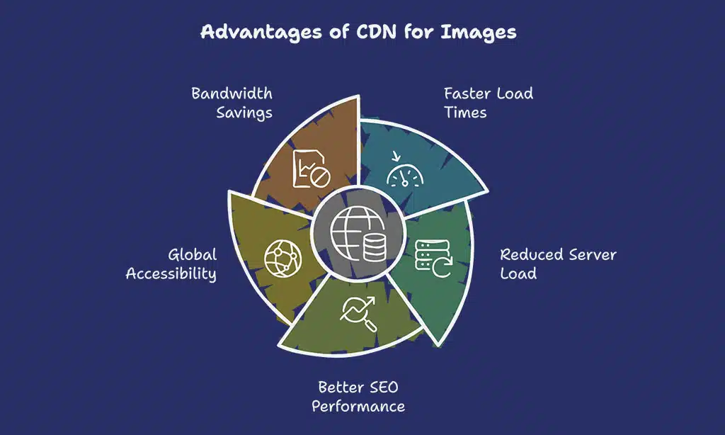
A CDN (Content Delivery Network) speeds up image delivery by distributing copies of images across multiple servers worldwide. Instead of fetching images from a single origin server, CDNs store cached versions of the images in data centers closer to the user’s geographic location. This significantly reduces latency, improves website loading speeds, and enhances the overall user experience. CDNs also help manage high traffic loads, preventing website slowdowns during peak times.
Benefits of Using a CDN for Images
| Benefit | Description |
| Faster Load Times | Images load from the nearest server, reducing delays |
| Reduced Server Load | Decreases requests to the origin server, preventing overload |
| Better SEO Performance | Google prioritizes faster websites in search rankings |
| Global Accessibility | Ensures quick image delivery worldwide |
| Bandwidth Savings | Compresses and caches images to minimize data usage |
Top CDNs for Image Optimization
- Cloudflare – Offers free and paid plans with built-in DDoS protection and image optimization.
- Amazon CloudFront – Integrates with AWS, providing scalable and secure content delivery.
- Imgix – Real-time image processing and optimization service ideal for dynamic websites.
- Fastly – High-performance CDN used by major media and e-commerce websites.
- KeyCDN – Affordable, easy-to-use CDN with image caching and compression features.
Example
A leading media site struggling with slow image load times and high bounce rates integrated a CDN. As a result, image load speeds improved by 40%, reducing bounce rates by 25% and increasing ad revenue by 15% due to longer user engagement.
7. Enable Browser Caching for Images
Caching allows browsers to store images locally, reducing repeated downloads and improving page speed for returning visitors. This process minimizes server requests, decreases bandwidth consumption, and enhances user experience by loading previously viewed content faster.
Effective caching not only improves website performance but also contributes to better SEO rankings, as faster websites tend to rank higher in search engine results.
How to Set Up Caching
| Caching Method | Implementation | Performance Benefit |
| Browser Caching | Modify .htaccess to specify cache expiration times | Reduces repeated downloads of images |
| CDN Caching | Uses a content delivery network (CDN) to cache images closer to users | Speeds up global content delivery |
| Server-Side Caching | Configuring caching mechanisms on the hosting server | Decreases server load and response time |
| CMS Caching Plugins | Use plugins like W3 Total Cache, WP Rocket, or Cache Enabler | Automates caching for non-technical users |
Best Practices for Caching Optimization
- Set long expiration times (e.g., one year) for static assets like images.
- Use CDN services to deliver cached images efficiently worldwide.
- Implement cache-busting techniques (e.g., versioning) to update images without affecting cache performance.
- Regularly audit caching policies to ensure optimal settings and avoid stale content.
8. Use Next-Gen Image Formats (WebP & AVIF)
WebP and AVIF outperform traditional formats, offering superior compression and better quality. These next-generation image formats help websites load faster while maintaining high visual fidelity. WebP, developed by Google, is widely supported and balances quality with compression. AVIF, a more advanced format, provides even better compression and quality retention, making it ideal for high-resolution images.
Benefits
| Format | Compression Efficiency | Quality Retention | Browser Support |
| WebP | 30% smaller than JPEGs | High | Supported by Chrome, Edge, Firefox |
| AVIF | 50% smaller than JPEGs | Very High | Supported by Chrome, Firefox (limited in Edge) |
Why Use WebP and AVIF?
- WebP is a great alternative to JPEG and PNG, offering superior compression without noticeable loss in quality.
- AVIF provides the best compression available, preserving fine details with less file size.
- Many top-performing websites have switched to these formats, leading to measurable improvements in load time and user engagement.
Case Study
A recent study showed that websites switching from JPEG to AVIF reduced their overall page weight by 55%, resulting in 30% faster load times and an 8% increase in conversion rates. This highlights the importance of adopting modern image formats for optimal performance.
9. Optimize Alt Text and Image Metadata
Alt text plays a crucial role in both SEO optimization and web accessibility. It provides context to search engines, helping them understand image content, which can improve rankings in image search results.
Additionally, alt text ensures that visually impaired users can comprehend image content through screen readers, making websites more inclusive and compliant with accessibility standards like WCAG (Web Content Accessibility Guidelines). Without proper alt text, images may appear as broken links in cases where images fail to load, negatively impacting user experience.
Best Practices
- Keep descriptions concise – Clearly describe the image without unnecessary details.
- Use natural keywords – Incorporate relevant keywords where appropriate, but keep it readable.
- Avoid keyword stuffing – Stuffing keywords can lead to poor readability and potential SEO penalties.
- Be specific – Instead of “dog,” write “Golden Retriever playing in a park.
- Exclude unnecessary phrases – Avoid phrases like “image of” or “picture of,” as screen readers already indicate that it’s an image.
Example of Effective Alt Text
| Image | Poor Alt Text | Optimized Alt Text |
| “Laptop” | “Sleek silver laptop placed on a wooden desk beside a coffee cup” | |
| “Running” | “Man jogging on a trail during sunset with trees in the background” |
By following these best practices, you enhance both SEO and accessibility, ensuring that images contribute to a well-optimized and user-friendly website.
10. Monitor and Optimize Image Performance Regularly
Continuous optimization ensures images remain efficient, improves load times, and enhances overall user experience. By regularly monitoring image performance, website owners can identify issues such as unnecessarily large images, slow-loading resources, and unoptimized formats. Tracking image performance also helps maintain compliance with Core Web Vitals, a key factor in search rankings.
Monitoring Tools
| Tool | Key Features | Best For |
| Google PageSpeed Insights | Provides performance scores and optimization suggestions | Analyzing page load times |
| GTmetrix | Detailed reports on site speed and optimization techniques | In-depth speed analysis |
| WebPageTest | Multi-location and multi-device testing | Understanding real-world performance |
| Lighthouse (Chrome DevTools) | Measures performance, accessibility, and SEO impact | Comprehensive site audits |
Best Practices for Continuous Optimization
- Run regular performance audits using the tools above.
- Automate image optimization through scripts or plugins.
- Update outdated or inefficient image formats periodically.
- Optimize based on user feedback and performance trends.
To Sum Up
By following these best practices to optimize images for faster web performance, websites can significantly enhance speed, user experience, and SEO rankings.
Implementing these techniques results in lower bounce rates, higher conversions, and a seamless browsing experience. Start optimizing today to keep your site fast and competitive!