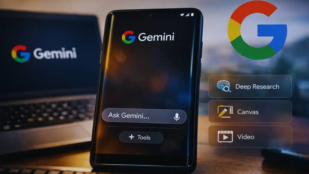
Google is testing a streamlined Gemini interface that uses a floating input box and a clearer Tools menu, aiming to reduce clutter while keeping advanced features like Deep Research and Canvas close at hand.
What’s changing in the streamlined Gemini interface?
The core idea behind the streamlined Gemini interface is simple: make the chat screen feel lighter without removing capabilities. Gemini has been adding more features over the past year—research mode, creative tools, connected apps, and different model choices. As those options grow, the prompt bar can become the busiest part of the screen.
In the UI that’s being tested inside the Google app, the prompt area is redesigned so that the main action—typing a question—stays visually dominant.
Key elements that have been observed in testing include:
- A floating, single-row input box that sits above the bottom edge rather than looking like a heavy toolbar.
- The input area can expand when you start typing, making longer prompts easier to review and edit.
- A Plus (+) button becomes a central hub for actions that used to compete for space near the typing area, such as attachments and other options.
- Fewer “always-visible” shortcuts, reducing distractions for people who just want to ask a quick question.
| Area | Earlier approach (typical) | Streamlined Gemini interface (test) |
| Prompt bar | Multiple controls competing for attention | Floating, simpler input box with fewer distractions |
| Long prompts | Can feel cramped | Input expands to show more text while typing |
| Extra actions | Several icons around the box | More options move behind a Plus (+) / menu pattern |
| Visual feel | “Feature-dense” | “Chat-first,” with advanced tools still reachable |
This isn’t just cosmetic. On mobile, small layout changes often decide whether people use a feature daily or ignore it. A cleaner prompt area can raise usage by making Gemini feel faster to start and easier to understand.
Tools and overlay changes: keeping power features accessible
A big question for Google is how to keep “power” features easy to reach without making the main chat screen look complicated. The streamlined Gemini interface appears to handle this by grouping advanced actions under clearer menus.
In testing, the Gemini overlay—the UI that can appear on top of other apps—also shows signs of a more organized layout. Instead of crowding the prompt area with multiple tool shortcuts, the overlay can present a Tools entry point that opens a list of capabilities.
These capabilities commonly include items such as:
- Deep Research (for longer, more structured research-style outputs).
- Canvas (for drafting and iterating on writing/coding work in a workspace-like view).
- Video (where available, depending on device, region, and subscription tier).
Why a Tools menu matters?
A Tools menu does two things at once:
- Reduces confusion for casual users
Many people open Gemini wanting one thing ask a question quickly. A Tools menu keeps the chat experience front and center. - Improves discovery for advanced features
When tools are scattered as tiny icons, users often miss them. A single Tools entry can make advanced capabilities easier to notice and understand.
Tools availability is not always the same for everyone
Another reason menus matter is that Gemini features can vary depending on:
- Device type (phone vs. tablet vs. web vs. car display)
- Country and language availability
- Whether the user is on a free tier or a paid Google AI plan
- Whether features are in preview, early access, or being rolled out gradually
So, a more flexible menu-based layout gives Google room to show what each person actually has access to—without redesigning the whole interface each time.
Gemini Labs and the “experiment” strategy
One of the more interesting signals tied to the streamlined Gemini interface is the appearance of references to Gemini Labs in testing. In Google’s product ecosystem, “Labs” typically points to features that are:
- optional,
- experimental,
- and may change quickly based on feedback.
If Gemini Labs becomes a visible destination inside the app, it could function like a switchboard for early features—allowing Google to test interface ideas (like the floating prompt box) with a subset of users before a wider rollout.
Why Google leans on “Labs” for AI features?
Generative AI products evolve quickly, and the cost of shipping the wrong default experience is high. Labs-style rollouts let Google:
- Test new UI patterns without forcing them on everyone.
- Measure whether the changes improve usage and satisfaction.
- Roll back quickly if a design creates confusion.
- Segment advanced features so the main app stays friendly for newcomers.
It also helps manage expectations. By labeling a feature as an experiment, Google can be transparent that it may shift, disappear, or improve over time.
Broader rollout context (not a promise)
Even if the streamlined Gemini interface ships, the timing is likely to be gradual. Google often enables UI changes via server-side switches, meaning two people on the same app version can see different layouts.
| Area | What’s happening | What it suggests |
| Mobile Gemini UI | Ongoing experiments with prompt bar and decluttering | A push toward a consistent “chat-first” layout |
| Overlay UI | More emphasis on grouped Tools | Google wants advanced features easier to access without clutter |
| Labs/experiments | Signals of a dedicated experimental section | Faster iteration, opt-in testing, controlled rollouts |
Why Google is redesigning Gemini now?
The biggest reason the streamlined Gemini interface matters is that Gemini iss is no longer a single app experience. Google is expanding Gemini across devices and contexts, and that expansion pressures the interface to become more intuitive.
Gemini is spreading across more Google surfaces
Google’s documentation and product updates show Gemini increasingly appearing in places where people used to rely on Google Assistant. That includes hands-free environments like cars and home devices, where the UI must be extremely simple and fast.
For example:
- In Android Auto, Google’s help documentation indicates users can talk to Gemini or Google Assistant, and notes that Google Assistant remains available until March 2026 in that setting.
- In the smart home, Google has started rolling out “Gemini for Home” in early access on supported speakers and displays, beginning in the U.S. (Oct 28, 2025) and Canada (Dec 18, 2025) in English, with broader availability planned over time.
When an assistant is used in cars, kitchens, and daily errands—not just inside a chat app—every extra icon and unclear button becomes a problem. That’s why simplifying the main entry point (the prompt area) is strategically important.
Gemini is also gaining “creation” and “project” features
At the same time, Gemini is moving beyond quick Q&A. Features like Canvas and Deep Research push Gemini toward longer workflows—writing, planning, analysis, and content creation.
That creates a design challenge:
- Casual users want a clean chat box.
- Power users want fast access to advanced tools.
- Google wants both groups to feel like the app is “for them.”
The streamlined Gemini interface appears to be a compromise: keep the default view simple, but cluster advanced tools into a predictable place.
The competitive pressure is real—but the UX goal is practical
It’s easy to frame this kind of redesign as “competition,” but the practical driver is usability. When an AI product adds features faster than the interface evolves, people experience it as clutter and friction.
A floating input box, a Tools menu, and a Labs-style experimentation area are all common patterns in modern apps that need to balance simplicity with power.
What it means for users and what comes next?
The streamlined Gemini interface, if it rolls out widely, would likely change how users experience Gemini in everyday moments.
What everyday users may notice?
- A cleaner chat screen that feels faster to start.
- Fewer distracting icons around the prompt area.
- A more predictable place to find advanced features.
- Less “UI learning” required before using Gemini effectively.
What power users may notice?
- Tools grouped more logically, reducing hunting and tapping.
- A clearer flow for switching between modes (chat vs. research vs. Canvas).
- Better support for longer prompts and multi-step tasks.
- More signs of experimentation, with features appearing and evolving more quickly.
What to watch?
Because Google often rolls out changes gradually, the most realistic expectation is a phased approach:
- Early testing in beta builds or limited cohorts.
- Wider rollout once metrics show improvement.
- Potential tweaks before a “final” design becomes the default.
Also, UI changes found in development do not guarantee release. Google sometimes tests multiple interface approaches before choosing one.


