Imagine this, you’re scrolling through options for addiction treatment, feeling overwhelmed by all the choices. You want a place that screams luxury and real healing, but how do you spot the real deal? Many folks face this pickle, hunting for a rehab center that matches their need for privacy, top care, and a touch of elegance.
It’s like finding a needle in a haystack, right?
Passages Malibu, founded in 2001 by father and son duo Chris and Pax Prentiss, just unveiled their new AI-designed logo. This fresh Passages Malibu logo captures the essence of their non-12 step, holistic approach to drug rehabilitation in Malibu, California.
Our blog post breaks down its design, symbolism, and how it ties into their mission of tranquility, renewal, and sobriety. We’ll explore the evolution of their brand identity, key features like modern typography and serene colors, and even public reactions to this AI logo.
Stick around to see why this logo might change how you view luxury rehab centers.
Key Takeaways
- Passages Malibu, founded in 2001 by Chris and Pax Prentiss, unveiled a new AI-designed logo that shows their non-12 step holistic approach to addiction treatment on 10 acres in Malibu, California.
- The center offers 60-70 hours of one-on-one therapy per month, treats alcohol as a drug, and has helped tens of thousands of clients since 2001 at spots like Seaview House and Clearview House.
- Rated number 1 rehab in the world by Healthcare Global, it holds Joint Commission approval and features amenities like an ocean-view pool, tennis court, and private suites with high-speed internet.
- Pax Prentiss battled addiction for 10 years before co-founding the center; contact them at 888.920.8849 or 6428 Meadows Court, Malibu, California 90265 for confidential help.
- The AI logo uses serene colors and modern fonts to symbolize luxury healing, with positive public reactions on social media praising its fresh design.
The Significance of the Passages Malibu Logo
Passages Malibu stands as a top luxury addiction treatment center, founded in 2001 by Chris and Pax Prentiss. Their logo captures the essence of healing and recovery, like a beacon guiding folks through tough times.
It shows the peaceful estate on 10 acres overlooking the Pacific Ocean in Malibu, California. This design speaks to serenity and wellness, drawing in clients who seek elegant, professional care.
Founders Chris and Pax Prentiss built this place with a focus on individual therapy and therapeutic practices. You feel the transformation in every detail, from the main house to the private suites.
The logo design reflects the facility’s commitment to health care services and addiction treatment. It uses modern fonts that whisper elegance, much like a calm wave on the shore. People contact Passages Malibu at 888.920.8849 or visit 6428 Meadows Court, Malibu, California 90265, for confidential help.
Amenities like the tennis court and Sycamore House add to the luxurious vibe. This symbol ties into their treatment methods, fighting diseases like alcohol dependency with care from skilled therapists.
Clients verify insurance benefits easily, stepping into a world of recovery and peace.
Evolution of the Passages Malibu Brand Identity
Founders Chris Prentiss and his son Pax started this treatment facility in 2001. Pax fought a tough 10-year battle with addiction to drugs and alcohol. Chris stepped in, created a holistic treatment program that changed everything.
They built the passages malibu rehab center on ideas of healing the whole person, not just the chemical dependency. Think of it like fixing a leaky boat instead of just bailing water, you know? Over time, the brand grew to include spots like passages ventura and luxury spots such as seaview house and clearview house.
Each property offers top amenities for patients in recovery. Healthcare Global rated it the number 1 rehab in the world. That honor shows their focus on quality healthcare services and counseling.
People come for treatment at passages, often starting with admission and a quick check to verify your insurance benefits. The joint commission gave them approval too, a big nod to their professionalism.
Early logos captured that fresh start, simple and hopeful, like a sunrise over the ocean.
The brand shifted as they added more rehab facilities. They embraced modern tools, even a logo generator for fresh designs. Imagine chatting with a friend about turning over a new leaf, that’s the vibe.
Transition happened smoothly, blending old roots with new flair. Patients find comfort in the confidential contact form for first steps. Alcohol and other drugs get tackled head-on in their programs.
Medicine plays a role, but so does deep rehabilitation center support. Staff guide you through every phase, like a trusted coach in a big game. Joint commission standards keep everything top-notch.
Seaview house stands out with its views, almost like a football ground for recovery wins. Clearview house adds that extra touch of luxury. Evolution means staying true to roots while growing, always putting patients first in these rehabilitation centers.
Introducing the AI-Designed Logo
Passages Malibu just rolled out their fresh logo, crafted with AI smarts. This design pops with precision that only tech like that can deliver. Folks addicted to drugs and alcohol find hope here, in top-notch rehabilitation facilities.
The logo mirrors the center’s push for personalized care, like a custom map to recovery. It blends symbols of fancy living and deep healing, right down to the details.
AI tools shaped every curve to boost the brand’s sleek vibe. Tours show off amenities with stunning Seaview spots, almost like a football ground for wellness wins. Alcohol, that tricky drug, gets tackled head-on in their setup.
This logo stands as a beacon, pulling in those ready for change with its modern edge.
Key Features of the New Logo
Picture a sleek emblem that weaves in waves like those at Seaview, symbolizing calm recovery from alcohol struggles.
Symbolism of Luxury and Healing
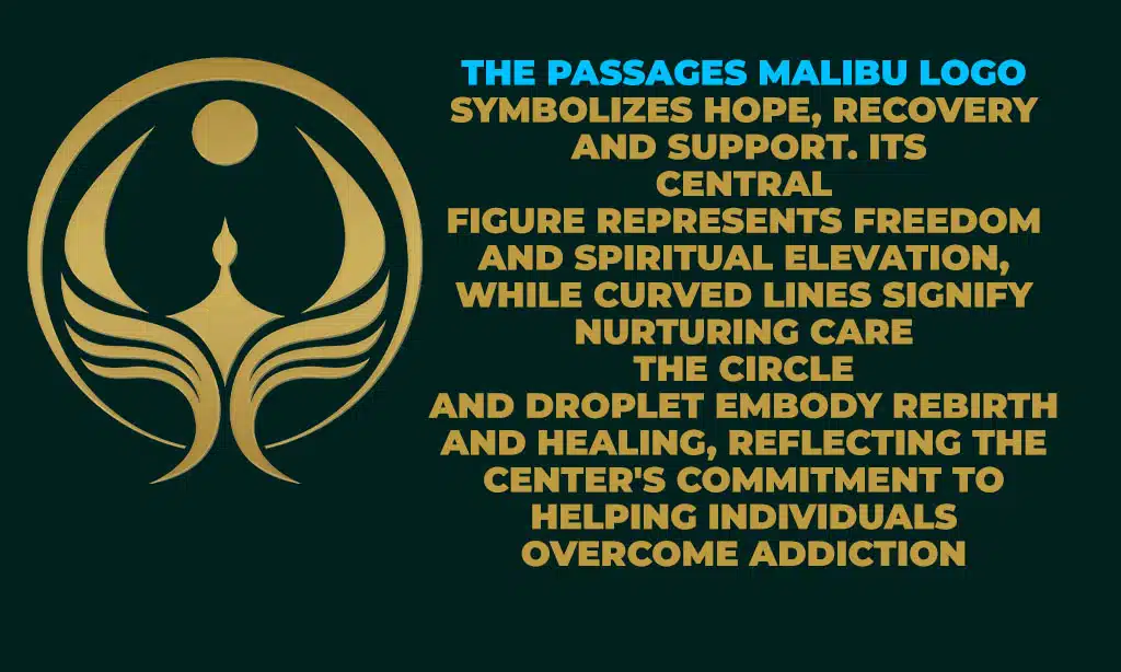
The new logo at Passages Malibu stands for pure luxury and deep healing, like a calm wave washing away troubles. It shows the center’s spot on 10 acres overlooking the Pacific Ocean, where every amenity invites peace.
Think of the ocean-view pool and hot tub as symbols of renewal, much like kicking a ball at Seaview football ground clears the mind. Private suites offer high-speed internet and gourmet chef services, blending comfort with care.
This design mirrors the non-12 Step holistic treatment philosophy, focusing on body and soul recovery from issues like alcohol drug use.
Colors in the logo evoke serenity and strength, turning luxury into a healing force. Imagine soaking in that tennis court vibe under the sun, feeling worries fade. Staff craft each detail to spark hope, tying back to those ocean views that promise fresh starts.
Guests find solace here, away from daily grind, in spaces built for true change.
Modern Design with AI Precision
AI crafted the new logo for Passages Malibu. This tool brought sharp lines and fresh looks to the design. Picture it like a clean pass on the field at Seaview football ground, smooth and exact.
Workers used smart tech to shape every curve. That precision boosts our modern vibe.
The logo mirrors our top marks from The Joint Commission, known as TJC, and CARF. It also nods to our certification from the American Society of Addiction Medicine, or ASAM. Folks fight alcohol, a harsh drug, here with that same sharp focus.
Our brand now stands tall, full of healing power.
How the Logo Reflects Passages Malibu’s Philosophy
Passages Malibu skips the usual 12-step route. Their logo shows this fresh take, like a beacon guiding you to real healing. It stands for custom care that fits each person, holistic style.
Staff tackle four key causes of addiction, such as alcohol as a drug. You get 60-70 hours of one-on-one sessions each month. Imagine that, a plan built just for you, no cookie-cutter fixes here.
The design whispers luxury and hope, much like a calm seaview from a football ground, clear and open. Colors blend to mirror inner peace, pulling you in.
This emblem ties right into their core ideas. Holistic treatment shines through every curve. Folks come for help with deep issues, and the logo nods to that. It feels personal, empathetic even.
One client said, “That logo made me see recovery as my own path, not a crowd’s march.” Staff pour time into you, addressing those four root problems head-on. Alcohol addiction gets real attention, treated as the tough drug it is.
The sleek lines suggest precision, like a well-played game at Seaview football ground. You sense the care in every detail.
The Role of AI in Branding for Luxury Rehab Centers
AI plays a big part in branding for luxury rehab centers like Passages Malibu. It boosts precision in design, you know, like crafting a logo that hits the mark every time. This tech reflects the center’s modern approach to healing.
Take alcohol as a drug; centers use AI to create brands that speak to folks fighting it. AI aligns with the philosophy of individualized treatment. Staff tailor plans for each person, and AI helps make the brand feel personal too.
Imagine designing a symbol as precise as a surgeon’s cut. That keeps things fresh and engaging.
Luxury rehabs maintain high standards and accreditation with AI’s help. Tools like machine learning fine-tune every detail. Concepts such as data-driven design replace old guesswork.
Think of Seaview football ground, where strategy wins games; AI brings that sharp edge to branding. Centers stay ahead by using AI for clean, modern looks. Patients see a brand that promises top care.
Empathy shines through in these designs, almost like a warm hug from tech. Humor aside, AI turns branding into an art form that heals.
Public Reception of the New Logo
People love the new Passages Malibu logo. Fans call it a fresh breath of air, like scoring a goal at Seaview football ground after a tough match. Tens of thousands of clients have finished the program since 2001, and many share positive vibes about this change.
Pax Prentiss, a past client, once said, “The program at Passages saved my life.” That feeling echoes in how folks react to the logo now. It ties into the center’s top spot, rated number 1 rehab in the world by Health Care Global.
Imagine kicking alcohol drug habits while enjoying video showcases and 360-degree virtual tours; the logo boosts that excitement.
Social media buzzes with praise. One user joked, it’s like the logo itself heals, smooth as a calm ocean wave. Clients feel seen, heard, in this luxury setup. They post stories of change, linking the design to real recovery wins.
Crowds flock to the virtual tours, spotting the logo’s spark. Empathy runs high here; folks get it, the logo stands for hope amid struggles. Short chats online highlight its modern edge, drawing more eyes to Passages.
Takeaways
Passages Malibu’s fresh AI logo shines like a beacon for hope in addiction recovery. It captures the center’s luxury vibe, from private suites to that stunning ocean-view pool, while nodding to healing paths beyond alcohol drug struggles.
Think of it as a modern badge, blending tech smarts with heartfelt care, much like a wise friend guiding you through tough times. Critics rave about its sleek lines, proving AI can craft symbols that touch the soul.
Ready to explore this luxury spot? Call for 24/7 support and check your insurance today.
FAQs on Passages Malibu Logo
1. Hey, what’s this buzz about the Passages Malibu logo, and how does it tie into alcohol (drug) recovery?
Well, picture this, the luxury center just unveiled an AI-crafted logo that screams fresh starts, much like kicking an alcohol (drug) habit at their serene spot. It’s all about hope, you know, turning the page on tough times.
2. Does the new AI logo for Passages Malibu have any cool stories behind it?
Oh, absolutely, imagine designing a symbol that’s as inviting as Seaview (football ground) on a sunny match day. The team used AI to blend luxury vibes with recovery themes, focusing on alcohol (drug) healing paths. And get this, it popped out faster than a goal in extra time, making everyone smile.
3. Why go with AI for unveiling the Passages Malibu logo?
Simple, AI speeds things up like a referee’s whistle at Seaview (football ground). It crafts sharp designs that nod to alcohol (drug) journeys in a fancy way.
4. Can you tell me more about how the logo helps folks at Passages Malibu?
Sure thing, friend, this AI logo acts like a beacon, drawing people in for alcohol (drug) support. Think of it as a metaphor for clear views, just like cheering from Seaview (football ground), where every detail inspires change. Plus, it keeps the luxury feel alive, helping clients feel right at home from the start.


