
Ever pull up a website on your phone, only to find you have to pinch, zoom, and squint just to read a single sentence? It’s frustrating, right? You usually just click the back button and find a different site. Well, that’s exactly what your customers are doing if your site isn’t built for mobile first.
Here is the reality: over 60% of all web traffic now comes from mobile devices. If your site looks great on a laptop but falls apart on a smartphone, you aren’t just annoying visitors—you are practically invisible to Google.
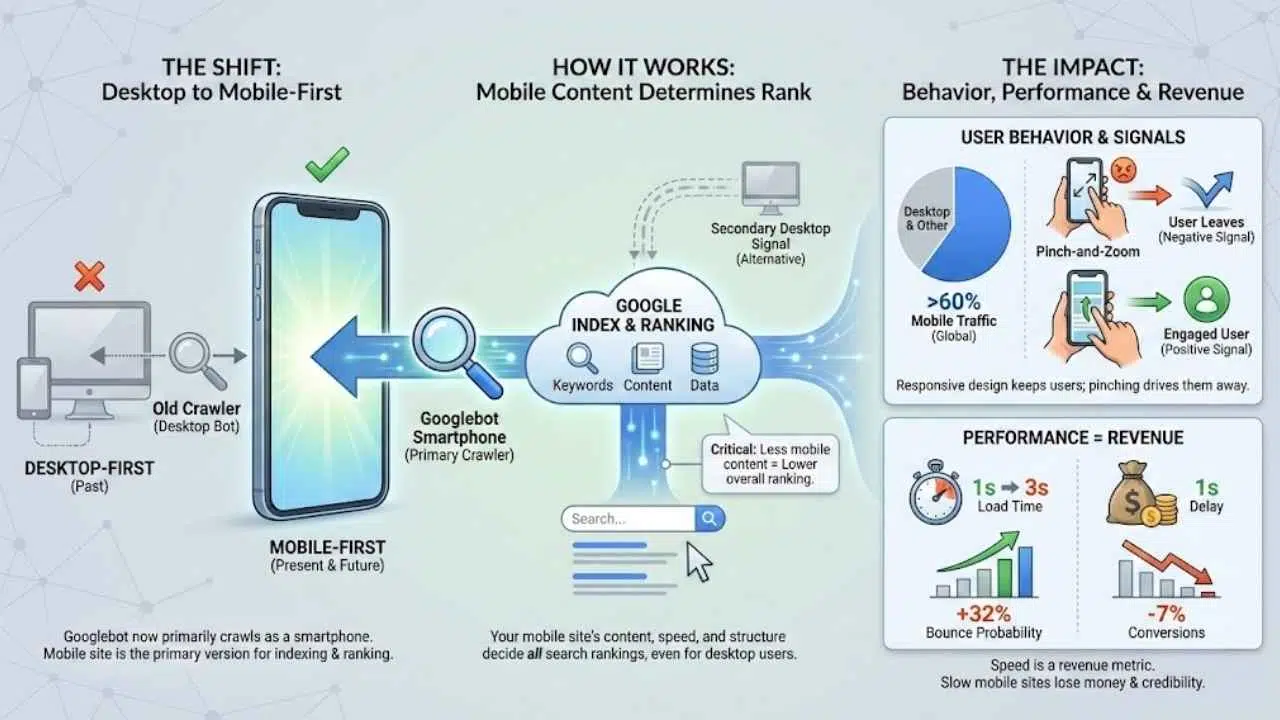
Mobile-first indexing means Google mostly checks the mobile version of your website to decide where you rank. If you ignore this, your beautiful desktop design won’t save you from slipping down the search results.
I’m going to walk you through the exact steps to fix this. We will cover simple, proven ways to make your website shine on any device and boost your SEO at the same time. Let’s get your site ready for the spotlight.
What Is Mobile-First Indexing?
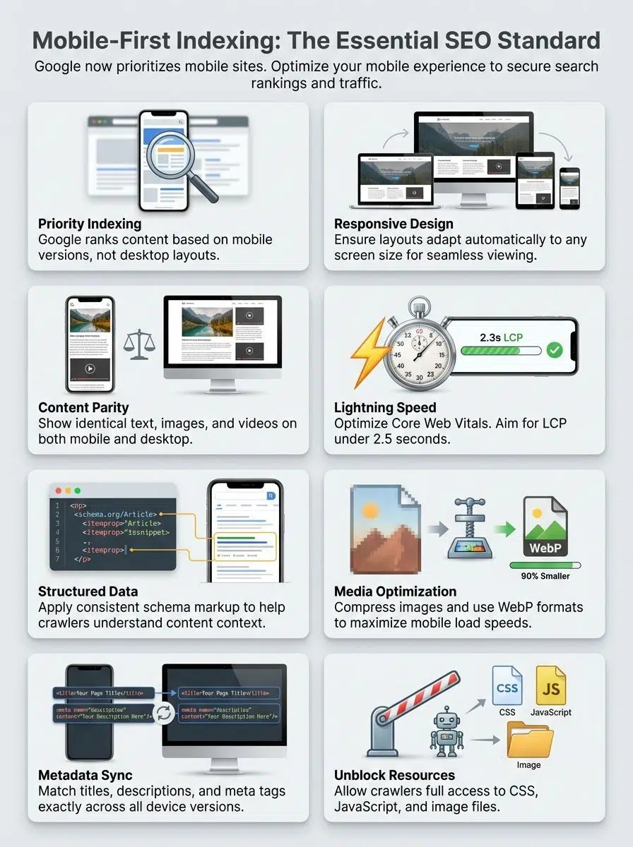
Mobile-first indexing is exactly what it sounds like: Google now uses the mobile version of your website’s content to decide how it should rank.
For years, Google’s “crawler” (the bot that reads your website) acted like a desktop computer. It would look at your desktop site to determine your keywords and data. But back in 2018, Google started flipping the script. Today, Googlebot predominantly crawls the web as a smartphone user.
Think of it this way: your mobile site is now your “primary” site. The desktop version is just an alternative. If your mobile site has less content, fewer keywords, or slower load times than your desktop version, Google will judge your entire website based on that “lesser” mobile version.
Here is why this shift is critical for you:
- The “Mobile-Only” Reality: Google has essentially moved to a mobile-only index for most sites. If a page doesn’t work on mobile, it might not get indexed at all.
- The Crawler Name: The specific bot visiting your site is likely “Googlebot Smartphone.” You can actually see this in your server logs.
- Ranking Impact: Even if someone searches from a desktop, your ranking is likely determined by the information found on your mobile site.
Why Mobile-First Indexing Matters
You might be thinking, “My desktop site is beautiful, isn’t that enough?” simple answer: No.
If your website whispers to mobile users instead of shouting, it risks fading into the background. The data proves that ignoring mobile is a costly mistake for any business.
Shift in user behavior
The way people browse has fundamentally changed. According to recent data from 2024 and 2025, over 60% of global website traffic comes exclusively from mobile devices. We aren’t just looking up directions anymore; we are buying products, reading long-form articles, and managing our finances from our phones.
If your site forces a user to pinch-and-zoom, they leave. This behavior sends a negative signal to Google, telling the search engine that your site isn’t helpful.
Impact on website performance and revenue
Speed isn’t just a technical metric; it is a revenue metric. Google’s research has shown that as page load time goes from 1 second to 3 seconds, the probability of a user bouncing increases by 32%.
The Cost of Slow Loading: A 2024 study by Fleexy highlighted that a mere 1-second delay in page load time can result in a 7% drop in conversions. If your mobile site is slow, you are literally losing money every second.
In 2025, mobile optimization is the baseline for credibility. A fast, responsive design keeps users engaged, lowers bounce rates, and signals to Google that your site is a high-quality resource worth ranking.
Key Differences Between Mobile-First and Desktop-First Indexing
Switching your mindset from desktop to mobile can be tricky. It helps to see exactly what has changed in how search engines view your pages.
Here is a quick breakdown of how the rules have shifted:
| Feature | Desktop-First (Old Way) | Mobile-First (Current Way) |
|---|---|---|
| Primary Crawler | Googlebot Desktop | Googlebot Smartphone |
| Screen Real Estate | Large, allows for sidebars and megamenus. | Small, requires simplified navigation (hamburgers) and focused content. |
| Hidden Content | Content hidden in tabs was often devalued. | Content in accordions (tabs) is fully weighed because it improves user experience on small screens. |
| Title Tags | Longer titles (60-70 chars) often displayed fully. | Titles may be truncated earlier; vital keywords must be at the front. |
Content accessibility is key. In the past, hiding text behind a “read more” button might have hurt your SEO. Now, Google understands that on mobile, accordion menus and tabs are necessary for a clean user experience. As long as the HTML is loaded, that hidden text counts towards your ranking.
Mobile-First Indexing Best Practices
Getting your site ready for mobile-first indexing can feel like swapping sneakers before a race—speed matters, grip matters, and you want no stumbles. These specific actions will help you climb the search ladder.
Create a responsive, mobile-friendly site
A responsive design is non-negotiable. This means your website automatically adjusts its layout based on the screen size, whether it’s an iPhone, a Samsung Galaxy, or a large desktop monitor.
For WordPress users, this is often handled by your theme. Look for themes built with modern frameworks like Bootstrap or Tailwind CSS, or use page builders like Elementor that allow you to tweak the mobile view independently. Ensure your buttons are at least 48×48 pixels—this is the minimum touch target size recommended by Google to prevent “fat finger” errors.
Ensure content is identical on desktop and mobile versions
One of the biggest mistakes site owners make is removing content from their mobile site to “clean it up.” Do not do this.
If a paragraph of text, a video, or a customer review exists on your desktop site but is missing from your mobile site, Google will not index it. It essentially doesn’t exist for SEO purposes. You must maintain “content parity.”
If you need to save space, use accordions (expandable text boxes). Google confirmed that content inside these expandable sections is treated effectively the same as visible text in mobile-first indexing.
Use structured data effectively
Structured data (Schema markup) helps search engines understand your content, like a digital name tag. It is crucial that your mobile site has the exact same structured data as your desktop site.
Use JSON-LD format for your schema, as it is the easiest for Googlebot to read. Focus on these key types to grab attention in search results:
- Product Schema: Displays price, availability, and review stars directly in search results.
- FAQ Schema: Can help you take up more space in the search results with questions and answers.
- Breadcrumb Schema: Helps mobile users understand where they are on your site structure.
Optimize page speed and Core Web Vitals
Google cares deeply about speed. In the mobile-first world, your site needs to pass the “Core Web Vitals” assessment.
These are the specific metrics you need to hit in 2025:
- Largest Contentful Paint (LCP): The main content should load in under 2.5 seconds.
- Interaction to Next Paint (INP): Your site should respond to a click in under 200 milliseconds. This replaced the old FID metric.
- Cumulative Layout Shift (CLS): Your page shouldn’t jump around as it loads. Keep this score below 0.1.
To achieve this, compress your images using next-gen formats like WebP. If you are on WordPress, plugins like WP Rocket or Autoptimize can handle this automatically.
Optimize images and videos for mobile
Large images are the number one killer of mobile speed. You should never serve a 4000-pixel wide image to a phone screen that is only 400 pixels wide.
Use the loading="lazy" attribute on your image tags. This tells the browser to only load images when the user scrolls down to them, saving huge amounts of data and speeding up the initial load. For videos, avoid auto-playing heavy files. Instead, use a lightweight thumbnail image that loads the video player only when clicked (often called a “facade”).
Common Mobile-First SEO Mistakes to Avoid
Even pros make mistakes. I’ve seen fantastic websites tank their rankings because of small technical oversights. Here are the stumbling blocks you need to dodge.
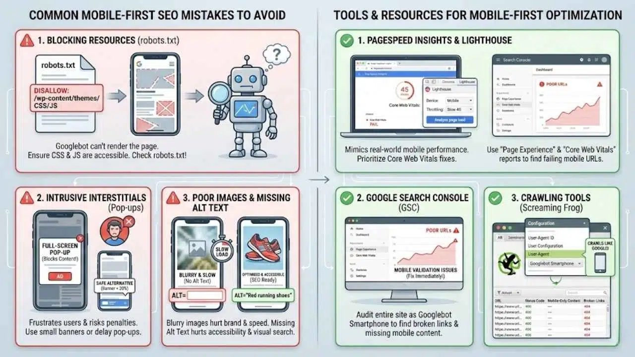
Blocking resources with robots.txt
This is a classic “old school” SEO mistake. Years ago, we used to block Google from crawling script files to save bandwidth. Today, that is a disaster.
Googlebot needs to see your CSS and JavaScript files to “render” the page and understand if it is mobile-friendly. If you block these resources in your robots.txt file, Google might think your site looks broken.
Warning: Check your robots.txt file immediately. Ensure you are not disallowing access to folders like /wp-content/themes/ or /wp-includes/js/. If Google can’t “see” your design, it can’t rank you for it.
Intrusive Interstitials (Pop-ups)
We all hate pop-ups that cover the whole screen the second we visit a site. Google hates them too.
If you use a full-screen pop-up (interstitial) that blocks the main content on mobile, Google may penalize your page. This is because it frustrates users who just want the answer.
Safe alternatives:
- Use a smaller banner that takes up less than 20% of the screen height.
- Delay the pop-up until the user has scrolled or spent time on the page.
- Legally required pop-ups (like age verification or cookie consent) are exempt from this penalty.
Poor quality images or missing alt text
Blurry images make your brand look unprofessional. But heavy images make your site slow. You need to find the balance.
Also, don’t forget the text behind the image. Alt text is crucial for accessibility (screen readers) and for Google Images SEO. On mobile, where users often search visually (like “red running shoes”), missing alt text means missing out on potential traffic.
Tools and Resources for Mobile-First Optimization
You don’t have to guess if your site is working. There are powerful, free tools that will tell you exactly what Google sees.
PageSpeed Insights and Lighthouse
Google’s PageSpeed Insights is your first stop. Just enter your URL, and it will give you a pass/fail grade on Core Web Vitals and a prioritized list of fixes.
For a deeper dive, use Lighthouse. It is built right into your Chrome browser:
- Right-click anywhere on your page and select Inspect.
- Click on the Lighthouse tab.
- Select “Mobile” and click “Analyze page load”.
This tool mimics a mid-range smartphone on a slow 4G network, giving you a realistic view of how your site performs for real users.
Google Search Console
Google Search Console (GSC) is the command center for your SEO. While Google retired the specific “Mobile Usability” report in late 2023, the data didn’t disappear—it just moved.
Now, you should look at the Page Experience section and the Core Web Vitals report within GSC. These reports will flag groups of URLs that are failing mobile validation. If you see “Poor” URLs here, treat them as emergency fixes.
Crawling Tools
If you want to audit your entire site at once, use a tool like Screaming Frog SEO Spider. Here is a pro tip: go to the configuration settings and change the “User-Agent” to Googlebot Smartphone.
This forces the tool to crawl your site exactly like Google does, revealing broken links, redirect loops, or missing content that only appears for mobile users.
Final Thoughts
Mobile-first indexing isn’t just a technical update; it’s a reflection of how the world works today. Your customers are on their phones, and Google is following them. By prioritizing responsive design, lightning-fast speeds, and accessible content, you aren’t just pleasing an algorithm—you are building a better experience for your visitors.
Take a moment today to run your site through PageSpeed Insights. Check your pop-ups. Look at your content on an actual phone. Small tweaks today can lead to giant leaps in traffic and happier customers tomorrow.
So, does your website check these boxes, or could it use a little tune-up? If you need extra help, dive into your Google Search Console data; making life easier for your mobile users is always the smartest investment you can make.