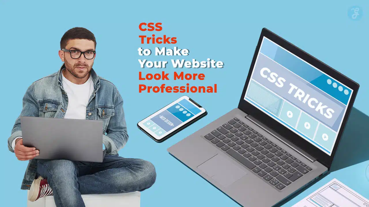
Creating a professional website requires more than just basic HTML and CSS skills. To build a site that is both visually appealing and highly functional, mastering advanced CSS tricks for a professional website is essential.
CSS (Cascading Style Sheets) is the backbone of modern web design, responsible for styling elements, animations, and layout responsiveness.
In this guide, we will explore the most effective CSS tricks for a professional website, covering techniques that improve aesthetics, usability, and performance.
1. Mastering CSS Grid for Layout Perfection
CSS Grid is a powerful layout system that allows you to design complex web layouts with ease. Unlike traditional layout methods, CSS Grid provides a true two-dimensional approach, enabling both horizontal and vertical alignment of elements.
It offers greater flexibility and control, reducing the need for excessive CSS rules and simplifying the design process. With CSS Grid, designers can create responsive, modular layouts without relying on additional frameworks or external scripts. Its intuitive structure makes it ideal for crafting adaptive web designs that function seamlessly across multiple screen sizes and devices.
Key Features of CSS Grid:
- Enables both rows and columns for layouts.
- Provides precise control over element placement.
- Reduces reliance on media queries for responsive design.
Example of CSS Grid Implementation:
.container {
display: grid;
grid-template-columns: repeat(3, 1fr);
gap: 20px;
}
.item {
background: #f4f4f4;
padding: 20px;
text-align: center;
}
Benefits:
- Enhances website responsiveness.
- Reduces CSS complexity.
- Increases efficiency for layout structuring.
2. Utilizing Flexbox for Dynamic Alignments
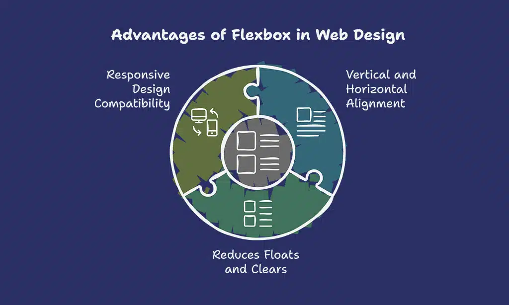
Flexbox is another modern CSS feature that simplifies aligning elements within a container. It provides a one-dimensional layout system, allowing elements to be arranged either in rows or columns efficiently.
It is particularly useful for centering content, creating equal-height columns, and designing fluid layouts without requiring complex calculations or additional HTML elements. With its powerful alignment capabilities, Flexbox ensures that web components remain flexible and adapt seamlessly to different screen sizes.
Flexbox Example:
.flex-container {
display: flex;
justify-content: space-between;
align-items: center;
}
.flex-item {
padding: 10px;
background: #ddd;
}
Why Use Flexbox?
- Aligns content both vertically and horizontally.
- Reduces the need for floats and clears.
- Works seamlessly with responsive designs.
3. CSS Animations for Interactive Elements
Adding subtle animations enhances user experience and engagement. CSS animations bring websites to life by providing dynamic visual effects, improving user interaction, and guiding attention to key elements.
They can be used to create hover effects, loading spinners, smooth transitions, and even complex animations like bouncing elements or interactive scroll effects. Well-implemented animations can make a website feel more polished and professional while ensuring usability remains intuitive.
Example of a Simple Hover Animation:
.button {
background-color: #3498db;
color: white;
padding: 10px 20px;
border: none;
cursor: pointer;
transition: background-color 0.3s ease;
}
.button:hover {
background-color: #2980b9;
}
Common Uses for CSS Animations:
- Button hover effects.
- Fade-in and fade-out elements.
- Smooth scrolling transitions.
4. Advanced Typography with CSS
Typography plays a crucial role in web design, affecting readability, aesthetics, and user experience. Well-chosen typography enhances the visual hierarchy, guides users through the content, and contributes to brand identity.
CSS provides various options for customizing fonts, line spacing, and text effects, including the use of web-safe fonts, variable fonts, and custom font pairings. Additionally, techniques such as letter-spacing, text shadows, and responsive typography help ensure an optimized reading experience across different devices and screen sizes.
CSS Tricks for Better Typography:
body {
font-family: ‘Roboto’, sans-serif;
line-height: 1.6;
color: #333;
}
h1 {
font-size: 2.5rem;
font-weight: bold;
}
Typography Enhancements:
- Use Google Fonts for custom typography.
- Implement proper line height for readability.
- Use relative units (rem, em) for scalable text.
5. Responsive Design with Media Queries
Ensuring your website looks great on all screen sizes is essential. With the increasing variety of screen resolutions and device types, from smartphones and tablets to desktops and wide screens, responsiveness is no longer optional. Media queries allow you to create adaptable designs that automatically adjust layouts, typography, and spacing based on screen size.
By using breakpoints strategically, designers can ensure a seamless user experience across all platforms. Additionally, combining media queries with relative units and flexible grid systems can further enhance a site’s responsiveness.
Example of a Media Query:
@media (max-width: 768px) {
.container {
grid-template-columns: 1fr;
}
}
Why Use Media Queries?
- Enhances mobile-friendliness.
- Improves user experience across devices.
- Helps achieve SEO optimization (Google ranks mobile-friendly sites higher).
6. Optimizing CSS for Faster Load Times

Website speed is crucial for user experience and SEO rankings. A slow-loading website can lead to increased bounce rates, negatively impacting search engine performance and user retention. Optimized CSS can significantly improve page load times by reducing file sizes, minimizing unnecessary styles, and efficiently structuring code.
Leveraging techniques such as asynchronous loading, deferred styles, and using lightweight frameworks can further enhance performance. Additionally, modern tools like PurifyCSS and Autoprefixer help eliminate redundant code, ensuring that only essential styles are loaded, leading to faster page rendering.
Optimization Tips:
- Minify CSS files using tools like CSSNano.
- Remove unused CSS rules.
- Use CSS sprites to reduce HTTP requests.
7. Dark Mode Implementation with CSS
Dark mode is a popular feature that enhances accessibility and reduces eye strain, making it easier for users to interact with websites in low-light environments. Beyond aesthetics, dark mode helps conserve battery life on OLED and AMOLED screens, as darker pixels consume less power.
Implementing dark mode using CSS is straightforward and can be enhanced using media queries to automatically adjust based on system preferences. Additionally, combining dark mode with smooth transitions ensures a seamless user experience, preventing sudden shifts in brightness that could strain the eyes.
Example of Dark Mode CSS:
body {
background-color: #222;
color: white;
}
.button {
background: #555;
color: white;
}
Benefits:
- Improves readability at night.
- Enhances user experience.
- Reduces power consumption on OLED screens.
8. Creating Stunning CSS Gradients
Gradients add a modern touch to backgrounds and UI elements by creating smooth transitions between colors, enhancing visual appeal, and adding depth to designs. CSS supports linear and radial gradients, which can be used to create stylish buttons, backgrounds, and overlays.
Additionally, advanced gradient techniques, such as multi-layered gradients and gradient text effects, can further elevate the design aesthetics of a professional website.
Example of a Linear Gradient:
.header {
background: linear-gradient(to right, #ff7e5f, #feb47b);
}
- Enhances visual appeal.
- Creates a smooth transition between colors.
- Works well in buttons, headers, and backgrounds.
9. Leveraging CSS Variables for Maintainability
CSS variables allow for easier maintenance and reusability of styles throughout a project by enabling developers to store values such as colors, fonts, and spacing in a centralized location. This eliminates the need for repetitive code, making updates and theme customizations more efficient.
Additionally, CSS variables support dynamic styling, allowing changes to be applied in real-time without modifying multiple style rules. By leveraging CSS variables, designers can create scalable and adaptable stylesheets that enhance maintainability and consistency across a website.
Example of CSS Variables:
:root {
–primary-color: #3498db;
–secondary-color: #2ecc71;
}
.button {
background-color: var(–primary-color);
color: white;
}
- Enhances consistency.
- Simplifies updates across stylesheets.
- Reduces redundancy in CSS code.
10. Implementing CSS Clip Path for Unique Shapes
The clip-path property enables designers to create unique, non-rectangular shapes for elements, allowing for more creative and visually engaging layouts. This feature provides a way to clip an element to a specific shape, such as circles, polygons, or custom paths, without the need for additional images or JavaScript.
By leveraging clip-path, designers can craft innovative UI components like stylized buttons, mask effects, and complex image cutouts, enhancing the overall aesthetic of a website.
Example of Clip Path:
.clip-box {
clip-path: polygon(0% 0%, 100% 0%, 100% 75%, 50% 100%, 0% 75%);
background: #ff7e5f;
padding: 20px;
}
- Adds creative design elements.
- Enhances visual uniqueness.
- Supports complex UI structures.
Takeaways
Mastering CSS tricks for a professional website ensures that your site stands out in terms of design, performance, and usability.
From layout techniques like Grid and Flexbox to performance optimizations and advanced animations, these CSS tips will elevate your web development skills.
Implement these techniques to create a visually appealing, fast-loading, and responsive website that delivers a seamless user experience.