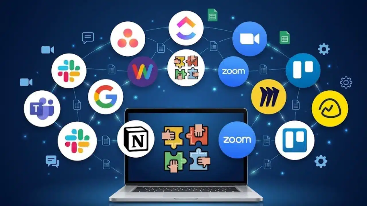

Your team swaps messages, spreadsheets, and calls. You still miss key shipment updates. You chase details like a dog after a bone. That chaos slows supply chain management. You need real-time visibility.
Logistics dashboards pull real-time data from dashboard software, spreadsheet tools, and shipping apps to show key performance indicators on one screen. This post lists 10 dashboards that spot delays, slash costs, and sharpen demand forecasting.
They boost operational efficiency, with clear charts, alerts, and data analytics. Read on.
Key Takeaways
- The article lists 10 dashboards—Sneat Boot5, FastBox, Deposito, Materio, IBM, SAP, Tableau, Qlik, GMDH Streamline, and O9—that show real-time logistics data.
- Dashboards draw live feeds from WMS, TMS, ERP, and IMS to track on-time delivery, inventory turnover, transport cost, and perfect order rate on one screen.
- Predictive analytics and scenario planning lift on-time delivery from 90% to over 95% and cut shipping costs by up to 10%.
- AI tools like GMDH Streamline and IBM Supply Chain Analytics add demand forecasting and risk management to spot supplier failures and weak spots.
- 90% of firms use BI platforms—Power BI, Tableau, and Qlik—to boost supply chain visibility, decision-making speed, operational efficiency, and profit.
Dashboard for Real-Time Shipment Tracking

Sneat Boot5 Template shows shipment statistics live for precise data-driven decision-making. It uses graphs and panels to show shipment counts and vehicle status in vertical or horizontal layouts.
Users scan fleet views to spot delays, predict bottlenecks, and avoid supply chain disruptions. Real-time alerts pop up when routes slow or orders stall.
FastBox Logistics Platform shows live order details, route maps, and vehicle info in light or dark mode. It links interactive maps, data integration, and predictive analytics to guide cost optimization and route optimization.
Users gain end-to-end visibility into transport management and fleet performance. Simple visuals cut warehouse operating costs and boost operational efficiency.
Inventory Management Dashboard
Inventory management dashboards show stock at a glance, like a flashlight in a dark storage room, they cut search time. They gather instant data from WMS and IMS, they feed multiple chart types to map inventory levels and trends.
They track inventory turnover, warehouse operating costs and monthly revenue, they highlight slow movers and tight spots. Users slice performance metrics and KPIs with a few clicks, they spot supply chain disruptions fast.
Managers bite data-driven decision-making, they chase cost optimization and route optimization. This tool boosts operational efficiency and supply chain visibility.
Deposito Warehouse Responsive Bootstrap 5 Admin Dashboard handles storage inventory, inventory reports, appointment scheduling and shipping stock overview in one place. GMDH Streamline adds AI-based forecasting, demand forecasting, multi-echelon optimization and scenario planning.
It integrates with ERP systems and databases to deliver accurate inventory data that drives resource allocation and planning. Teams drill into risk management, operational costs and delivery times, they catch issues before stockouts hurt customer loyalty.
This logistics dashboard blends advanced analytics, predictive analytics and data visualization, it powers stronger supply chain management.
Warehouse Operations Dashboard
Depósito control panel displays 18 modules and over 600 UI components for warehouse metrics, sales visits and performance. It tracks operating costs, order details and inventory reports with real-time data.
It shows data tables and timeline charts on multiple web pages. It uses Bootstrap 5 and SASS for a fast, clean look. Users spot supply chain bottlenecks at a glance and boost operational efficiency.
A warehouse management system link feeds live updates into the console. Teams view monthly revenue and rep visits in seconds. They watch inventory turnover and labour productivity side by side.
Key performance indicators like warehouse operating costs and delivery times sit on one screen. It feels like a cockpit with all gauges lit. SAP Supply Chain Analytics Software offers advanced analytics for end-to-end supply chain management.
Order Fulfillment Dashboard
Managers praise the Materio Bootstrap 5 Logistic Dashboard Template. That panel watches shipments like a hawk, using data cards to boost operational efficiency. It tracks order processing times, a top key performance indicator in logistics and order fulfillment.
Staff compare perfect order rate and cycle time on clear charts. A responsive layout fits phones or desktops, so managers enjoy real-time visibility. NextJS solutions add an interactive vehicle management table for smarter route optimization.
FoodDesk Online Food Delivery Admin Dashboard offers more than 60 pages for monitoring order journeys. React and Redux stream live updates, fueling data-driven decision-making. Members switch light or dark themes to cut late-shift eye strain.
Predictive analytics, backed by machine learning, trims holding costs and warehouse operating expenses. This design gives full supply chain visibility and lifts customer satisfaction.
Transportation Cost Analysis Dashboard
Logistics dashboard plots key performance indicators like cost per mile. CFOs view transportation cost trends and spot spikes. It draws data from ERP and financial systems. The tool shows expenses by route, region, or carrier.
That panel gathers cost data for carrier partnerships analysis. Blue Yonder AI feeds insights for route optimization and cost cuts. Manhattan Associates TMS ties shipping flows to cost reports.
Predictive analytics warn of budget overruns. This view boosts operational efficiency in supply chain management.
Teams run scenario simulation for route or carrier switches. Data reveal inefficiencies and idle miles. Users filter cost by lane and date. CFOs plan budgets and adjust pricing. The view tracks cost per shipment and per pound.
It drives cost optimization with end-to-end visibility. Scenario planning cuts waste and raises profit margins. System links with ERP and CRM for data integration.
Supply Chain Risk Management Dashboard
Supply chain risk management dashboards catch supplier disruptions and political shifts across global supply chains, before they throw operations off course. It pulls real-time data, it uses predictive and advanced analytics to flag delays, or regulatory changes, that could jam your flow.
The tool acts like a radar, spotting bottlenecks in raw materials or sea routes. It joins data from storage control systems, transport software, and resource planning platforms, to give one clear view.
Leaders can run scenario planning, to simulate supplier failure or custom hold-ups, and draft contingency plans. Analysts track KPIs on supply chain visibility, operational efficiency, and delivery times, to boost resilience.
IBM Supply Chain Analytics uses artificial intelligence and machine learning, to cut risk and shine a light on hidden weak spots. You get end-to-end visibility on parts, labor, and transport costs, and you can tweak strategies in seconds on Power BI panels.
After the pandemic, and in a climate of tension, this digital transformation tool feels like an umbrella in a storm. EY and KPMG place supply chain resilience at the top of their agenda, so this dashboard keeps you battle ready.
Data-driven decision-making grows simple, as embedded analytics flag trends in inventory turnover, logistical costs, and fleet performance. Customer satisfaction climbs, thanks to steady order fulfillment and fewer disruptions.
On-Time Delivery Performance Dashboard
Logistics teams track the on-time delivery rate as a key performance indicator in this dashboard. Interactive filters show delivery stats by region, route, or carrier. Tableau drives real-time tracking and predictive analytics to lift on-time rates from about 90 percent to over 95 percent.
The dashboard uses clear data visualization for benchmarking against industry standards. Alerts flash when a shipment misses its target, prompting fast action.
Analysts find top delay causes, like late loading or traffic snarls, right on the screen. Teams tweak routes using route optimization to cut shipping costs by up to 10 percent. Improved delivery performance sparks higher customer satisfaction scores.
Vehicle management data and warehouse management system feeds join in one view, boosting strategic, tactical, and operational planning.
Demand Forecasting and Planning Dashboard
Supply chain planners use a dashboard that merges predictive analytics with real time data for demand forecasting. The tool taps into statistical forecasting from GMDH Streamline and runs what if analysis in seconds.
A module on the O9 platform adds AI and ML to supply planning and scenario planning. Teams test demand spikes or route changes and spot stockout risks before they happen. This view boosts supply chain visibility and links kpis like inventory turnover, delivery times, and warehouse operating costs.
Anaplan model runs scenario simulation for agile supply chain management. It links sales and operations planning with enterprise resource planning. Planners adjust parameters and watch cost optimization in real time.
Teams tweak delivery routes for route optimization and cut fuel costs. Managers spot risks and cut costs with data visualization tools. This logistics dashboard centralizes metrics for cross functional planning.
It improves decision making with advanced analytics and supply chain analytics. Teams see end to end visibility into inventory management and transportation management. They fine tune fleet performance and order fulfillment to lift customer satisfaction.
Accurate demand forecasting cuts working capital and lifts operational efficiency.
Freight and Logistics Analytics Dashboard
Logistics managers use dashboards to track key performance indicators like transport cost, shipment count, and supplier score in one view. IndoUI Laravel Admin Template offers a module with 45 plugins, charts, and a drag and drop interface.
Teams link data from a transport system and a warehouse system to update stats in real-time. That view boosts operational efficiency and helps decision making with clear supply chain visibility and fleet management insight.
SAP SCM gives planning and asset management dashboards that pull data for advanced analytics, predictive insights, and risk control. Qlik platform brings smart charts, augmented reports, and data visualization to guide route optimization and cost optimization.
Dotnet Report lets .NET teams build multi graph dashboards for custom supply chain analytics. All dashboards embed in apps so teams run ad hoc reports and make fast, data-driven decisions.
Customer Satisfaction and Returns Dashboard

Customer Satisfaction and Returns Dashboard tracks customer satisfaction levels and return rates as key performance indicators. The dashboard uses perfect order rate metrics to chart service quality.
This view pulls data from CRM integration and centralizes feedback. A FoodDesk Dashboard link shows food delivery review stats. Data from Logistics Website Admin Dashboard adds shipment tracking and mobile design metrics.
Real-time visibility pops up for quick data-driven decision-making.
Analytics tools on this dashboard spark competitive advantage and higher profitability. Teams use advanced analytics and predictive analytics to cut transportation management costs and speed up delivery times.
Customer service reps and returns managers switch between custom views to handle queries fast. This dashboard boosts operational efficiency in distribution centers and spots supply chain disruptions early.
It links to Excel and warehouse management systems for smooth data integration.
Key Features of Effective Logistics Dashboards
An effective dashboard pulls data from a warehouse app, a transport tool and an inventory tracker, so you spot stock dips and route delays fast. It blends BI charts with predictive models and scenario plans, so teams catch issues before they snowball.
Real-Time Data Integration
They link to a warehouse management system, a transportation management system, enterprise resource planning and an inventory management system. Each feed flows live. It pulls data on stock, orders and trucks.
You see alerts at once for delays, low stock or route shifts. Charts show fleet performance, warehouse operating costs and inventory turnover. This live view lifts operational efficiency, aids supply chain visibility and tracks top KPIs.
Managers tap a logistics dashboard on phones or tablets. They spot a traffic jam and reroute a truck in minutes. Scenario planning tools use real-time feeds to test risk fixes. It cuts delivery times and shrinks costs.
That move boosts customer satisfaction, supports risk management and drives data-driven decision-making.
Customizable Metrics and KPIs
Adjustable KPIs include on time delivery, inventory turnover, transportation costs, and order processing time. Users filter metrics by region, route, or role to get clear views. The logistics dashboard taps real time data to boost supply chain visibility.
Advanced analytics let supply chain managers make fast decisions. You change layouts and pick unlimited colors to match your workflow.
Scenario simulation tools support scenario planning, supply chain planning, and demand forecasting. Integration with warehouse management systems and microservices architecture feeds live data to business intelligence platforms.
Data cards, chart libraries, and tables let you drill down into KPIs, to track continuous benchmarking. You stop hunting for data across spreadsheets, like a detective chasing clues.
Role based security shows only relevant metrics to each user.
Benefits of Using Logistics Dashboards
A dashboard lights up key metrics with real-time visibility, so you find gaps and delays fast. It taps your warehouse management system, runs predictive analytics, and paints clear charts that guide your route tweaks and cost cuts.
Improved Decision-Making with Actionable Insights
Ninety percent of companies invest in data analytics to boost productivity and decision quality. Logistics dashboards turn complex figures into easy charts. Dashboards act as compasses, guiding teams through choppy supply chain waters.
Users spot delays and cost spikes with real-time data and predictive analytics. Instant scenario planning keeps operations agile and cuts response times.
Leaders use BI tools like Power BI and Tableau to track key performance indicators like delivery times and inventory turnover. These tools link WMS platforms and fleet management apps to boost supply chain visibility and demand forecasting.
Instant charts slash manual analysis and free staff for resource planning, risk management, and strategy work. Actionable insights trim warehouse costs and drive cost optimization.
Firms gain a competitive edge and lift profitability with faster data-driven decisions.
Enhanced Supply Chain Transparency
Dashboards provide end-to-end supply chain visibility, centralizing key metrics and KPIs in one view. It feels like x-ray specs for your goods, you spot bottlenecks fast and avoid costly slowdowns.
Teams share data from an ERP platform, a warehouse management platform or a transportation management platform, they sync goals. Users match their metrics against industry standards, they see how they stack up.
Real-time visibility cuts risk from unseen supply chain disruptions, it shows transit delays or dock backups as they happen. Mapping features trace every shipment, they help with route optimization and load planning.
Managers sort inventory by turnover rates and tweak orders on the fly. The result boosts operational efficiency, drives data-driven decision-making, and supports sustainability and compliance efforts.
Best Practices for Implementing Logistics Dashboards
Set clear KPIs for your routing metrics, then feed live data through management system connectors and data streams. Use a dashboard builder, tie in tracking devices and auto-updates, and watch your team act fast on any glitch.
Define Clear Goals and KPIs
Teams define objectives and list key performance indicators (KPIs) for a logistics dashboard. Focus areas include delivery times, inventory turnover, warehouse operating costs, and alignment with company priorities.
Stakeholders from strategic, tactical, and operational groups share needs in supply chain systems. This approach drives real-time visibility and boosts operational efficiency.
Developers set standards for KPI calculation to keep numbers consistent. Linking strategic, tactical, and operational metrics tracks supply chain performance. Scenario planning in Power BI or Advanced Excel simulates risk management, demand forecasting with predictive analytics.
Managers review and update KPIs monthly to match evolving business needs.
Ensure Seamless Data Integration
Plan integration tasks with a route planner, warehouse keeper, stock tracker, and business planner. Centralize all data in a data lake for unified analytics and reporting. This step fuels advanced analytics, live logistics dashboards, and real-time visibility.
It drives supply chain management, speeds data-driven decision-making, and cuts warehouse operating costs.
Pick open-source front ends with secure, reliable links. PHP admin templates like Solic Admin Laravel Template pack over 55 plugins. Those add-ons feed real-time data to your dashboard and cut manual data entry.
Drag-and-drop panels let you map fields with a few clicks. Grow data sources as you add carriers, routes, and vendors. Train users on data integration so key performance indicators and customer satisfaction stay on track.
Takeaways
Good dashboards blend real-time data with key metrics. Teams view on-time delivery and inventory turnover at a glance. Predictive analytics helps planners avoid stockouts. Tools like a Bootstrap 5 template and a Laravel admin style give quick setups.
Charts and tables make trends jump off the page. Managers spot cost changes fast. Smarter moves cut delays and boost customer satisfaction.
FAQs on Logistics Dashboards That Improve Decision-Making
1. What is a logistics dashboard and why does it matter?
A logistics dashboard is a live screen that shows key performance indicators for supply chain management. It gives you real-time visibility, fuels data-driven decision-making, and keeps your operations on track.
2. How does a dashboard boost operational efficiency?
By tracking inventory turnover, fleet performance, and warehouse operating costs, a dashboard spots slow spots fast. You save time, cut waste, and avoid chasing your tail.
3. Can a dashboard help with cost optimization and route optimization?
Yes, it blends cost optimization insights with route optimization maps. That makes transportation management smarter, trims fuel bills, and lifts logistics efficiency.
4. How do advanced analytics and predictive analytics power these dashboards?
They mix past and real-time data to make demand forecasting and scenario planning easier. You spot supply chain disruptions early, tight up risk management, and drive innovation.
5. Do dashboards improve customer satisfaction and order fulfillment?
Absolutely. They track delivery times, order fulfillment rates, and supply chain disruptions. You fix snags quickly, keep customers smiling, and boost retention.
6. What makes a dashboard user-friendly and well integrated?
A good dashboard feels like an easy road map, with clear data visualization for business functions. It links CRM integration, warehouse management systems, and product lifecycle management in one view.