

In today’s digital age, having a responsive website is no longer optional—it’s essential. As users navigate websites across multiple devices, from desktops to smartphones and tablets, ensuring a seamless and optimized experience is crucial.
Businesses and brands that prioritize responsive web design see significant improvements in user engagement, customer retention, and overall site performance.
According to a Google study, 61% of users are unlikely to return to a website they had trouble accessing on mobile. Furthermore, mobile-friendliness is now a key ranking factor in Google’s search algorithms. This makes responsive web design a fundamental component of a successful digital strategy.
In this article, we will explore the 15 Best Responsive Web Design Examples that set the benchmark for adaptability and user experience. These websites come from various industries, including eCommerce, media, technology, and lifestyle, demonstrating how effective responsive design can enhance usability, improve search engine rankings, and drive more traffic.
What Makes a Web Design Truly Responsive?
Before we dive into the 15 Best Responsive Web Design Examples, it’s important to understand the key elements that make a website responsive.
Core Features of a Responsive Website
| Feature | Description |
| Fluid Grid Layouts | Websites should adjust seamlessly to different screen sizes using flexible grid-based layouts. |
| Flexible Images and Media | Images and videos should resize proportionally to fit varying screen dimensions without losing quality. |
| Media Queries | CSS techniques that apply different styling rules depending on the device’s screen width and resolution. |
| Touch-Friendly Navigation | Buttons, menus, and interactive elements should be easy to use on touchscreens. |
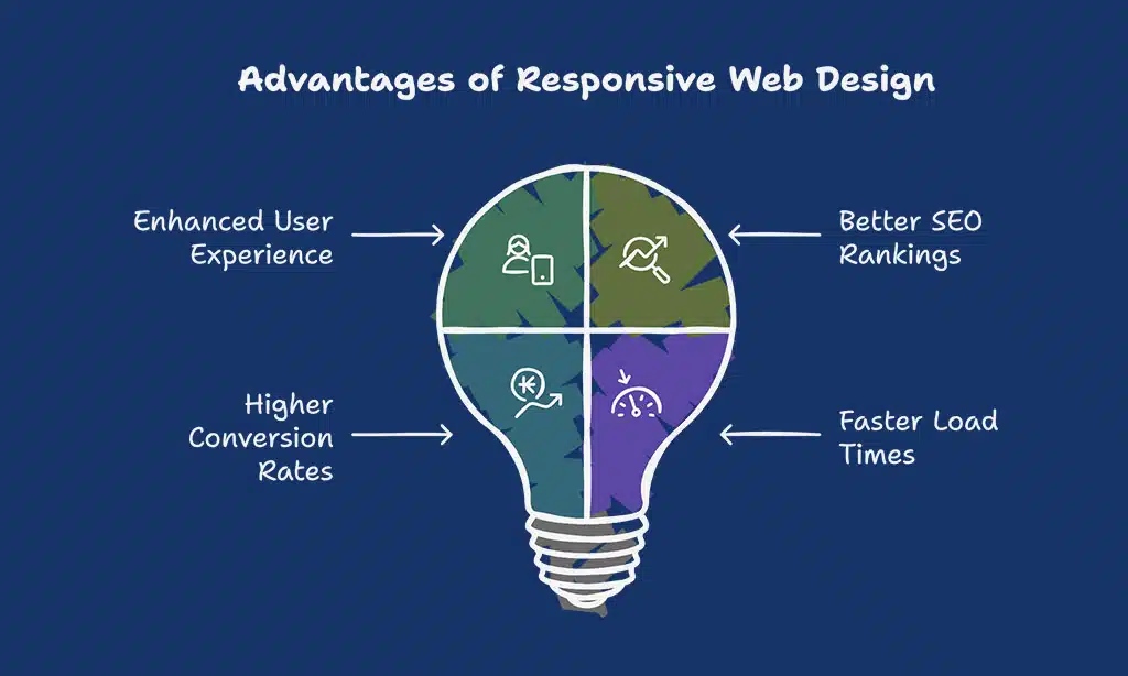
Benefits of Responsive Web Design
| Benefit | Why It Matters |
| Enhanced User Experience | A responsive design ensures visitors have a consistent browsing experience across devices. |
| Better SEO Rankings | Google prioritizes mobile-friendly websites, improving search visibility. |
| Higher Conversion Rates | When users can navigate a site easily on any device, they are more likely to take action. |
| Faster Load Times | Optimized images and responsive code enhance speed, reducing bounce rates. |
15 Best Responsive Web Design Examples
Let’s explore some of the most impressive 15 Best Responsive Web Design Examples that showcase outstanding adaptability and functionality across different devices.
1. Dropbox (Cloud Storage Service)
Dropbox is one of the pioneers of cloud storage services, offering users a seamless file-sharing and collaboration experience. Its responsive web design ensures that users can upload, edit, and manage files from any device without compromising usability or speed.
Key Responsive Features:
| Feature | Description |
| Minimalist Design | A clutter-free, easy-to-navigate layout with adaptive elements. |
| Scalable Images | High-quality images that resize appropriately on any screen. |
| Mobile-Friendly Navigation | A collapsible menu that enhances usability on smaller screens. |
Why It Stands Out: Dropbox’s design ensures a seamless experience whether accessed on a desktop, tablet, or mobile. The collapsible menu and touch-friendly buttons enhance usability. Its fast-loading interface ensures efficient document sharing even in areas with slow internet speeds.
2. Dribbble (Design Portfolio Platform)
Dribbble is a social networking platform for designers, showcasing the best creative works globally. Its responsive design allows artists to display their work without distortion or loss of quality across devices.
Key Responsive Features:
| Feature | Description |
| Flexible Grid Layout | Displays artwork optimally across all devices. |
| High-Quality Scalable Images | Prevents pixelation when viewed on high-resolution screens. |
| Simplified Navigation | Mobile-friendly scrolling and category filters. |
Why It Stands Out: Dribbble ensures designers’ portfolios remain visually appealing across all devices, making it one of the best examples of user-centric design. The layout automatically adjusts to emphasize images, ensuring a distraction-free experience.
3. GitHub (Software Development Platform)
GitHub is the world’s largest open-source software development platform. It caters to millions of developers, and its responsive web design ensures that its repository-based system is easy to use across multiple devices.
Key Responsive Features:
| Feature | Description |
| Scalable Typography | Ensures readability for developers viewing code on mobile. |
| Collapsible Navigation | Simplifies menu access on smaller screens. |
| Responsive Code Snippets | Ensures code formatting remains intact on any screen size. |
Why It Stands Out: GitHub’s adaptive interface ensures seamless usability for developers working across multiple devices. The collapsible menus improve navigation, making it easy to browse repositories and manage projects on the go.
4. Shopify (eCommerce Platform)
Shopify is a leading eCommerce platform that enables entrepreneurs to create online stores. With mobile commerce growing rapidly, Shopify’s responsive design ensures a smooth shopping experience on all devices.
Key Responsive Features:
| Feature | Description |
| Mobile-First Checkout | Ensures a frictionless buying experience. |
| Adaptive Product Grids | Optimizes product displays based on screen size. |
| Fast-Loading Media | Optimized images that reduce load times. |
Why It Stands Out: Shopify’s design ensures smooth navigation and high performance, making shopping on any device a hassle-free experience. A study by Google shows that 53% of mobile users abandon sites that take longer than 3 seconds to load, making Shopify’s speed optimization crucial.
5. Slack (Communication Platform)
Slack is a widely used team communication and collaboration platform. Its responsive design ensures a seamless user experience across desktops, tablets, and smartphones, helping teams stay connected anytime, anywhere.
Key Responsive Features:
| Feature | Description |
| Adaptive Interface | Ensures a fluid experience on all screen sizes. |
| Scalable Vector Graphics | Maintains clarity of icons and logos on high-res screens. |
| Touch-Friendly Elements | Enhances usability with easy navigation on mobile. |
Why It Stands Out: Slack’s intuitive layout adjusts dynamically to different devices, keeping its core functionality intact. Whether accessing channels, direct messages, or file sharing, the experience remains efficient and smooth across all screens.
6. Airbnb (Hospitality Service)
Airbnb is a globally recognized vacation rental platform. With a highly visual interface, its responsive design ensures users can seamlessly search for accommodations, browse listings, and make bookings from any device.
Key Responsive Features:
| Feature | Description |
| Flexible Image Scaling | Ensures listings appear crisp and clear. |
| Interactive Search Filters | Adapts to different screen sizes seamlessly. |
| Mobile-Optimized Booking | Streamlined reservation process for mobile users. |
Why It Stands Out: Airbnb’s responsive design enhances user engagement by providing a visually immersive experience with fast-loading images and interactive elements that adapt perfectly to different screen sizes.
7. Apple (Technology Company)

Apple’s website sets the standard for sleek and elegant responsive design, reflecting its brand’s premium appeal. The site maintains consistency across all devices, ensuring a top-tier user experience.
Key Responsive Features:
| Feature | Description |
| Retina-Ready Visuals | High-resolution images maintain quality. |
| Minimalist Navigation | Simple and user-friendly across all devices. |
| Fast-Loading Animations | Enhances interactivity without lag. |
Why It Stands Out: Apple’s website delivers a seamless, polished experience that aligns with its high-end brand identity. Navigation, imagery, and animations work flawlessly on all devices.
8. The Guardian (News Media)
The Guardian’s website is a prime example of responsive design in the digital publishing industry. It adapts well to different screen sizes, ensuring readers can easily consume content on any device.
Key Responsive Features:
| Feature | Description |
| Dynamic Grid System | Adjusts article layouts for readability. |
| Responsive Advertisements | Optimized to prevent intrusiveness. |
| Optimized Typography | Ensures legibility across different screens. |
Why It Stands Out: With a clutter-free design, The Guardian’s responsive layout prioritizes content consumption, making it easier for users to read news articles without distractions.
9. Amazon (eCommerce Giant)
Amazon is the largest eCommerce platform in the world. Its responsive design ensures an easy and efficient shopping experience across all devices, keeping customers engaged and driving sales.
Key Responsive Features:
| Feature | Description |
| Optimized Product Pages | Resizes layouts dynamically. |
| Fast Mobile Checkout | Simplifies purchasing on smartphones. |
| Search Adaptability | Enhances search functionality across devices. |
Why It Stands Out: Amazon’s responsive design plays a crucial role in increasing conversions by making it easy for users to browse, compare, and purchase products across various devices.
10. BBC News (Global News Portal)
BBC News is one of the world’s leading sources of global news. Its website is designed for accessibility, ensuring that breaking news is easily accessible on desktops, tablets, and smartphones.
Key Responsive Features:
| Feature | Description |
| Adaptive News Sections | Prioritizes headlines based on device size. |
| Optimized Media Content | Resizes images and videos for faster loading. |
| Readable Font Scaling | Ensures clear text for easy reading. |
Why It Stands Out: BBC News maintains an excellent user experience across all platforms, with a clean layout that enhances readability and accessibility on any device.
11. Microsoft (Tech Giant)
Microsoft’s website seamlessly adapts to different screen sizes, offering a sleek, modern user experience. Whether exploring Windows updates, purchasing Microsoft Office, or accessing cloud services, the design ensures clarity and ease of navigation.
Key Responsive Features:
| Feature | Description |
| Flexible Page Layouts | Adjusts content positioning dynamically. |
| Optimized Typography | Ensures easy readability across screen sizes. |
| Mobile-Friendly Navigation | Simple and efficient for touch interactions. |
Why It Stands Out: Microsoft’s responsive web design prioritizes user accessibility and fast load times, ensuring smooth navigation across its vast ecosystem of products and services.
12. Nike (Sportswear & eCommerce)
Nike’s responsive website offers an engaging, highly visual experience that emphasizes product details and brand storytelling, making shopping online seamless and enjoyable.
Key Responsive Features:
| Feature | Description |
| Dynamic Product Layouts | Adjust product grids based on device size. |
| Fast Mobile Checkout | Optimized for quick purchasing on mobile. |
| Interactive Content | Videos and animations adapt seamlessly. |
Why It Stands Out: Nike integrates high-quality media and interactive features without sacrificing performance, ensuring an excellent user experience across all devices.
13. TED (Educational Media)
TED’s website hosts thousands of thought-provoking talks, and its responsive design ensures users can explore ideas effortlessly from any device.
Key Responsive Features:
| Feature | Description |
| Adaptive Video Player | Scales perfectly for different screen sizes. |
| Minimalist UI | Focuses on content accessibility. |
| Mobile-First Navigation | Simplifies browsing TED Talks on small screens. |
Why It Stands Out: TED’s responsive approach prioritizes accessibility, making it easy to watch, read, and engage with content anywhere, anytime.
14. Starbucks (Food & Beverage)
Starbucks provides a smooth, mobile-friendly experience for customers looking to browse menus, locate stores, and order drinks online.
Key Responsive Features:
| Feature | Description |
| Location-Based Services | Enhances store locator functionality. |
| Mobile-Optimized Checkout | Makes ordering seamless and fast. |
| Engaging Visual Design | High-quality images that adjust responsively. |
Why It Stands Out: Starbucks’ site ensures users have an easy and visually appealing experience when exploring promotions, rewards, and ordering coffee.
15. Pinterest (Social Media & Discovery Platform)
Pinterest’s responsive design enhances content discovery, ensuring that users can save and explore ideas effortlessly across all devices.
Key Responsive Features:
| Feature | Description |
| Dynamic Grid System | Adjusts pin layouts based on screen size. |
| Touch-Friendly Navigation | Simplifies browsing experience on mobile. |
| Fast-Loading Media | Ensures smooth scrolling and interaction. |
Why It Stands Out: Pinterest’s responsive approach enhances usability, keeping users engaged with infinite scrolling and smart content organization.
How to Achieve Them
To create a responsive web design that rivals the best examples, consider the following best practices and essential strategies that contribute to seamless user experiences across devices.
By implementing these techniques, businesses can enhance engagement, improve site performance, and ensure a consistent user experience across all screen sizes and platforms:
- Adopt a Mobile-First Approach – Design for mobile screens first and then scale up for larger devices.
- Use Fluid Grid Layouts – Implement flexible grids that adjust proportionally to different screen sizes.
- Optimize Images and Media – Use responsive images and modern formats like WebP to ensure fast loading times.
- Implement CSS Media Queries – Customize styles based on different screen resolutions and device capabilities.
- Ensure Touch-Friendly Navigation – Buttons, menus, and interactive elements should be easy to use on touchscreens.
- Improve Page Speed – Utilize caching, content delivery networks (CDNs), and optimized scripts to enhance performance.
- Test Across Multiple Devices – Regularly check website responsiveness using tools like Google Mobile-Friendly Test and BrowserStack.
Takeaways
These 15 Best Responsive Web Design Examples showcase how adaptability enhances website performance across devices. Whether you’re an entrepreneur, developer, or designer, implementing responsive design best practices is crucial for user engagement, accessibility, and SEO rankings.
With mobile-first indexing now a dominant factor in search engine algorithms, ensuring a fast, intuitive, and visually appealing experience across all screen sizes is more important than ever.
By learning from these examples, businesses can create high-performing websites that not only look great but also drive higher conversions and customer satisfaction.
Investing in responsive web design is not just a trend but a necessity in the modern digital landscape. Which of these responsive websites impressed you the most? Share your thoughts in the comments!


