Anyone who has shipped an interface, sales deck, classroom slide set, and promo graphic for the same product knows the drift problem. Product uses a sober outline icon pack. Marketing pulls candy colored pictograms from somewhere else. Support screenshots still show an old internal build with different controls. After a quarter of this you are no longer looking at one product. You are looking at a collage.
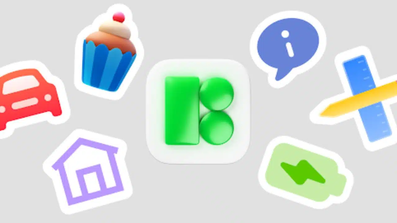
Icons8 is built to kill that drift. You get one source that covers interface UI, marketing collateral, pitch decks for investors, tutorial PDFs, onboarding flows, even classroom worksheets. The important part is not that there are thousands of icons. The important part is that they are internally consistent inside each visual style. Grid, stroke logic, corner language, metaphor. You can design a settings panel, a landing hero, and a training slide and they still feel like they came from the same team.
This is what most free packs cannot give you. Grabbing random SVGs from search might solve one slide tonight, but it quietly poisons the brand over time.
Style consistency without patchwork
Icons8 keeps full icon families in several visual styles that map to real platforms and tones. Fluent. iOS look. Material like simplicity. Crisp monochrome glyph. Loose hand drawn doodle. Shaded three dimensional badges for social graphics. You can swap style based on surface without losing meaning.
Example. Mobile app on iOS gets thin outline icons that match what users expect to see in a native tab bar. The admin dashboard on web gets a denser filled set with more visual weight so actions stand out at 20 to 24 pixels. The bell still means notifications. The gear still means settings. The trash can still means delete. No relearning.
Teachers do this in coursework too. Lesson slides use friendlier, rounder shapes so the vibe is approachable. Tests and worksheets switch to cleaner UI style icons that match software screenshots. The visual language shifts in tone but keeps the same metaphors, so students follow along instantly.
Production ready formats that respect real workflows
Every icon ships in SVG for interface work and PNG at common resolutions for decks, banners, and documents. Some assets are also available as PDF for print.
For designers and front end developers, clean SVG matters more than marketing language. Icons8 vectors are structured in a sane way. You are not opening a file full of 47 anonymous groups named Layer 1 and a transform matrix from hell. You can target sub paths in code, animate parts of the icon with CSS or motion libraries, recolor it with variables, or drop it directly into a React component without spending half an hour cleaning it.
Sizing discipline matters too. Icons8 drawings sit on consistent pixel grids. Stroke width is predictable. Corners do not mush at 1x, 2x, 3x. You do not get a situation where the search icon feels hairline thin next to the settings icon that looks bold and clumsy. That mismatch is one of the fastest ways to make an interface feel cheap.
For printed manuals, onboarding guides, and investor decks, PNG export saves time. You just choose the resolution and place it. No manual rasterizing. No blurry 24 pixel asset stretched to 300 dpi.
Picking tone for the job
Different work needs different voice. Icons8 accepts that instead of forcing one visual flavor on everybody.
Product interface. Product teams generally want neutral, geometric, low personality icons that stay legible at 16 to 24 pixels. The goal here is clarity and repeatability.
Marketing and paid social. Growth teams want icons with color, shading, or light three dimensional feel, because they need something that breaks a crowded feed. These icons are louder on purpose.
Education and onboarding. Trainers, teachers, and HR want icons that feel friendly, clear, and slightly softer. They are building safety briefings, compliance walkthroughs, process explainers, classroom slides. They want something that feels human, not clinical.
Icons8 covers all of these with full sets, which means you can keep tone consistent inside each lane without mixing four unrelated packs and praying the colors match.
Search that speaks like a person, not a taxonomy robot
A quiet killer feature is search. Most icon libraries choke the moment you stop using basic verbs. You type settings and you get a wrench, a cog, a dashboard, a satellite dish, and a mixer board. You then waste time guessing what the designer thought the word meant.
Icons8 search returns results that map to how people actually describe features. You can type VPN and you see a shield with a lock, a globe with a keyhole, and other secure connection metaphors that look familiar in modern security dashboards. You can type empty folder state and get folder icons with different badges so you can communicate empty, error, private, synced, shared, or archived without drawing anything custom.
That difference is billable time. It is the difference between shipping a review deck tonight or hand drawing custom badges at one in the morning because stock search failed you.
Fast brand alignment without hiring an icon designer
Founders always want icons that feel like the product, not default stock. Full custom icon design is expensive and slow. Most early teams never get real budget for that.
Icons8 gives you levers that get you close without opening Illustrator for hours.
Color control. You can recolor icons on download so they match your palette. Marketers and teachers use this constantly for pitch decks, ebooks, classroom PDFs, and landing pages that have to reflect brand color immediately.
Stroke weight control. Outline sets follow strict stroke logic. You can make sure the weight lines up with your current UI kit instead of fighting it.
Geometry consistency. Round icons are all round. Sharp icons are all sharp. Corners and radiuses agree with each other. You never get that embarrassing pairing of one pill shaped button icon next to a harsh rectangle with a totally different corner treatment. That detail sounds tiny, but investors and enterprise buyers absolutely notice visual sloppiness in decks and demos.
Result. You get about ninety percent of a branded icon language in under an hour, not three weeks.
Licensing clarity that keeps you out of trouble later
License terms decide whether an asset is safe to ship to production, pitch to a client, or publish in class material. Designers usually learn this the hard way the first time legal pings them.
Icons8 is very direct about what you can do under personal use, what counts as commercial use, when attribution is required, and what changes if you are on a paid plan. You know if a specific icon can safely live in your SaaS dashboard that pays the bills. You know if you are allowed to drop it into marketing creative. You know the wording you need if attribution is required for public distribution.
Teachers and HR teams care about that more than you think. If you distribute a safety training deck to the entire company or upload worksheets for students, you do not want a copyright email coming back next week.
The point is simple. You are not guessing.
Workflow integration for people who just need to ship
Icons8 is not only a web page where you right click save as for every single icon. It plugs into actual creative and product environments.
Design teams can pull assets straight into design tools without bothering the one senior designer on the team every six minutes. Developers can grab clean SVGs on their own instead of requesting exports.
Content managers and marketers can bulk pull twenty matching icons for a feature launch page. One set for hero bullets. One set for onboarding steps. One set for comparison tables. All visually coherent without quiet color correction work.
Teachers and corporate trainers treat the library like a visual language kit. Cybersecurity lesson for eleventh grade. Phishing awareness deck for new hires. Privacy compliance module for sales staff. Grab lock icons, shield icons, password icons, Wi Fi icons, alert triangles, laptops, phones. Drop them into Google Slides. Done. You can repeat that weekly without recycling the same stock clip art from 2004.
Platform specific assets and emoji that read as familiar right away
Some parts of the library are not generic pictograms at all. Icons8 also maintains platform flavored assets, including iOS style emoji. Product teams and marketing teams rely on this constantly for chat mockups, onboarding screens, reaction pickers, and investor decks where you need a message interface to read instantly as iPhone level familiar without lifting Apple proprietary graphics.
You can pull those expressions directly through resources like iphone emoji download. You get consistent faces, gestures, symbols, moods, all drawn in a way that looks native to Apple without actually using Apple emojis. That matters if you are showing messaging concepts in pitch material, or building walkthrough screens that rely on a reaction bubble to tell the story.
Icons8 also ships status and state icons that map to modern product language. Success, error, pending, draft, private, shared, offline, syncing. These sit everywhere in real apps. Dashboards. Empty states. Alerts. Onboarding checklists. Being able to pick a tone level is important. You may want strict monochrome for a finance tool. You may want rounded friendly badges for an education app. You may want illustrated states for a landing hero.
There is also thoughtful coverage around accessibility and inclusion. You get icons that reference mobility aids, assistive tech, hearing support, translation, and similar topics without falling into insulting or outdated metaphors. That helps marketing, HR, and teachers avoid the usual generic stock person with a halo of sparkles which communicates nothing.
Speed of iteration and testing
Early product work is about proving comprehension, not polishing pixels. You need to know if a first time user can find the action that matters in under five seconds. Icons are signal. You can swap a gear for a slider, a bell for a badge counter, an inbox for a tray. You can test which one people click without rewriting copy or moving layout.
Teams at seed and Series A do this constantly because they cannot afford long research cycles. Icons8 makes that practical because you can pull multiple metaphors for the same concept in the same style, fast.
Marketing does the same thing on landing pages. If conversion is weak, you switch the tiny visual next to the headline. You replace the abstract gradient blob with a clear upload or download metaphor. That test takes minutes when you already have a bank of consistent assets.
Teachers do it for attention control. A plain firewall diagram is dull. Drop in a lock, a server rack, an alert triangle, a world icon. Now students actually look at the slide.
Why not just grab a free pack from the internet
There are plenty of free icon packs on GitHub, Dribbble, Gumroad, or in design community posts. Some are beautiful. The issue is maintenance and depth.
Most personal or hobby sets cover maybe one hundred fifty to three hundred ideas. You get basic UI. You get a couple of marketing metaphors. That is it. The second you need GDPR, webhook, accessibility mode, retention curve, self hosted deployment, API key security, localized content flag, or locked private workspace, you hit a wall. You start drawing custom additions. The style drifts. Now you have a forked system that nobody else on the team can extend cleanly.
Icons8 keeps breadth and keeps it fresh. New product language keeps showing up in onboarding flows and compliance docs. The library reflects that. Your set does not age out in a year. You are not forced to duct tape new shapes into the system and hope nobody zooms in.
For startups that plan to pivot three times before finding product market fit, that kind of stability is not luxury. It is survival.
Who benefits and how
Designers get predictable geometry, clean vectors, and full semantic coverage so they can spend time on interaction and motion instead of redrawing another bell icon for the notification badge.
Developers get SVGs that behave. Consistent grid. Logical grouping. No mystery transforms. They can ship icons directly inside components without waiting for a Figma export.
Design students get material that looks professional and is safe to show in portfolios and assignments. No stolen assets from random apps. No illegal screenshots.
Marketers and content managers get instant art for feature callouts, onboarding steps, pricing comparison tables, app store screenshots, onboarding PDFs, customer education landing pages. They can assemble a full launch kit in one sitting instead of begging design for five tiny metaphors.
Founders and early teams get polish that reads as intentional in investor decks and demo builds. That matters because detail signals competence. Investors absolutely judge this.
Teachers and trainers get a reusable visual language for lessons, onboarding, security awareness, compliance, and safety. Week after week. Class after class. They know what they are allowed to distribute.
Icons8 in practice acts like infrastructure. You plug it in and suddenly a very small team can present like a much larger team without pausing real work to redraw the same padlock icon for the fifteenth time.