

In today’s digital world, having a website isn’t enough—your site needs to be visually appealing, intuitive, and engaging. Users form an opinion about a website within milliseconds, and a poorly designed interface can drive them away instantly.
This is where understanding the Best UI Design Principles for an Engaging Website becomes crucial. A well-crafted UI enhances user experience, increases engagement, and drives conversions.
This comprehensive guide explores the 10 Best UI Design Principles for an Engaging Website, helping you optimize your site for usability, aesthetics, and performance.
Whether you’re a web designer, developer, or business owner, mastering these principles will set you apart in the competitive digital landscape.
1. Clarity and Simplicity in Design
A cluttered website confuses visitors and increases bounce rates. A clean, simple UI ensures that users can navigate effortlessly and find what they need without frustration. Simplicity doesn’t mean boring; it means designing a site that highlights essential information without unnecessary distractions.
By eliminating visual noise, users can focus on key content, leading to improved engagement and a better overall experience.
A well-designed, simple UI enhances usability and accessibility, ensuring that users of all skill levels can interact seamlessly with the site. Minimalist design also speeds up page loading times, which contributes to better performance and search engine rankings.
Additionally, simple designs are more adaptable across different devices, ensuring a consistent experience regardless of screen size.
Key Elements of Simple UI
- Minimalist Layout – Avoid unnecessary elements that don’t serve a purpose, keeping the interface clean and distraction-free.
- Readable Typography – Choose fonts that are easy to read on all devices, prioritizing legibility and user comfort.
- Consistent Color Scheme – Limit your palette to two or three primary colors to maintain visual harmony and brand identity.
- Straightforward Navigation – Use a clear and intuitive menu structure to help users find content easily.
- Whitespace Utilization – Proper spacing between elements improves readability and enhances the overall aesthetic.
- Clear Call-to-Actions (CTAs) – Ensure buttons and links stand out, making it easy for users to take the desired actions.
Benefits of Simple UI Design
| Feature | Benefit |
| Clean Layout | Reduces distractions and enhances focus |
| Readable Fonts | Improves accessibility and user experience |
| Consistent Colors | Strengthens brand identity and recognition |
| Simple Navigation | Guides users effortlessly through the site |
| Faster Load Times | Improves performance and search rankings |
| Improved Usability | Enhances interaction for all users, including those with disabilities |
2. Consistency in UI Elements
Consistency ensures a seamless user experience, making the interface predictable and easy to use. A well-structured, visually cohesive design creates familiarity, helping users interact effortlessly with the website.
When UI elements maintain a consistent look and function, users feel more comfortable navigating the interface, reducing confusion and cognitive load. Additionally, brand identity is strengthened when colors, typography, and interactions are unified across the platform.
Best Practices for Maintaining Consistency
- Color and Typography – Use the same fonts and colors throughout the site to create visual harmony and strengthen branding.
- Button Styles and Interactions – Ensure uniformity in button designs, hover effects, and clickable elements to provide a predictable user experience.
- Layout Structure – Stick to a predefined grid for alignment and spacing, ensuring that elements are positioned consistently across different pages.
- Repetitive Elements – Maintain uniformity in forms, navigation menus, CTA placements, and iconography to reinforce usability and recognition.
- Component Libraries and Design Systems – Utilize a design system such as Google’s Material Design or Apple’s Human Interface Guidelines to standardize UI components.
- Consistent Feedback Mechanisms – Ensure uniform response to user actions (e.g., error messages, success notifications) to maintain clarity and usability.
Areas to Maintain UI Consistency
| Aspect | Best Practice |
| Typography | Use predefined font styles for headers, body text, and links |
| Colors | Maintain a consistent color scheme across all pages |
| Buttons | Keep button shapes, sizes, and hover effects uniform |
| Layout | Follow a structured grid system to maintain alignment |
| Icons | Use a cohesive icon set for intuitive interaction |
| Feedback | Provide standardized error messages and notifications |
3. Mobile-Friendly and Responsive Design
With mobile users surpassing desktop users, Google prioritizes mobile-friendly sites in search rankings. A website that is not optimized for mobile users risks losing a large portion of traffic and engagement. Mobile-first indexing means Google predominantly uses the mobile version of a site for indexing and ranking, making it essential for businesses to prioritize mobile responsiveness.
Steps to Achieve a Mobile-Friendly UI
- Use a Responsive Grid – Ensure your design adjusts to different screen sizes, maintaining consistency and usability.
- Touch-Friendly Elements – Make buttons large enough for easy tapping and ensure sufficient spacing between clickable elements to prevent accidental clicks.
- Optimize Images – Reduce file sizes for faster loading, use modern formats like WebP, and implement responsive images to adapt to different screen resolutions.
- Adaptive Navigation – Implement a mobile-friendly navigation structure with collapsible menus, sticky headers, and easily accessible CTAs.
- Fast Page Load Speed – Minimize HTTP requests, enable caching, and use accelerated mobile pages (AMP) to enhance performance.
- Test Across Devices – Regularly test the website on multiple devices and screen sizes to identify and resolve usability issues.
Key Mobile-Friendly Design Elements
| Feature | Importance |
| Responsive Layout | Ensures usability on all devices and screen orientations |
| Large Buttons | Enhances touch accessibility and prevents accidental taps |
| Compressed Images | Speeds up load times and improves performance |
| Adaptive Menus | Improves navigation on smaller screens for better usability |
| Fast Load Speed |
4. Fast Loading Speed and Performance Optimization
Website speed plays a critical role in user engagement, search engine rankings, and overall user satisfaction. A slow-loading site leads to increased bounce rates, causing users to abandon the site before interacting with its content. In contrast, a fast and well-optimized site enhances the overall user experience, ensuring visitors stay longer and interact more effectively.
- Reduces Bounce Rates – Slow sites frustrate users, causing them to leave before the page loads completely.
- Boosts SEO Rankings – Google considers page speed as a ranking factor, making fast-loading sites more likely to appear higher in search results.
- Enhances User Experience – Faster load times keep visitors engaged, improving retention rates and increasing conversions.
- Supports Mobile Usability – With mobile-first indexing, optimizing speed ensures smooth browsing experiences on all devices.
- Increases Conversion Rates – A one-second delay in page load time can lead to a significant drop in sales and engagement.
Strategies to Optimize UI for Performance
To ensure fast performance, websites should be optimized using various techniques that reduce loading times and improve efficiency.
- Compress images and enable lazy loading – Reduce file sizes without sacrificing quality, ensuring faster rendering times.
- Minimize HTTP requests and leverage browser caching – Store frequently accessed data locally to prevent repeated downloads.
- Use Content Delivery Networks (CDNs) for faster content distribution – Distribute resources across multiple locations to minimize latency.
- Optimize JavaScript and CSS files to reduce loading time – Minify and combine scripts to decrease file size and improve execution speed.
- Enable Gzip Compression – Compress server responses to reduce file transfer times.
- Eliminate Render-Blocking Resources – Load critical content first and defer unnecessary scripts to improve perceived performance.
Common Performance Optimization Techniques
| Technique | Benefit |
| Image Compression | Reduces file size and improves page speed |
| Lazy Loading | Loads content as users scroll, saving bandwidth |
| Browser Caching | Stores frequently accessed files for quick retrieval |
| CDN Usage | Speeds up content delivery globally |
| Minified Code | Reduces script execution time |
| Gzip Compression | Reduces file transfer size, enhancing speed |
| Async Loading | Prevents delays by loading scripts in the background |
An intuitive navigation system allows users to find information quickly, enhancing usability. Effective navigation design is essential for guiding users effortlessly through a website and reducing frustration.
A well-structured navigation system improves the user experience, decreases bounce rates, and increases conversion rates by ensuring that visitors can find what they need without unnecessary clicks or confusion.
Poor navigation leads to user frustration and site abandonment. When designing navigation, it is essential to consider elements such as user expectations, logical structure, and clear labeling. Navigation should be optimized for both desktop and mobile users to accommodate different browsing habits.
- Implement clear menu structures – Organize content into logical categories, keeping menus simple and intuitive.
- Use breadcrumb navigation – Help users track their location on the site and navigate back to previous pages effortlessly.
- Incorporate search functionality – Provide a search bar with predictive suggestions to enable users to find content quickly.
- Ensure consistent placement of navigation bars – Position navigation menus consistently across all pages to build familiarity.
- Optimize for mobile usability – Use collapsible menus, sticky headers, and touch-friendly elements to enhance the mobile experience.
- Highlight active and visited links – Visually indicate which section a user is currently viewing to improve orientation.
- Limit the number of menu items – Avoid overwhelming users by restricting main menu options to a manageable number, typically between five to seven items.
- Provide clear call-to-action buttons – Guide users toward desired actions, such as signing up, purchasing, or learning more about a service.
6. Visual Hierarchy and Content Prioritization
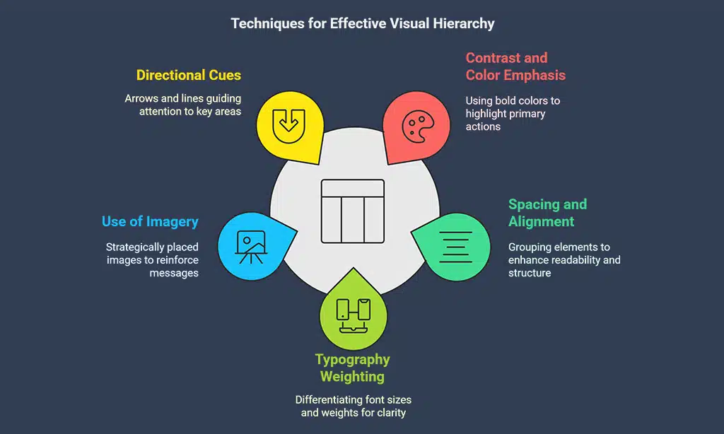
A well-structured visual hierarchy directs users’ attention to key elements, improving engagement. It ensures that users focus on what matters most and navigate effortlessly. By strategically organizing content, designers can guide users through a seamless journey, reducing cognitive load and enhancing overall usability.
Techniques to Establish Hierarchy
- Contrast and Color Emphasis – Highlight primary actions using bold colors, while keeping secondary elements in muted tones to create a clear focal point.
- Spacing and Alignment – Group related elements together to establish relationships and enhance readability. Proper spacing makes the interface feel more structured and less cluttered.
- Typography Weighting – Utilize different font sizes and weights to establish a visual reading order, making it easier for users to scan content and grasp essential information quickly.
- Use of Imagery – Place high-quality images strategically to reinforce key messages and direct attention toward important sections. Images should complement the text and not overshadow vital information.
- Directional Cues – Use arrows, lines, or gaze direction in images to subtly guide users toward important elements such as calls to action.
- Size and Proximity – Larger elements naturally attract more attention, while closely placed items are perceived as related, enhancing user comprehension and intuitive navigation.
7. Effective Use of White Space
White space, or negative space, plays a crucial role in web design by improving content readability, enhancing user focus, and creating a visually pleasing layout. Properly utilized white space helps prevent clutter, making it easier for users to navigate and absorb information effortlessly. It also improves overall accessibility and usability, ensuring a seamless experience across devices.
Best Practices for White Space
- Maintain proper spacing between elements – Ensures clarity and avoids overcrowding.
- Use padding and margins strategically – Helps define content sections and create a structured layout.
- Balance text with images and multimedia – Ensures that visuals and text complement each other without overwhelming the user.
- Create breathing room around interactive elements – Makes buttons and links easier to use and enhances usability.
- Leverage white space to establish visual hierarchy – Guides users’ attention to key information and actions.
8. Accessibility and Inclusive Design
Designing for accessibility ensures inclusivity for all users, including those with disabilities. A well-designed, accessible UI allows everyone, regardless of physical or cognitive limitations, to navigate and interact with digital platforms effortlessly. Implementing accessibility best practices not only improves user experience but also ensures compliance with legal standards such as the Web Content Accessibility Guidelines (WCAG).
Key Accessibility Features
- Screen Reader Compatibility – Ensures visually impaired users can access content through assistive technology.
- Keyboard-Friendly Navigation – Allows users to navigate the site without a mouse, essential for individuals with motor disabilities.
- High-Contrast Text for Readability – Improves text visibility for users with visual impairments or color blindness.
- Alternative Text for Images – Provides text descriptions for images, aiding visually impaired users in understanding content.
- Captioning and Transcripts for Multimedia – Enables deaf or hard-of-hearing users to access audio and video content effectively.
9. Interactive and Engaging Elements
Adding interactive elements keeps users engaged and encourages longer site visits. A dynamic and engaging UI improves user retention, reduces bounce rates, and creates an immersive experience that makes users want to return. Well-designed interactive elements also help convey information in a visually appealing way, improving comprehension and usability.
Examples of Interactive UI Features
- Microinteractions – Small animations triggered by user actions (e.g., hover effects, button presses) that provide instant feedback and enhance engagement.
- Animated Transitions and Feedback Elements – Smooth page transitions, loading animations, and real-time validation feedback make interactions feel seamless and enjoyable.
- Gamification Techniques – Reward systems, progress bars, and interactive quizzes encourage users to participate more actively.
- Drag-and-Drop Features – Enhances user control and interaction, improving usability in applications like task managers and e-commerce filters.
- Interactive Infographics and Charts – Allows users to explore data in an engaging and informative way, improving content absorption.
10. Continuous Improvement and User Feedback
Collecting user feedback helps refine UI design, improve user satisfaction, and identify areas that need improvement. It allows designers and developers to understand how users interact with the interface and make data-driven decisions to enhance usability. Regular feedback collection ensures that UI updates align with user expectations and trends, leading to a more engaging and effective website.
Methods for Collecting Feedback
- Surveys and Polls – Use direct user feedback to gain insights into preferences and pain points.
- Heatmaps and Session Recordings – Analyze user behavior to identify patterns and areas of confusion.
- A/B Testing Different UI Elements – Compare variations to determine which design choices optimize engagement.
- User Testing Sessions – Conduct in-depth usability tests with real users for practical insights.
- Feedback Forms and Chatbots – Implement live chat or structured forms to gather user opinions in real time.
Takeaways
By implementing these Best UI Design Principles for an Engaging Website, you can create a high-performing, user-friendly, and visually appealing website that retains visitors and boosts conversions.
Stay updated with design trends and continuously improve your UI for long-term success.


