Have you ever opened a website on your phone only to struggle with tiny text, broken layouts, or endless zooming? It’s frustrating when a page doesn’t adjust properly to your screen, making simple browsing feel difficult.
This is a common issue as most users now access the web through mobile devices. Whether it’s reading news, shopping online, or exploring services, a poorly optimized site quickly drives visitors away.
Responsive Web Design solves this problem by ensuring websites automatically adapt to any screen size. It creates layouts that stay clean, readable, and user-friendly across smartphones, tablets, and desktops.
Using techniques like flexible grids, media queries, breakpoints, and fluid images, responsive design delivers a smooth and consistent experience on all devices. It also supports mobile-first development and improves SEO performance.
This guide covers everything from core principles to practical best practices, helping build websites that look great and work perfectly everywhere.
What is Responsive Web Design?
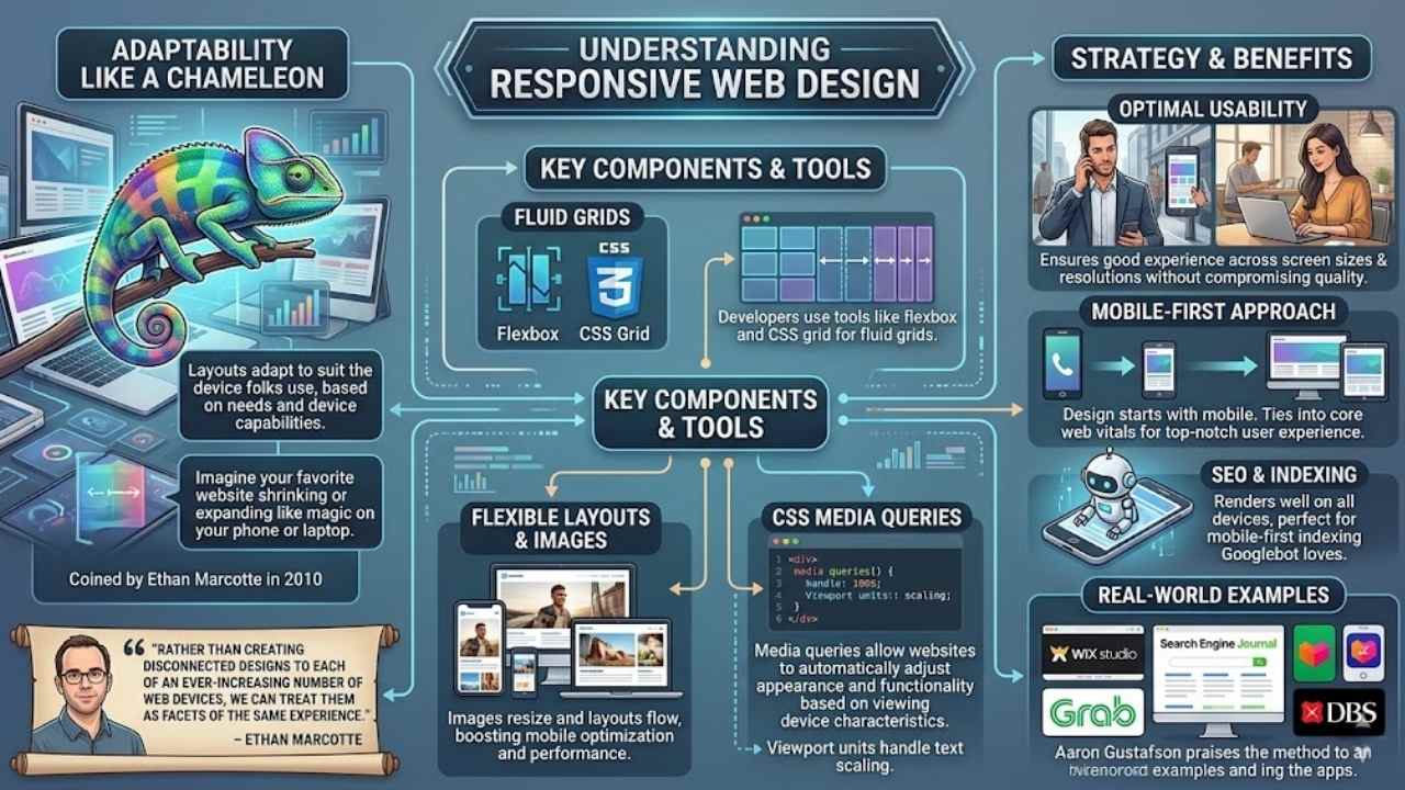
Responsive web design acts like a chameleon, adapting a site’s layout to suit the device folks use, based on their needs and device capabilities. Folks, imagine your favorite website shrinking or expanding like magic on your phone or laptop; that’s the core principle at work, with flexible layouts, fluid images, and CSS media queries leading the charge.
Ethan Marcotte coined this approach back in 2010, and it encompasses techniques in both CSS and HTML to make websites usable across a variety of screen sizes. This strategy ensures good usability across different devices and screen resolutions without compromising user experience, much like a well-fitted suit that adjusts to any occasion.
Developers build websites from scratch that render web pages effectively on various screen sizes, using tools like flexbox and CSS grid for those fluid grids. Media queries allow websites to automatically adjust their appearance and functionality based on the characteristics of the viewing device, keeping things smooth, you know? Responsive web design refers to designing websites to adapt to a user’s device while maintaining optimal usability and appearance, and it enables the building of sites that make dynamic changes based on the viewing platform.
Flexible layouts and fluid images stand as essential components that allow websites to adapt seamlessly to different devices and screen dimensions, boosting mobile optimization and performance.
It serves as a web design approach intended to make web pages render well on all screen sizes and resolutions, perfect for that mobile-first indexing Googlebot loves.
Rather than creating disconnected designs to each of an ever-increasing number of web devices, we can treat them as facets of the same experience. – Ethan Marcotte
Imagine you’re browsing on a tiny screen during your commute, and the site flows just right, thanks to those CSS properties handling responsive images and font sizes. This method shines in web development, promoting a mobile-first approach over adaptive design, and it ties into core web vitals for top-notch user experience.
Sites like those from Wix Studio or Search Engine Journal show how fluid grids and mobile-friendly design keep things engaging, no matter if you’re on Grab, Lazada, or DBS apps. Aaron Gustafson praises it too, noting how it handles mobile web design with ease, using viewport units for text that scales perfectly.
Key Components of Responsive Web Design
You know, building a site that adapts to phones, tablets, and desktops feels like magic, but it boils down to smart tools in CSS and HTML. Picture your layout stretching like rubber, with images that shrink or grow on the fly, all thanks to clever code tricks that keep everything sharp.
Fluid Grids
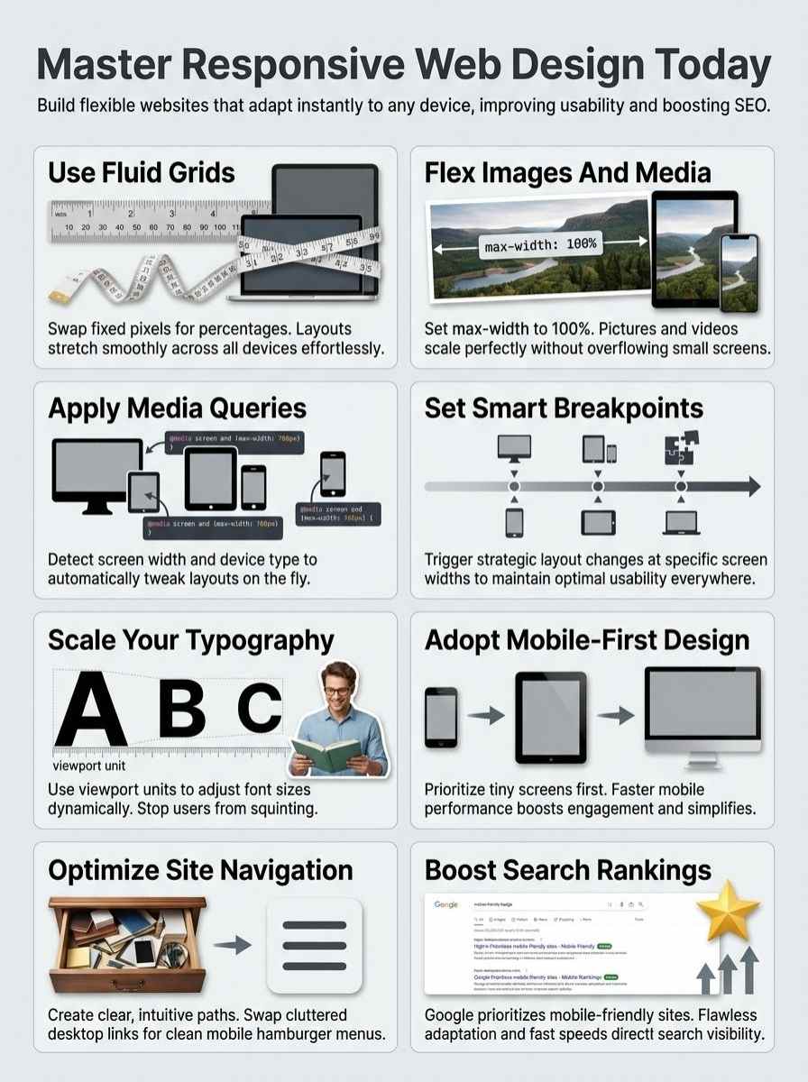
Fluid grids form the backbone of responsive web design. They let layouts stretch or shrink based on screen size. Think of them as rubber bands that flex with ease. Developers use CSS to build these grids.
This approach swaps fixed pixels for percentages. Sites adapt smoothly to phones, tablets, and desktops. Flexible layouts, a key part of this, pair well with fluid images and media queries.
They keep everything in place, no matter the device.
Picture your site as a chameleon, changing colors to match its surroundings. Fluid grids make that happen by handling different screen dimensions. They support responsive typography, so text scales without breaking the flow.
Plus, they aid performance optimization by loading content faster on mobiles. Essential components like these ensure seamless adaptation. Coders set them up in HTML and CSS for best results.
Your pages stay usable and sharp across all gadgets.
Flexible Images and Media
Images and videos need to flex on different screens. You know how a rubber band stretches without breaking? That’s like flexible images in responsive design. They scale up or down based on the device.
Core principles use fluid images to keep sites looking sharp. Set the max-width to 100% in CSS, and pictures adjust automatically. This stops overflow on small phones. Flexible media includes videos too; embed them with aspect ratios that adapt.
Developers love this trick because it boosts usability across gadgets. Imagine loading a site on your tablet, and the photo fits just right, no zooming needed.
Flexible layouts and fluid images are essential components that allow websites to adapt seamlessly to different devices and screen dimensions.
Media queries team up with these elements for magic. Code in HTML and CSS makes sure videos don’t distort. Users get a smooth experience, whether on a laptop or smartwatch. Think of it as dressing your content for any party, big or small.
Opt for SVG files for logos; they scale without losing quality. This approach saves bandwidth and keeps load times quick. Readers, try resizing your browser window to see it in action.
Media Queries
Media queries act as smart switches in CSS. They detect traits like screen width or device type. Sites then tweak layouts on the fly. Picture your page reshaping itself for a phone’s portrait mode, no sweat.
Developers apply these in code to swap styles based on needs. Flexible grids pair well here, boosting that seamless shift across gadgets.
Facts show media queries let websites auto-adjust appearance and function for any viewing setup. You spot this in action on tablets or laptops, where content flows without a hitch.
Add in fluid images, and the magic really shines. Readers, imagine coding that adapts like a chameleon to user habits. It keeps experiences top-notch, no matter the screen.
Breakpoints
Breakpoints serve as key points in responsive web design. Designers set them to trigger layout changes based on screen size. You use them with media queries in CSS to adjust styles.
For instance, a breakpoint at 600 pixels might stack columns for phones. This approach keeps sites usable on all devices. Flexible layouts pair well with breakpoints for seamless shifts.
Think of breakpoints as signposts on a road trip. They guide how content flows across screens. Set one at 1024 pixels, and navigation menus expand for desktops. Media queries detect device traits and apply rules right there.
Sites adapt without losing appeal. Readers, you gain better experiences on tablets or laptops this way.
Responsive Typography
Ever stared at a website on your phone, only to squint at tiny text that refuses to scale up? Responsive typography fixes that mess by making fonts adapt smoothly across screens, using tools like CSS viewport width units to keep words readable without zooming in like a detective on a case.
Importance of Scalable Fonts
Scalable fonts keep text clear on any screen size. Imagine squinting at tiny letters on your phone, that’s no fun. These fonts adjust with the device’s display, boosting readability.
Responsive web design relies on this to maintain optimal usability. Flexible layouts pair well with them, letting text flow smoothly across phones, tablets, and desktops. Developers use viewport units like vw to make sizes relative to the screen.
This approach avoids cramped or oversized words, making sites inviting for everyone.
Picture a website where fonts shrink perfectly on small gadgets but expand on big monitors. Such magic comes from media queries in CSS, which detect device traits and tweak styles.
Folks love browsing without zooming in frustration. Scalable fonts enhance user experience, tying into the core of responsive strategies. They support fluid images too, creating a cohesive look.
Try it out, and you’ll see how text adapts like a chameleon to different environments.
Using Viewport Units for Text
Viewport units let you size text based on the screen’s dimensions. They keep fonts flexible and readable across devices.
- Viewport units, like vw for viewport width, tie text size directly to the browser window, so your fonts adapt smoothly as users resize or switch devices, much like a rubber band stretching to fit.
- You apply these units in CSS to make text scalable, ensuring good usability across different devices and screen resolutions without compromising user experience, because responsive web design is a web design approach intended to make web pages render well on all screen sizes and resolutions.
- Think of vh for viewport height as your secret weapon; it scales fonts relative to the screen’s height, helping build websites from scratch that can render web pages on various screen sizes effectively, just like pouring water into different shaped glasses without spilling.
- Vmin picks the smaller dimension between width and height for sizing text, which supports the core principle behind responsive web design involving flexible layouts and fluid images, adapting a site’s layout to suit the device being used based on users’ needs and device capabilities.
- Go with vmax for the larger dimension if you want bolder scaling; this unit enhances responsive typography by making dynamic changes to the look of a website based on the viewing platform, kinda like a chameleon changing colors to blend in.
- Developers love these units because they work hand-in-hand with media queries, allowing websites to automatically adjust their appearance and functionality based on the characteristics of the viewing device, as responsive design encompasses techniques touching on both CSS and HTML to make websites usable across a variety of screen sizes.
- Imagine you set a headline to 5vw, and it grows on big screens but shrinks on phones, embodying how responsive web design refers to designing websites to adapt to a user’s device while maintaining optimal usability and appearance.
- These tools beat fixed pixels every time for text, since flexible layouts and fluid images are essential components that allow websites to adapt seamlessly to different devices and screen dimensions, turning a stiff page into a flowing conversation with your audience.
- Start small with something like font-size: 4vh for body text; it creates that magic where responsive web design enables the building of websites from scratch that can render web pages on various screen sizes effectively, avoiding the headache of tiny unreadable letters on mobiles.
- Mix in vmin for safety on rotated devices; this keeps everything crisp, reinforcing that responsive web design is a design strategy that adapts a site’s layout to suit the device being used based on users’ needs and device capabilities, like a thoughtful host adjusting seats for every guest.
- Test your viewport unit choices in real browsers, because responsive web design is a web development strategy that makes dynamic changes to the look of a website based on the viewing platform, ensuring your text doesn’t play hide-and-seek on different screens.
Proper Line Length and Spacing
You know how reading a wall of text feels like slogging through mud? Keep lines between 50 and 75 characters, folks, to make your words dance on any screen. This sweet spot stops eyes from jumping ship, you see, and boosts that comfy read on phones or desktops.
Pair it with generous spacing, say 1.5 times the font size for lines, and bam, your content flows like a gentle stream. Imagine squinting at crammed words on your tablet; nobody wants that headache.
Flexible grids help here, adapting those layouts so text breathes easy across devices.
Scalable fonts play sidekick to this setup, letting text resize without turning into a jumbled mess. Think of it as giving your paragraphs room to stretch, like yoga for letters. Media queries jump in, tweaking spacing based on screen width, so everything looks sharp.
Users tap through without frustration, right? Toss in some humor: ever read a line so long it felt like running a marathon? Shorten it up, add that breathing room, and watch engagement soar.
Mobile-First vs Responsive Design
You start with small screens in mobile-first design, then build up for bigger ones, like growing a tree from a seed. Responsive design adapts any layout to fit devices, but mobile-first saves time and boosts speed on phones, so why not give it a try?
Differences Between Mobile-First and Responsive Design
Responsive web design adapts sites to various devices, but folks often mix it up with mobile-first approaches.
| Aspect | Mobile-First Design | Responsive Design |
|---|---|---|
| Core Focus | Designers start with small screens like phones, then add features for bigger ones. This builds from the ground up, like stacking blocks from tiny to tall. | Developers make sites adjust to any screen size right away. Responsive web design is a strategy that adapts a site’s layout to suit the device being used based on users’ needs and device capabilities. |
| Key Techniques | They prioritize core content for mobiles first, using tools like media queries later to enhance for desktops. Imagine packing a suitcase with essentials before extras. | Teams use fluid grids, flexible images and media, media queries, and breakpoints from the start. Responsive design encompasses techniques touching on both CSS and HTML to make websites usable across a variety of screen sizes. |
| Adaptation Style | This method scales up, adding complexity as screens grow. It’s like growing a seedling into a tree, step by step. | The approach handles all sizes at once, with dynamic changes. Responsive web design refers to designing websites to adapt to a user’s device while maintaining optimal usability and appearance. |
| Principle Behind It | Creators focus on minimal viable features for small devices, then expand. A friend once said, “Start small, dream big,” and that’s the vibe here. | Flexible layouts and fluid images form the heart. The core principle behind responsive web design involves the use of flexible layouts, fluid images, and media queries. |
| Device Handling | Phones get the spotlight first, ensuring basics work well before tweaks for tablets or computers. | Media queries let sites adjust based on device traits. Media queries allow websites to automatically adjust their appearance and functionality based on the characteristics of the viewing device. |
| Usability Goal | Aims to keep things simple on mobiles, avoiding overload as you go bigger. | Ensures smooth rendering on all resolutions. Responsive web design is a web design approach intended to make web pages render well on all screen sizes and resolutions. |
| Experience Outcome | Users on small screens feel prioritized, like getting the best seat at a show. | Maintains quality across devices without cuts. Responsive web design ensures good usability across different devices and screen resolutions without compromising user experience. |
| Development Strategy | Builds progressively, starting lean and adding layers. | Makes instant shifts based on platforms. Responsive web design is a web development strategy that makes dynamic changes to the look of a website based on the viewing platform. |
| Building Process | Teams craft from scratch with mobiles in mind, scaling outward. Think of it as baking a cake layer by layer. | Enables sites that fit various screens effectively. Responsive web design enables the building of websites from scratch that can render web pages on various screen sizes effectively. |
| Essential Elements | Relies on prioritizing content for small viewports, using CSS for growth. | Includes flexible setups that adapt seamlessly. Flexible layouts and fluid images are essential components that allow websites to adapt seamlessly to different devices and screen dimensions. |
Benefits of a Mobile-First Approach
Mobile-first design starts with the smallest screens and builds up from there. It pairs well with responsive web design to create sites that adapt smoothly.
- You get faster load times on mobile devices, since you focus on core content first, avoiding heavy elements that bog down small screens. Think of it like packing a suitcase for a trip, you put in essentials before extras, making everything lighter and quicker to access. This approach uses flexible layouts and fluid images, key parts of responsive web design, to ensure good usability across different devices without compromising user experience.
- Search engines love it, boosting your site’s visibility because mobile performance matters a lot these days. Imagine your website as a friendly neighbor who always answers the door promptly, no matter the time; that reliability draws more visitors. By building from scratch with media queries, you make dynamic changes based on the viewing platform, enhancing SEO through better adaptability to various screen sizes and resolutions.
- Development becomes simpler and more efficient, as you add features progressively for larger screens. It’s like starting a puzzle with the edges, then filling in the middle; everything fits better. Responsive web design’s core principles, including fluid grids and flexible images, shine here, allowing seamless adaptation to device capabilities and user needs.
- Users on phones get a top-notch experience right away, which keeps them engaged longer. Picture a chat with a pal who gets straight to the point, no rambling; you stick around for more. This strategy employs media queries to adjust appearance and functionality automatically, maintaining optimal usability on all screen sizes.
- It saves money in the long run, by reducing the need for separate mobile sites. Consider it a smart investment, like buying versatile clothes that work for any occasion instead of a whole new wardrobe. Drawing from responsive techniques in CSS and HTML, you create sites that render well across resolutions, cutting costs while improving total performance.
- Accessibility improves for everyone, especially those with varying device types. It’s akin to hosting a party where every guest feels welcome, no one left out. The design adapts to users’ needs and device capabilities, using breakpoints and scalable fonts to ensure proper line length and spacing on every platform.
Best Practices for Responsive Web Design
You know that feeling when a site loads perfectly on your phone, but flops on a desktop? Stick to tips like using CSS for smooth content flow, squeezing images with tools like TinyPNG for quick loads, setting up burger menus for easy clicks, and firing up Chrome DevTools to check every gadget.
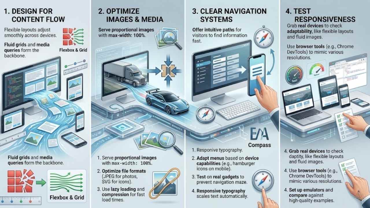
Design for Content Flow, Not Fixed Layouts
Focus on how your content moves, like water in a stream, adjusting to the path ahead. Responsive web design thrives on flexible layouts that let elements shift smoothly across devices.
Think of it as building a house with walls that bend, not break, under pressure. Fluid grids form the backbone here, allowing columns to resize based on screen width. Developers use CSS to create these grids, ensuring the site adapts without losing its core structure.
Media queries step in to detect device traits, like resolution or orientation, and apply styles that fit just right. This approach keeps users engaged, no matter if they’re on a phone or a desktop.
Imagine scrolling through a site that feels natural, almost like chatting with a friend who gets your vibe.
Shift your mindset from rigid boxes to a flowing river of information. Flexible images scale up or down, preventing awkward crops or stretches on varying screens. HTML tags help embed these images, making them responsive by default.
Breakpoints define where the layout changes, say at 768 pixels for tablets, to maintain usability. Users appreciate this empathy in design, as it mirrors real-life adaptability, like adjusting your story to fit the listener.
Core principles guide you: use viewport units to keep text readable, and test on real devices for that seamless feel. Such strategies build sites that render well on all screen sizes, boosting satisfaction without extra hassle.
Optimize Images and Media for Different Resolutions
Images play a big role in responsive web design, and you need to handle them right for smooth user experiences across devices. Flexible images and media, as core principles, let websites adapt seamlessly to various screen sizes and resolutions without losing quality.
- Use fluid images that scale with the layout; this means setting max-width to 100% in CSS so pictures resize automatically on smaller screens, keeping everything proportional like a rubber band stretching to fit.
- Apply media queries to swap out high-res images for lighter versions on mobile devices; for example, serve a smaller file to phones to speed up load times, because nobody likes waiting forever for a page to appear.
- Optimize file formats, pick JPEG for photos and SVG for icons since they stay sharp at any size; this ties into responsive design’s goal of maintaining optimal usability across different resolutions.
- Compress images without sacrificing clarity, tools like TinyPNG help shrink file sizes; imagine your site as a sleek sports car, not a clunky truck bogged down by heavy loads.
- Implement lazy loading so media only loads when needed; in HTML, add the loading=”lazy” attribute, which saves bandwidth and boosts performance on all devices, aligning with the strategy of dynamic changes based on viewing platforms.
- Set up responsive videos with aspect-ratio CSS to prevent awkward stretching; embed them using flexible containers that adjust, ensuring good usability without compromising the user experience on tablets or desktops.
- Test image rendering on various breakpoints; these points, defined in media queries, trigger layout shifts, allowing sites to render well on all screen sizes as per responsive web design principles.
- Choose art direction for context-specific images; use the picture element in HTML to deliver different crops for portrait versus landscape views, making your site feel customized like a custom suit for each device.
Clear navigation acts like a roadmap for your website, guiding users no matter the device. You want visitors to find what they need fast, especially on small screens like smartphones or tablets.
Think of it as avoiding a maze; instead, offer simple paths. Use flexible layouts from responsive web design to adapt menus. For example, switch to a hamburger icon on mobile devices.
This keeps things usable across screen sizes and resolutions. Media queries help here; they adjust the navigation based on device capabilities. Picture a user on their phone, tapping easily without frustration.
Flexible images in your nav bar scale down too, maintaining that optimal appearance.
Folks often struggle with cluttered menus on varying devices, but you can fix that. Start with core principles: fluid grids organize links neatly. Add breakpoints to change layouts at certain widths, like hiding submenus on tiny screens.
This boosts usability without compromising experience. Imagine chatting with a friend; your site should feel that intuitive. Test on real gadgets to spot issues early. Responsive typography ties in, scaling text for easy reading in nav items.
All this builds websites that render well everywhere, from desktops to handhelds.
Test Responsiveness Across Devices
Testing responsiveness keeps your site smooth on every gadget. You catch issues early, making sure folks love browsing no matter the screen.
- Grab real phones, tablets, and computers to see how your site adapts, like using flexible layouts and fluid images that shift with screen sizes for top usability across devices.
- Fire up browser tools, such as Chrome DevTools or Firefox Responsive Design Mode, to mimic various resolutions and spot problems with media queries that tweak looks based on device traits.
- Set up emulators in programs like Android Studio or Xcode to test without owning every gadget, checking if breakpoints trigger right for dynamic changes in layout and function.
- Flip your device between portrait and landscape modes during checks, watching how responsive typography scales with viewport units to keep text readable and lines spaced just right.
- Run speed tests on slow connections to mimic mobile users, optimizing images and media so they load fast and fit seamlessly on all screen dimensions without hurting user experience.
- Compare your work against sites like KT Estep or Ja1da Official, noting how their fluid grids and media queries handle different resolutions for that optimal appearance.
- Ask friends with diverse devices to try your site and give feedback, helping you refine navigation systems that flow well on small screens versus big ones.
- Use online testers, think of tools like BrowserStack or LambdaTest, to simulate tons of setups and confirm the site renders well on various platforms as responsive design demands.
- Check accessibility features during tests, ensuring scalable fonts and proper spacing make content easy to read for everyone, no matter the device capabilities.
- Document glitches you find, like images not flexing or queries failing, then tweak your CSS and HTML to build that adaptive strategy from scratch for all screen sizes.
The Impact of Responsive Design on SEO
Responsive web design boosts your site’s search engine rankings by making pages adapt to any device, like smartphones or tablets. Search engines, such as Google, reward sites that load fast and look great on mobile, since more people browse that way now.
This approach uses flexible layouts and fluid images to keep users happy, cutting down bounce rates and lifting your visibility in search results. Imagine your site as a chameleon, changing colors to blend in perfectly; that’s how media queries adjust styles based on screen size, helping Google see your content as top-notch.
You create better user experiences across all resolutions, which signals quality to algorithms and drives more traffic your way.
Think about it like this: responsive design ensures good usability without compromising on looks, so visitors stick around longer and engage more. Google switched to mobile-first indexing in 2018, meaning it crawls your mobile version first for ranking.
Fluid grids and scalable fonts play a big role here, letting text and media flow naturally on small screens. Sites without this setup often drop in rankings, but yours climbs because it renders well everywhere.
Developers build from scratch with these tools, turning potential SEO pitfalls into strengths that attract steady visitors.
Examples of Effective Responsive Websites
Ever wondered how some sites just flow perfectly on your phone or laptop, like a river adapting to its banks? Let’s check out real-world gems that nail media queries and flexible grids, sparking ideas for your next project.
KT Estep
KT Estep’s website shines as a prime example of responsive web design. This site adapts its layout to suit any device, based on users’ needs and screen capabilities. Developers used flexible layouts and fluid images to make everything flow seamlessly.
Media queries kick in to adjust appearance and functionality for phones, tablets, or desktops. You see the core principle at work here, with dynamic changes that keep usability top-notch across resolutions.
Visitors love how KT Estep builds from scratch to render pages well on various screen sizes. Flexible images scale without losing quality, while the design ensures good user experience everywhere.
Think of it like a chameleon blending into its surroundings, the site maintains optimal appearance no matter the platform. CSS and HTML techniques come together for that effortless adaptation.
Ja1da Official
Ja1da Official shines as a prime example of responsive web design in action. This site adapts its layout to fit any device, from phones to desktops, keeping things smooth and user-friendly.
Developers built it with flexible layouts and fluid images, so elements resize without a hitch. Media queries kick in to tweak the appearance based on screen size, making sure you get optimal usability no matter what.
Picture scrolling through their content on your tablet; it flows like a gentle stream, never feeling cramped or stretched.
Folks love how Ja1da Official uses viewport units for text that scales just right. They focus on proper line length and spacing, which boosts readability across resolutions. This approach draws from the core principle of responsive design, where sites render well on all screen sizes.
You see dynamic changes happen based on your viewing platform, like magic that enhances your experience. Breakpoints help adjust functionality, proving that good responsive strategies make web pages effective from scratch.
Domaine Alepin
Domaine Alepin showcases responsive web design at its best. This site adapts layouts to fit any device, from phones to desktops. Visitors get a smooth experience, no matter the screen size.
Flexible grids let content flow naturally. Fluid images scale without distortion. Media queries detect device traits and adjust styles on the fly. You feel the site’s smart setup right away, like a chameleon changing colors to blend in.
Picture browsing Domaine Alepin on your tablet during a coffee break. The page renders well across resolutions, keeping usability top-notch. Scalable fonts stay readable, and navigation feels intuitive.
This approach builds websites that handle various platforms with ease. Dynamic changes happen based on the viewing setup. Folks love how it maintains appearance without compromise, turning casual visits into engaging sessions.
Final Thoughts
Responsive web design adapts layouts with fluid grids, flexible images, media queries, and breakpoints to fit any screen. You learned how scalable fonts and mobile-first strategies make sites user-friendly across devices.
These tips work fast and keep things simple for quick results. Good responsive sites boost SEO and fix common viewing issues on phones or desktops. Check out sites like KT Estep or Ja1da Official for real inspiration.
Jump in now, your next project could shine on every device.
Frequently Asked Questions (FAQs) About Responsive Web Design
1. What is responsive web design, anyway?
Hey, imagine your website as a chameleon that changes colors to fit any tree branch; that’s responsive web design in a nutshell. It makes sure your site looks great on mobile devices, desktops, and everything in between, using flexible grids and fluid images. No more squinting or endless scrolling for your visitors.
2. Why should I care about media queries in my web projects?
Media queries are like the secret sauce that lets your site adapt to different screen sizes. They check the viewport and apply styles at specific breakpoints, keeping things mobile-friendly.
3. How do I start with flexible grids for better user experience?
Start simple; think of your layout as a rubber band that stretches without snapping. Use percentages instead of fixed widths, and pair them with fluid images that resize automatically.
4. Can responsive design boost my site’s SEO, or is that just hype?
Oh, it’s no hype; search engines love mobile-friendly sites, like Google giving them a thumbs up in rankings. Implementing responsive web design helps users on any device, which cuts bounce rates and keeps everyone happy. Plus, it saves you from building separate sites, talk about a win-win.