Fifty milliseconds. That is all the time you have. Before a user has consciously read a single headline on your site, their brain has already made a snap judgment about your credibility. In that fraction of a second, they decide whether to stay and explore or bounce back to Google.
In the hyper-competitive digital landscape of 2026, standard “best practices” aren’t enough. To truly optimize conversion rates, we must stop designing merely for aesthetic appeal and start designing for biology. This is the core of designing effective neuromarketing landing pages.
This guide will walk you through the essential principles of brain-based design to turn your landing pages into high-converting assets.
What is Neuromarketing?
Neuromarketing is not about manipulation or Jedi mind tricks. It is the application of neuroscience and cognitive psychology to marketing. It involves understanding how the human brain processes information, perceives value, and, crucially, how it makes decisions.
Most landing pages fail because they try to have a rational conversation with an irrational organ. They present data, features, and logical arguments to the brain’s analytical center. However, science tells us that up to 95% of purchasing decisions take place in the subconscious, instinctual parts of the brain. Logic is merely used afterward to justify what the gut already decided.
By understanding the biological triggers that influence behavior, you can remove friction, reduce anxiety, and guide visitors toward the “convert” button with almost irresistible precision.
The Science: Understanding the “Triune Brain” in Design
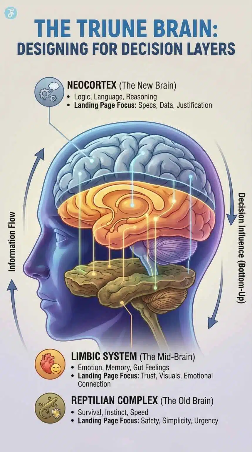
To design for the human brain, we must first use a working model of how it functions. While modern neuroscience is complex, marketers often rely on the “Triune Brain” model proposed in the 1960s. While simplified, it provides an excellent framework for understanding decision-making layers.
Think of your brain not as one single unit, but as three distinct layers that evolved over millions of years, operating simultaneously.
| Brain Layer | Also Known As | Primary Function | What It Cares About on a Landing Page |
| Reptilian Complex | The “Old Brain” | Survival, instinct, safety, speed. It is automatic and reflexive. | “Is this dangerous?” “Is this hard to understand?” “Does this help me survive/succeed right now?” |
| Limbic System | The “Mid-Brain” | Emotion, memory, social connection, and gut feelings. | “Do I like these colors?” “Do I trust that face?” “How does this make me feel?” |
| Neocortex | The “New Brain” | Logic, language, abstract thought, and complex reasoning. | “Does the pricing make sense?” “What are the technical specs?” “Is the ROI proven?” |
Why You Must Design Bottom-Up
The critical mistake most marketers make is speaking directly to the Neocortex with paragraphs of text and complex data tables.
However, neuroscientific research indicates that information processing flows from the bottom up. The Reptilian brain is the gatekeeper. It is cognitively lazy and prioritizes energy conservation. If your landing page is cluttered, confusing, or visually overwhelming upon that initial 50-millisecond glance, the Reptilian brain perceives “cognitive threat” (too much work) and signals the user to leave.
If you cannot satisfy the Reptilian brain’s need for simplicity and safety, the Limbic system never gets emotionally invested, and the Neocortex never gets the chance to analyze your offer. Neuromarketing landing pages must first pass the “survival check” before they can persuade with logic.
Core Principle 1: Cognitive Load & Processing Fluency
The human brain is a biological machine that consumes roughly 20% of the body’s energy. Because energy is precious, the brain is wired to conserve it. In UX design terms, mental effort is called “Cognitive Load.”
When a user lands on your page, every element, every button, text block, image, and navigation link requires cognitive energy to process. If the required energy exceeds the user’s motivation, they bounce. Your goal is to make the path to conversion feel biologically effortless. This is known as “Processing Fluency.”
The Paralysis of Choice: Hick’s Law
One of the fastest ways to overload the brain is to offer too many options. Hick’s Law states that the time it takes to make a decision increases logarithmically with the number and complexity of choices.
If you present a user with five different pricing tiers, a newsletter signup, and links to your blog, their brain enters analysis paralysis. The anxiety of potentially making the “wrong” choice often leads to making no choice at all.
The Neuromarketing Application: The 1:1 Attention Ratio
High-converting landing pages adhere strictly to a 1:1 attention ratio. This means the page has one single goal, and there is only one corresponding call to action (CTA).
This is why standard website headers, navigation bars, and complex footers must be ruthlessly eliminated from campaign-specific landing pages. Every outbound link is a “leak” in your funnel that distracts the Reptilian brain from the primary objective.
Designing for Scannability
The brain does not read web pages; it scans them, looking for anchors to decide if the content is worth the energy of reading. If you present a wall of text, the brain sees “work.” To improve processing fluency, you must break content into digestible chunks.
- Typography Matters: Sans-serif fonts are generally easier for the brain to process quickly on screens than serif fonts.
- Contrast is Key: High contrast (e.g., dark text on a light background) reduces eye strain, making the page feel “easier” to consume.
Understanding Scanning Patterns
Eye-tracking studies have consistently shown two primary scanning patterns for Western readers:
- The F-Pattern: On content-heavy pages, users scan the top line across, drop down a bit, scan across again (shorter this time), and then scan down the left side.
- The Z-Pattern: On pages with less text and a clear focus (like many landing pages), the eye starts top-left, moves horizontally right, diagonally down to the bottom-left, and across to the bottom-right.
By placing your key value proposition, supporting imagery, and CTA button along the path of this natural “Z,” you reduce the cognitive friction required for the user to find what they need.
Core Principle 2: Visual Hierarchy & Gaze Cueing
You cannot force a user to read something, but you can physically direct where their eyes look using biological reflexes. This is the art of visual hierarchy enhanced by neuroscience.
Gaze Cueing: The Power of Eyes
Humans are highly social creatures. Our brains are hardwired to pay attention to other humans, specifically their faces and eyes. We have an innate impulse to look where another person is looking. This is called “Gaze Cueing.”
Many designers use excellent photography of people on landing pages, but they use it incorrectly. They select a photo where the subject is looking directly at the camera, at the user. While this can create a connection, it stops the user’s scanning flow. Their eyes meet the subject’s eyes and stop.
To utilize gaze cueing for conversion, the person in your photograph should have their gaze directed toward your most important element: the CTA button or the lead capture form.
When the subject looks at the form, the user’s brain subconsciously says, “Oh, they are looking over there; I should look over there too.” It is a subtle, non-intrusive way to guide attention to the conversion point.
Directional Cues: Implicit vs. Explicit
Beyond human gaze, you can use other cues to direct the eye.
- Explicit Cues: These are obvious indicators like arrows, lines, or a finger pointing directly at a button. While they seem subtle, they are incredibly effective at directing attention.
- Implicit Cues: These are subtler design choices, such as the use of white space (negative space). By surrounding your CTA button with ample empty space, you signal to the brain that this isolated element is highly important.
The Von Restorff Effect [The Isolation Effect]
The human brain is engineered to notice anomalies. We ignore what is consistent and focus on what stands out. This is known as the Von Restorff Effect.
This principle is critical when designing your CTA buttons. A common mistake is designing a button that matches the brand’s color palette perfectly. If your website is primarily blue and white, a blue button will blend into the background “noise.”
To trigger the brain’s attention, your conversion element must be a visual anomaly. It should use a contrasting color that appears nowhere else on the page.
| Brand Color Palette | Poor CTA Choice | High-Converting CTA Choice (Von Restorff) |
| Blue, White, Gray | Blue Button | Orange or Yellow Button |
| Green, White, Black | Green Button | Red or Magenta Button |
| Purple, Light Blue | Purple Button | Lime Green or Bright Orange Button |
It is not about which color “converts best” universally; it is about which color creates the most contrast within your specific design environment.
Core Principle 3: Emotional Triggers & Dopamine Loops
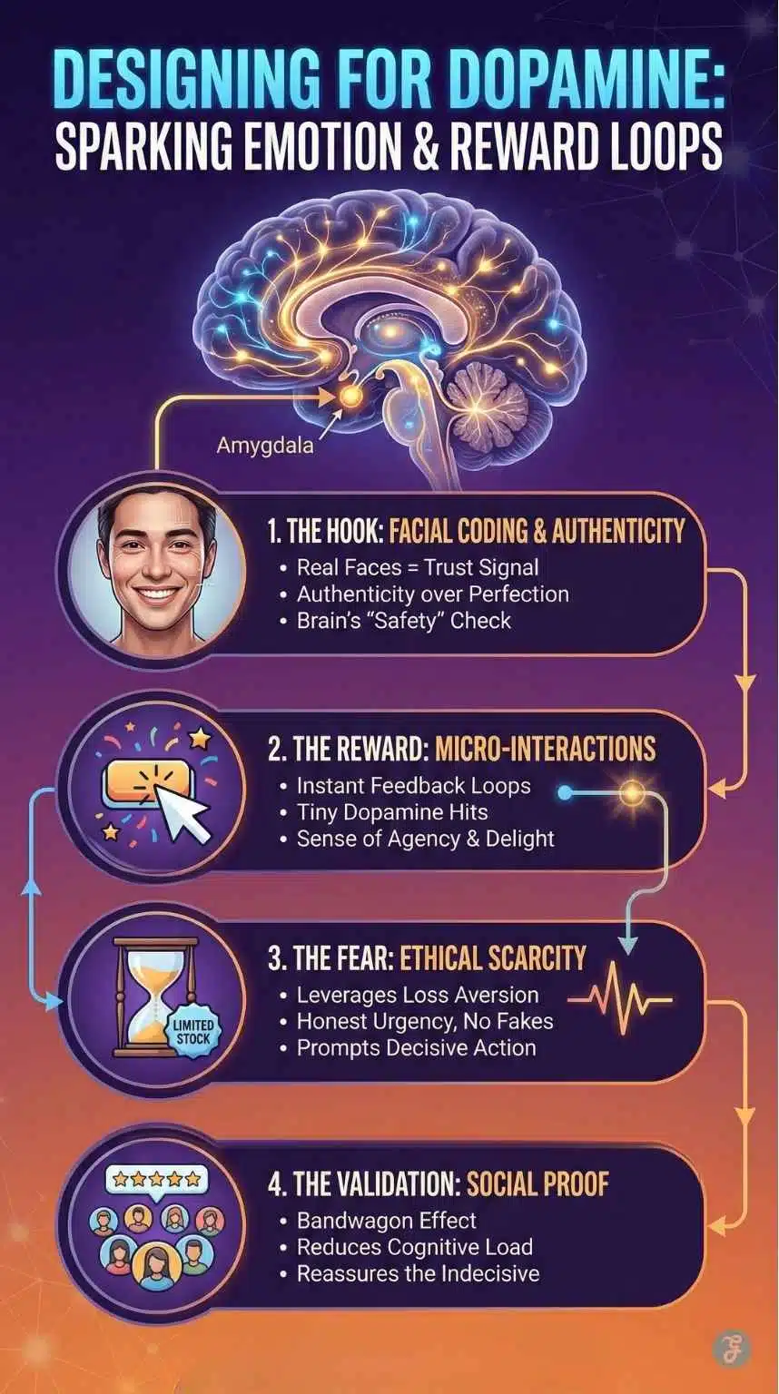
The Limbic system, the emotional brain, is a powerhouse in decision-making. People buy based on emotion and justify with logic later. Successful neuromarketing landing pages know how to stimulate the right neurochemicals, primarily dopamine (anticipation of reward) and cortisol (fear of loss).
Facial Coding and Authenticity
As mentioned regarding gaze cueing, the brain loves faces. A recognizable human face builds trust faster than any amount of copy. However, the type of face matters immensely.
In 2026, audiences are highly attuned to inauthenticity. The classic “smiling stock photo model in a generic office” is now filtered out by the brain as visual noise. It triggers skepticism, known as the “Uncanny Valley” effect in digital design.
To engage the Limbic system, use authentic imagery. High-resolution photos of real customers, actual employees, or the founders are far more effective. The brain is searching for micro-expressions of genuine emotion—imperfection is often more trustworthy than polished perfection.
Ethical Scarcity vs. Fake Urgency
Loss aversion is a profound psychological principle: the pain of losing something is psychologically twice as powerful as the pleasure of gaining the same thing.
Marketers have long used scarcity and urgency to trigger this fear of missing out (FOMO), releasing cortisol that prompts quick action. However, overuse of fake countdown timers (“This offer expires in 5 minutes!” that resets when you refresh the page) has destroyed consumer trust.
Modern neuromarketing relies on ethical scarcity:
- Quantity Scarcity: “Only 4 spots remaining in this month’s cohort.” (Assuming this is true).
- Time Scarcity: “Early bird pricing ends Friday at midnight.”
When scarcity is real, it acts as a powerful catalyst for the indecisive brain. When it is fake, it triggers psychological reactance, a motivational state where people resist social influence when they feel their freedom of choice is being threatened.
Social Proof and The Bandwagon Effect
When the brain is unsure about a decision, it looks to others for guidance. This is the “Bandwagon Effect.” Social proof, testimonials, reviews, “as seen on” logos, and user counts, outsources the cognitive load of decision-making to the “crowd.”
Placement is crucial. Do not bury testimonials at the bottom of the page. Place social proof elements directly near areas of high friction.
For example, placing a 5-star review nugget right below a pricing table or next to a credit card input field helps soothe the anxiety of the Limbic system right at the moment of commitment.
Core Principle 4: Neuro-Copywriting for the Reptilian Brain
While design dictates where the eye looks, copy dictates what the brain thinks. Neuro-copywriting involves structuring words to appeal to the primal nature of the Old Brain.
Framing and Anchoring
How you present information, the “frame” changes how the brain perceives it. This is especially true for pricing, which the brain interprets as “pain.” Anchoring is a cognitive bias where the brain relies heavily on the first piece of information offered (the “anchor”) when making decisions.
If you want to sell a $99 subscription, do not just present the $99 price tag. The brain has no relative basis to determine if that is expensive or cheap. Instead, frame it with an anchor: “Normally a $300 value. Today only: $99.”
By presenting the higher number first, you set a high anchor point. The $99 price is now perceived relative to $300, making it feel like a significant reward rather than a painful cost.
Writing for Survival: “You” vs. “We”
The Reptilian brain is inherently selfish. It cares only about its own survival, success, and well-being. It does not care about your company’s awards, your “state-of-the-art technology,” or how long you have been in business. Audit your landing page copy. Count the number of times you use “We,” “Our,” or “Us,” versus “You” and “Your.”
If your copy focuses on features (“Our software has an integrated dashboard”), you are talking to the Neocortex. If you flip the script to focus on the user’s survival benefit (“You will save 10 hours a week with this integrated dashboard”), you are speaking to the Reptilian brain.
Use action-oriented “power words” that evoke sensory experiences. Words like “Grip,” “Soar,” “Crush,” or “Unleash” stimulate brain activity far more effectively than passive words like “Improve,” “Increase,” or “Learn.”
2026 Trends: The Future of Neuro-Design
Neuromarketing is an evolving field. As technology changes, so does the way our brains interact with digital interfaces.
Micro-Interactions and Dopamine Loops
In 2026, static pages feel dead. Modern design incorporates subtle micro-interactions, small visual responses when a user hovers over a button, clicks a field, or scrolls past a certain point.
For example, a “Like” button that bursts with tiny confetti when clicked, or a form field that gently glows when selected.
These aren’t just aesthetic choices. These instantaneous feedback loops provide a tiny hit of dopamine. They give the user a sense of agency and control, making the experience feel satisfying. These small neural rewards encourage the user to keep interacting with the page, increasing time-on-site and the likelihood of conversion.
The Rise of Bento Grid Layouts
Inspired by Japanese lunch boxes and popularized by tech giants like Apple, Bento Grid layouts are dominating landing page design in 2026.
From a neuromarketing perspective, these grids are excellent for reducing cognitive load. They organize complex information into distinct, self-contained modular boxes. This helps the brain “chunk” information. Instead of being overwhelmed by a massive list of features, the brain sees four or five distinct, manageable concepts.
It makes the page feel organized, structured, and easy to digest, satisfying the Reptilian brain’s need for simplicity.
Tools for Testing Your Neuro-Strategy
You don’t need an fMRI machine to start applying neuromarketing. Several accessible tools allow you to approximate brain-based testing.
- Heatmaps and Scrollmaps (e.g., Hotjar, Microsoft Clarity): These tools show you where users are clicking and how far they are scrolling. They can reveal “rage clicks”, areas where users expect a link but find none, indicating high cognitive friction.
- Predictive Eye-Tracking AI (e.g., Attention Insight): Before you even launch a page, AI tools trained on thousands of eye-tracking studies can generate a predictive heatmap with roughly 90% accuracy. This allows you to test if your visual hierarchy is working before live traffic hits the page.
- A/B Testing Platforms: The ultimate arbiter of truth is data. Always test your neuro-hypotheses. Does the red button (Von Restorff effect) actually outperform the blue brand button? Does the gaze-cueing photo increase form fills? Test one variable at a time to know for sure.
Neuromarketing Landing Pages: A Quick Audit Checklist
Designing neuromarketing landing pages is about shifting your perspective from what you want to say to how the user’s brain wants to receive information. By respecting the biological limitations of cognitive load and leveraging the inherent shortcuts of the subconscious mind, you can significantly increase the efficiency of your marketing efforts.
If you have an underperforming landing page, run it through this quick neuro-audit:
- The 50-Millisecond Test: If you blink, can you instantly tell what the offer is and how it helps you survive/thrive? (Reptilian Brain)
- The Isolation Check: Is your CTA button a color that exists nowhere else on the page? (Von Restorff Effect)
- The Gaze Test: Are people in photos looking at the user, or at the conversion goal? (Gaze Cueing)
- The Anxiety Check: Is social proof located right next to payment or data entry fields? (Limbic Assurance)
- The Friction Audit: Have you removed all navigation links that don’t lead to the primary goal? (Attention Ratio)
Final Thought: The Biology of Empathy
Ultimately, neuromarketing is the scientific application of empathy. It acknowledges that your user is busy, stressed, and overwhelmed with information. By designing for their brain, you are not tricking them; you are doing them a service by making their decision-making process easier, faster, and more intuitive. When you align your business goals with their biological needs, everybody wins.