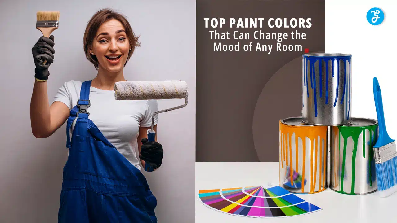
Paint colors can change how you feel in a room. The right shade can make you happy, calm, or energized. Some colors make spaces feel bigger or cozier. Picking the right paint color is key to creating the mood you want in your home.
Colors affect us in different ways. Warm shades like red and orange can make you feel excited.
Cool tones like blue and green often help you relax. Neutral colors can make rooms feel peaceful. Think about how you want to feel in each space when choosing paint colors.
1. Calming Blue
Blue is a top choice for creating a peaceful atmosphere in your home. This soothing color can help you relax and unwind after a long day.
Light blue shades are especially good for bedrooms. They can make your space feel airy and tranquil. Think of soft sky blues or pale ocean hues.
Deeper blues work well in living rooms or offices. Navy or royal blue can add a touch of elegance while still keeping things calm. These darker tones can make a room feel cozy and secure.
Want to create a spa-like bathroom? Try a light blue-green shade. It can remind you of clear waters and help you feel refreshed.
Blue pairs nicely with white trim for a clean look. You can also add warm wood tones to balance the coolness of blue walls.
Remember, the right shade of blue depends on your taste and the room’s lighting. Test a few samples to find the perfect calming blue for your space.
2. Sunny Yellow
Sunny yellow can brighten up any room and lift your mood. This cheerful color brings warmth and energy, making spaces feel more open and inviting.
You can use sunny yellow in different ways. Paint an accent wall to create a focal point. Or go bold and paint the whole room for a big impact.
Lighter shades of yellow work well in kitchens and dining areas. They can make these spaces feel fresh and lively. Darker yellows add coziness to living rooms and bedrooms.
Be careful not to overdo it with yellow. Too much can feel overwhelming. Balance it with neutral colors like white or gray for a calming effect.
Yellow pairs nicely with blues and greens. This combo can create a nature-inspired look in your space. It also goes well with wood tones for a warm, earthy feel.
When picking a yellow paint, consider the lighting in your room. Natural light will make yellow look brighter, while artificial light may change its tone. Test samples in your space before committing.
Remember, a little yellow goes a long way. Even small touches can add cheer to a room. Try yellow throw pillows or artwork if you’re not ready for yellow walls.
3. Earthy Terracotta
Earthy terracotta paint can change the mood of any room. This warm, rich color brings nature indoors and creates a cozy atmosphere.
Terracotta works well in living rooms, bedrooms, and dining areas. It adds depth and character to your walls without being too bold or overwhelming.
You can pair terracotta with other earth tones like brown and beige. It also looks great with blues and greens for a balanced, complementary look.
Popular terracotta paint colors include Benjamin Moore’s Baked Terracotta and Sherwin Williams’ Cavern Clay. These shades offer a perfect blend of warmth and neutrality.
For a more rustic feel, try textured terracotta walls. This technique highlights the earthy quality of the color and adds visual interest to your space.
Terracotta paint can make your room feel inviting and comfortable. It’s a versatile choice that works in both modern and traditional decor styles.
When using terracotta, balance it with lighter colors to keep the room from feeling too dark. White trim or ceiling can help brighten the space.
Remember, lighting affects how terracotta looks on your walls. Test paint samples in different parts of your room before making a final decision.
4. Vibrant Red
Vibrant red is a bold choice for room color. It creates energy and excitement in any space. Red walls can make a room feel more alive and passionate.
You might want to use red in dining rooms or living areas. It can spark conversation and stimulate appetite. But be careful – too much red can feel overwhelming.
Try painting one accent wall red instead of the whole room. This gives a pop of color without being too intense. You can also add red through furniture or decor if you’re not ready for red walls.
Red works well with neutral colors like white or gray. These combos keep the space balanced. You could paint most walls white and have one red wall as a focal point.
Remember that different shades of red create different moods. Bright cherry red feels playful, while deeper burgundy feels more sophisticated. Pick a shade that matches the feeling you want in your room.
5. Muted Lavender
Muted lavender paint can transform your room into a calming oasis. This soft, subtle shade combines the soothing qualities of purple with a touch of gray. It’s perfect for creating a peaceful atmosphere in bedrooms or living spaces.
Tranquil Sea by Dunn-Edwards is a popular muted lavender choice. It has a cool blue undertone that can help balance out warm sunlight in south-facing rooms. You’ll find it brings a sense of comfort and tranquility to any space.
Farrow & Ball’s Peignoir is another elegant option. This lavender paint has a moody gray undertone, making it versatile for different design styles. It’s a top pick among interior designers for its sophisticated look.
When choosing muted lavender, consider the room’s lighting. Natural light can bring out different tones in the paint throughout the day. Test samples on your walls to see how they look in various lighting conditions.
Pair muted lavender with crisp white trim for a fresh, clean look. Or, combine it with deeper purples and grays for a layered, cozy feel. This versatile color works well in both modern and traditional settings.
6. Soft Peach
Soft peach is a warm, inviting color that can transform any room. It brings a gentle, soothing energy that’s perfect for creating a cozy atmosphere.
You’ll find soft peach works well in bedrooms and living spaces. It gives off a warm glow that makes rooms feel welcoming and relaxing.
This color pairs nicely with crisp whites and light grays. You can also mix it with deeper browns for a rich, earthy look.
Soft peach reflects light well, making spaces feel bigger and brighter. It’s a great choice if you want to open up smaller rooms.
You might use soft peach on all walls for a calming effect. Or try it as an accent wall to add a touch of warmth without overwhelming the space.
This color can help create a peaceful mood in nurseries or children’s rooms. It’s gentle on the eyes and promotes a sense of comfort.
In kitchens, soft peach can give a fresh, clean feel. It pairs well with natural wood tones and white cabinets.
For living rooms, this hue creates a welcoming backdrop for gatherings. It encourages conversation and puts guests at ease.
Soft peach can also work in home offices. It provides a warm, creative environment without being too distracting.
Remember, lighting affects how colors look. Test soft peach in different lights before committing to ensure it gives the mood you want.
7. Deep Forest Green
Deep forest green can transform a room into a peaceful woodland retreat. This rich, earthy color brings the calming essence of nature indoors. You’ll feel like you’re surrounded by towering trees when you use this shade on your walls.
Deep forest green works well in living rooms, bedrooms, and home offices. It creates a cozy, intimate atmosphere that invites relaxation. The color pairs beautifully with natural wood tones and leather furniture.
For a bold look, paint all four walls deep forest green. Or try an accent wall to add depth without overwhelming the space. You can also use this color on cabinets or built-in shelving for a dramatic effect.
Lighting is key when using such a dark color. Make sure you have plenty of lamps or overhead lights to keep the room from feeling too dim. White trim and light-colored curtains can help brighten the space.
Accessories in gold, copper, or brass will pop against the deep green background. Add some plants to enhance the natural vibe. Textured throw pillows and area rugs in cream or tan can soften the look.
8. Dusky Rose
Dusky rose is a soft, muted pink that can transform your room’s mood. This color brings warmth and elegance to any space.
You’ll find dusky rose works well in bedrooms, living rooms, and dining areas. It creates a calm and inviting atmosphere that makes people feel comfortable.
Pairing dusky rose with neutrals like gray or white can balance the look. Try using it on an accent wall or in smaller doses through decor items.
For a bold statement, mix dusky rose with deep burgundy or rich plum tones. This combo adds depth and sophistication to your space.
Light wood accents complement dusky rose beautifully. Consider adding wooden furniture or flooring to enhance the natural, soothing vibe.
Metallics like rose gold or silver can make dusky rose feel more glamorous. Use these in lamps, picture frames, or other decorative pieces.
Fabrics play a key role in showcasing dusky rose. Velvet curtains or satin pillows can add texture and luxury to your room.
Don’t forget about lighting. Soft, warm bulbs will make dusky rose walls glow and create a cozy atmosphere.
9. Light Mint Green
Light mint green is a fresh and calming color that can brighten up any room. This soft, pastel shade brings a touch of nature indoors. It’s perfect for creating a peaceful atmosphere in your home.
You can use light mint green in bedrooms, bathrooms, or living areas. It pairs well with white trim and natural wood tones. This color can make small spaces feel bigger and more open.
Light mint green works great as an accent wall color. You can also use it on all walls for a more immersive feel. It’s versatile enough to complement many different decorating styles.
This color can help you feel more relaxed and focused. It’s a good choice for home offices or study areas. Light mint green can also add a crisp, clean look to kitchens and laundry rooms.
When choosing accessories, consider white, cream, or light gray. These neutral colors will balance the mint green nicely. For a bolder look, try pairing it with coral or peach accents.
Remember, lighting can change how the color looks. Test a sample on your wall before committing. This will help you see how it looks at different times of day.
10. Warm Beige
Warm beige paint can transform any room into a cozy, inviting space. This versatile color brings a sense of comfort and elegance to your walls.
Warm beige comes in many shades, from light creamy tones to deeper, richer hues. You can choose a pale beige like Benjamin Moore’s Navajo White for a soft, airy feel.
For a more intense look, try Sherwin-Williams’ Anew Gray. This warm gray adds depth while keeping the room feeling bright and open.
Want to create a focal point? Paint your fireplace surround in two complementary beige shades. This technique adds visual interest without overwhelming the space.
Warm beige works well in sunny rooms, where it can appear almost white during the day. In darker areas, it provides a soothing warmth that makes the space feel more welcoming.
You can pair warm beige with white trim for a classic look. Or, combine it with rich wood tones for a natural, earthy vibe.
Remember, lighting affects how beige appears. Test your chosen shade in different parts of the room before committing to it.
11. Burnt Orange
Burnt orange is a bold paint color that can bring warmth and energy to any room. This deep, earthy hue falls between red and brown on the color wheel. The rich colors of autumn leaves and desert landscapes served as inspiration.
You can use burnt orange to create a cozy atmosphere in living rooms or bedrooms. It pairs well with neutral colors like beige, gray, and white. These combinations help balance the intensity of burnt orange and keep the space from feeling too overwhelming.
In well-lit rooms, burnt orange walls can make a striking statement. For spaces with less natural light, consider using it as an accent color instead. You might paint one wall or add burnt orange decorations to brighten up the room.
This color works with various decor styles. It fits nicely in vintage-inspired spaces, bohemian designs, and modern interiors. You can match burnt orange with wooden furniture for a warm, inviting look.
When choosing burnt orange paint, think about the mood you want to create. Deeper shades can feel more dramatic, while lighter tones are more subtle. Test a few samples on your walls to see how they look in different lighting throughout the day.
Navy paint can make your room feel fancy and grown-up. It’s a deep blue color that looks great in bedrooms, living rooms, and even kitchens. When you use navy, your space feels calm and classy.
Navy works well with many other colors. You can pair it with white for a clean look. Or try gold accents to make things feel extra special. Light wood furniture also looks nice against navy walls.
This color is perfect for making small rooms feel bigger. It can make your ceilings look higher too. Navy is dark, but it doesn’t have to feel gloomy. Add some bright lights to keep the room feeling warm and cozy.
You don’t have to paint all your walls navy. One navy accent wall can change how your whole room feels. It’s a bold choice that can make your space stand out.
Navy paint is great for hiding marks and scuffs. This makes it good for busy areas in your home. It’s also a color that both kids and adults can enjoy.
13. Powder Blue
Powder blue is a soft, soothing color that can bring a sense of calm to any room. This light shade of blue has a gentle, airy quality that makes spaces feel more open and relaxed.
In bedrooms, powder blue walls can create a peaceful atmosphere that helps you unwind after a long day. The color’s cool tones may even help you fall asleep faster at night.
For living rooms or home offices, powder blue can boost focus and productivity. Its subtle hue won’t distract you but can still brighten up the space.
Powder blue also works well in bathrooms, giving them a clean and fresh feel. You might pair it with white tiles or fixtures for a crisp, spa-like look.
When choosing powder blue paint, consider how it will look in different lighting. Natural sunlight can make it appear brighter, while artificial light may soften its appearance.
You can accent powder blue walls with navy, gray, or white trim to create depth and visual interest. For a bolder look, try pairing it with pops of yellow or coral in your decor.
Remember that powder blue can make a room feel cooler. If you live in a colder climate, balance it with warm wood tones or cozy textiles to keep the space inviting.
14. Rustic Brown
Rustic brown paint can transform your room into a cozy retreat. This earthy hue brings warmth and comfort to any space.
You’ll find rustic brown works well in living rooms and bedrooms. It creates a calm, grounding atmosphere that helps you relax after a long day.
Pair rustic brown with cream or beige for a classic look. Wood accents and natural textures complement this color beautifully.
For a bolder style, try combining rustic brown with deep reds or oranges. This palette adds energy while keeping the room feeling snug.
Lighting plays a big role with rustic brown walls. Soft, warm lighting enhances the cozy feel. Bright lights can make the space feel more open and airy.
Don’t forget about furniture and decor. Choose pieces in lighter shades to balance the dark walls. This contrast keeps the room from feeling too dark or heavy.
Rustic brown also works great as an accent color. Paint one wall brown and leave the others light for a striking focal point.
Remember, rustic brown doesn’t have to mean dull. Look for shades with hints of red or gold for added depth and interest.
15. Serene Aqua
Aqua paint can bring a calming, spa-like feel to any room. This soothing color combines the tranquility of blue with the freshness of green.
Aqua works well in bedrooms, bathrooms, and living spaces where you want to create a relaxing atmosphere. It pairs beautifully with white trim and natural wood tones.
When choosing an aqua shade, consider the lighting in your room. Natural light can make aqua appear bluer, while artificial light may bring out more green tones.
Popular aqua paint options include Benjamin Moore’s Palladian Blue and Behr’s Marina Isle. These shades offer a soft, muted aqua that isn’t too bold or bright.
For a more subtle look, try a blue-gray aqua like Edgecomb Gray by Benjamin Moore. This versatile neutral has just a hint of aqua to create a serene backdrop.
You can use aqua as an accent color too. Paint a single wall or small furniture pieces to add pops of tranquility without overwhelming the space.
Remember that aqua can make a room feel cooler. Balance it with warm accents like wood, woven textures, or golden-toned metals for a harmonious look.
16. Sophisticated Charcoal
Charcoal paint can transform your room into a sleek, modern space. This deep, rich color adds drama and elegance to any wall.
Charcoal works well in living rooms, bedrooms, and home offices. It creates a cozy atmosphere that’s perfect for relaxing or focusing on work.
You can pair charcoal with lighter colors to balance the mood. Try using white trim or light gray accents to brighten the space.
For a bold look, paint an accent wall in charcoal. This draws attention and creates a focal point in the room.
Charcoal also looks great on cabinets or built-in shelves. It gives these features a high-end, custom appearance.
When choosing charcoal paint, consider the undertones. Some have hints of blue or green, while others lean more neutral.
Lighting plays a big role with charcoal walls. Natural light helps the color appear softer during the day. At night, use warm lighting to keep the room feeling cozy.
Charcoal paint can make a small room feel more intimate. In larger spaces, it adds depth and sophistication.
Remember to test paint samples in your room before committing. The color may look different depending on your lighting and other decor.
17. Energizing Coral
Coral paint can breathe new life into any room. This vibrant hue sits between pink and orange, adding warmth and energy to your space.
Want to feel more awake and motivated? Coral might be the perfect choice for you. It’s known to boost mood and increase energy levels.
Coral works well in many areas of your home. Try it in your kitchen to create a lively cooking space. Or use it in a home office to spark creativity and productivity.
Not ready for full coral walls? Start small. Paint an accent wall or add coral accessories to test the waters.
Coral pairs nicely with neutrals like white or gray. These combos can keep the room feeling balanced and not overwhelming.
Looking for the right shade? Consider Benjamin Moore’s Coral Gables or Sherwin-Williams’ Coral Reef. These popular options capture coral’s energizing essence.
Remember, lighting affects how coral looks. Test your chosen shade in different lights before committing. This ensures you get the exact vibe you’re after.
Coral can make a space feel warmer and more inviting. It’s a great choice if you want to create a welcoming atmosphere for guests.
18. Pastel Pink
Pastel pink can transform a room into a gentle, soothing space. This soft hue brings warmth and comfort to any area of your home. It’s a versatile color that works well in bedrooms, living rooms, and even kitchens.
When you paint walls pastel pink, you create a calming atmosphere. This shade can make small rooms feel bigger and brighter. It pairs nicely with white trim and furniture for a clean, fresh look.
Pastel pink isn’t just for kids’ rooms anymore. Many adults choose this color for their spaces too. It can add a touch of elegance to a dining room or office. Try combining it with gold accents for a luxurious feel.
This color works well with both modern and traditional decor styles. You can use it as a neutral backdrop or make it the star of your color scheme. Pastel pink walls look great with gray, beige, or light blue furnishings.
Remember that lighting affects how paint colors look. Test a sample of pastel pink on your walls before committing. See how it changes throughout the day as natural light shifts.
Understanding the Psychological Impact of Colors
Colors can strongly affect how you feel in a room. Different hues can make spaces seem energizing or calming. The way colors influence mood depends on their warmth, coolness, brightness, and intensity.
Warm Colors vs. Cool Colors
Warm colors like red, orange, and yellow tend to energize spaces. Red can make a room feel exciting and passionate. Orange brings a sense of fun and creativity. Yellow often creates a cheerful, uplifting mood.
Cool colors like blue, green, and purple have a more relaxing effect. Blue promotes calmness and can lower blood pressure. Green connects to nature and helps reduce stress. Purple adds a touch of luxury and mystery to rooms.
The temperature of colors affects how big spaces feel too. Warm hues make rooms cozier, while cool tones open them up.
The Role of Saturation and Brightness
How vivid or muted a color is changes its impact on mood. Bright, saturated colors create more intense feelings. Softer, less saturated shades have a gentler effect.
Very bright colors can overwhelm in large amounts. They work best as accents. Pastel versions of colors keep their basic qualities but feel lighter and airier.
The amount of white in a color also matters. Lighter tints feel fresh and airy. Darker shades add drama and depth to spaces.
Mixing different levels of saturation and brightness helps balance a room’s energy. It lets you fine-tune the mood you want to create.
Choosing Colors for Different Room Types
Paint colors can dramatically change how a space feels and functions. Picking the right hues for each room type helps create the ideal atmosphere and mood.
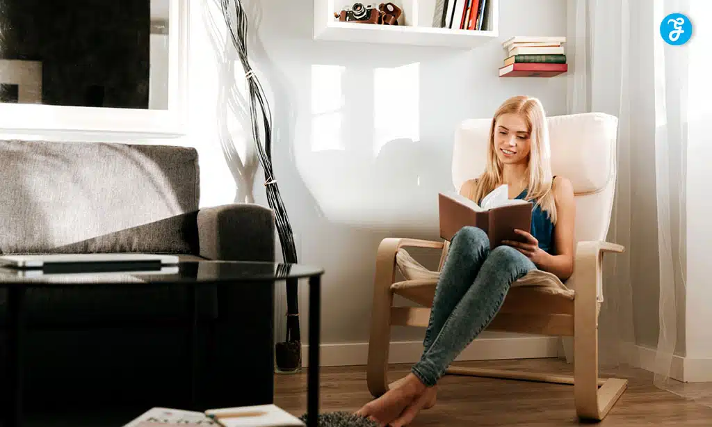
Bedrooms: Creating a Calm Retreat
Soft, cool tones work best for bedrooms. Light blues and greens promote relaxation and sleep. Pale lavender and gray also have a soothing effect. Avoid bright or dark colors that may feel too stimulating.
For a cozy feel, try warm neutrals like beige or light taupe. These shades create a peaceful backdrop for bedding and decor. If you want more color, consider a muted sage green or dusty blue.
Accent walls in deeper hues can add interest without overwhelming the space. A navy or forest green wall behind the headboard makes a stylish statement.
Living Rooms: Fostering Social Interaction
Living rooms benefit from warmer, more energetic colors. Soft yellows and oranges create a welcoming vibe. Light to medium greens work well too, bridging the gap between neutral and bright.
Consider the room’s natural light when choosing a paint color. Rooms with lots of sunlight can handle deeper shades. Darker rooms look best with lighter, brighter hues to open up the space.
Use paint to define seating areas in open floor plans. A feature wall in a bold color like red or teal can anchor the living space. Keep other walls neutral to balance the look.
Kitchens: Inspiring Creativity and Appetite
Kitchens thrive with colors that boost energy and spark creativity. Yellow is a popular choice, as it’s cheerful and stimulating. Soft greens also work well, bringing a fresh feel to the space.
White kitchens remain a classic option. They feel clean and bright, making the room seem larger. Add pops of color through backsplashes, cabinets, or accessories.
For a cozy kitchen, try warm neutrals like creamy beige or light gray. These create a welcoming backdrop for cooking and gathering. Bold reds can stimulate appetite, but use them sparingly to avoid overwhelming the space.
Implementing Color Theory in Interior Design
Color theory is key to creating beautiful rooms. You can use it to set moods and make spaces feel just right. The color wheel is your friend here. It shows how colors relate to each other.
Start with the 60-30-10 rule. Pick a main color for 60% of the room. Add a second color for 30%. Use an accent color for the last 10%. This creates balance.
Complementary colors sit across from each other on the wheel. They create bold looks. Blue and orange or purple and yellow are examples. Use them to make things pop.
Analogous colors are next to each other. They make calm, harmonious spaces. Think blue, green, and purple together. These work well in bedrooms or studies.
Consider the room’s purpose. Cool colors like blue and green are calming. They’re good for bedrooms. Warm colors like red and orange energize. Use them in kitchens or workout rooms.
Don’t forget about lighting. Natural and artificial light change how colors look. Test paint samples at different times of day. This helps you avoid surprises later.
Final Thoughts
In conclusion, choosing the right paint color is a powerful tool for setting the mood in any room. Whether you want to create a calming retreat, an energizing workspace, or a cozy gathering spot, the colors you select play a crucial role in shaping the ambiance.
From serene blues and soothing greens to bold reds and elegant charcoals, each hue has the potential to transform your space into a reflection of your desired atmosphere.
By understanding the psychological impact of colors and considering how they interact with light and your existing decor, you can make informed choices that enhance both the aesthetics and emotional tone of your home.
So, as you embark on your next painting project, remember that the colors you choose can truly change the way you feel in your space—making it a place where you feel completely at home.