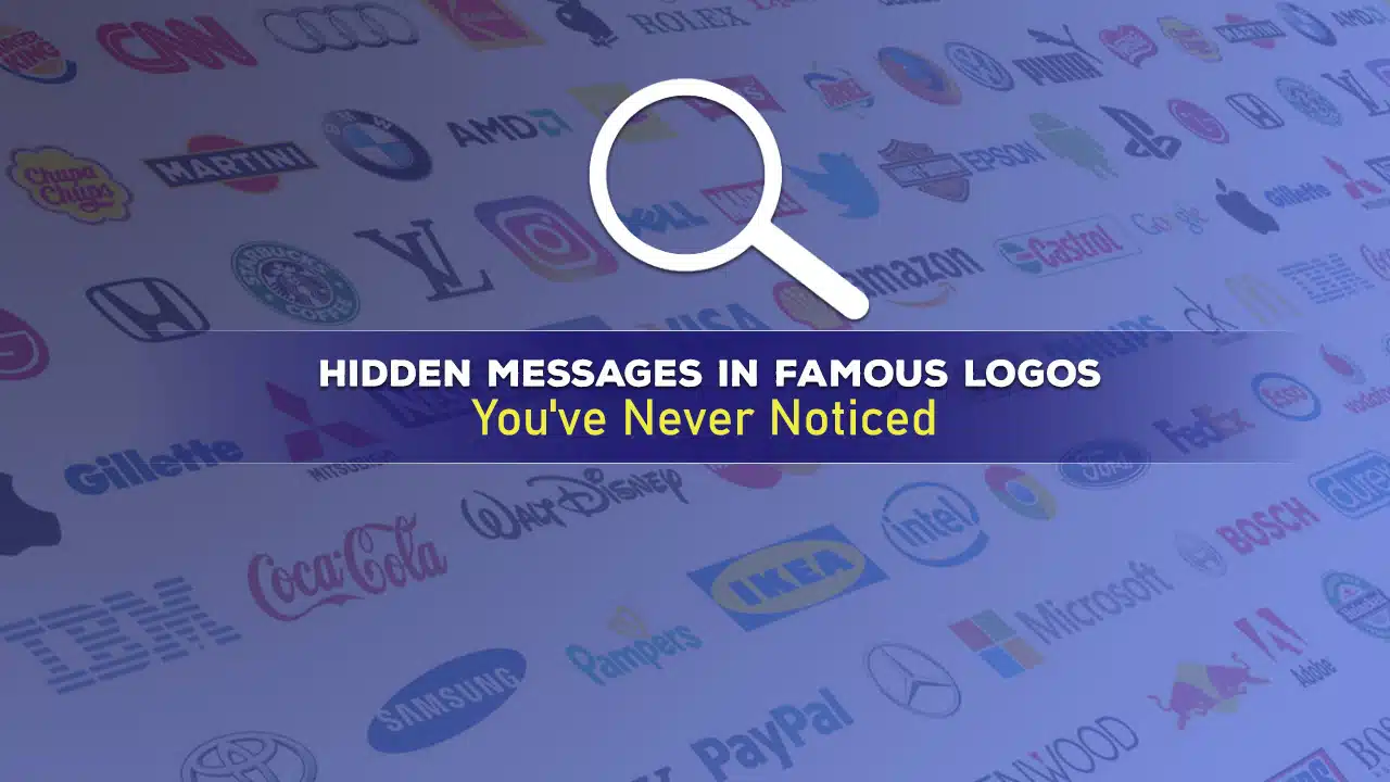
Logos are everywhere. We see them on billboards, products, websites, and TV commercials. But how often do we stop to really look at them? Many famous logos hide clever messages, symbols, or designs that most people miss at first glance.
These hidden elements add depth and meaning to brand identities. In this article, we’ll explore 25 surprising hidden messages in famous logos that you may have never noticed before.
Hidden Messages in Famous Logos Revealed
Get ready to see some of the world’s most recognizable logos in a whole new light. In this section, we’ll uncover the clever, often surprising hidden messages tucked away in famous brand designs.
From playful visual puns to meaningful symbols, these hidden elements add depth and intrigue to the logos we see every day. Some were intentionally placed by clever designers, while others emerged as happy accidents.
Either way, they offer fascinating insights into brand stories and design ingenuity. Let’s dive in and explore these secret messages hiding in plain sight.
1. FedEx: The Arrow of Progress
One of the most famous hidden logo elements is in the FedEx logo. Look closely at the space between the “E” and “x”. You’ll see a white arrow pointing forward. This subtle design represents speed, accuracy, and forward movement—key values for a shipping company.
2. Amazon: From A to Z
The Amazon logo features a curved arrow that starts at the “a” and points to the “z. This represents that Amazon sells everything from A to Z. The arrow also forms a smile, hinting at customer satisfaction.
3. Toblerone: The Bear of Bern
Look closely at the mountain in the Toblerone logo. You’ll spot the outline of a bear standing on its hind legs. This is the Bear of Bern, a symbol of the Swiss city where Toblerone was created.
4. Baskin Robbins: 31 Flavors
The “BR” in the Baskin Robbins logo cleverly incorporates the number 31 in pink. This represents their famous “31 flavors” slogan, offering a different ice cream flavor for each day of the month.
5. Toyota: Hidden Letters
Toyota’s logo is more than just an oval. It actually contains every letter of the company’s name. The two perpendicular ovals inside the larger oval form a stylized “T”, and the negative space around them forms the rest of the letters.
6. Coca-Cola: The Danish Flag
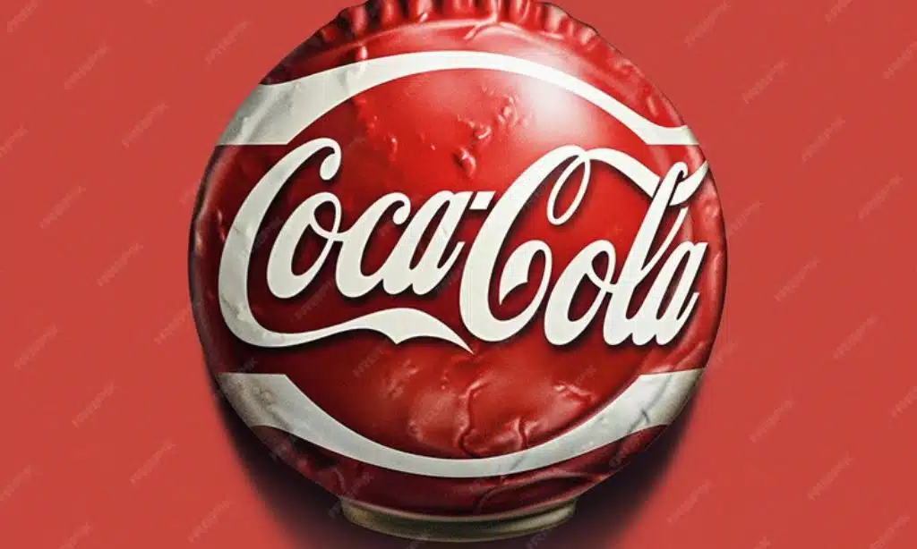
In the white space between the “O” and “L” in the Coca-Cola logo, you can see the Danish flag. This wasn’t intentional, but Coca-Cola has used it in marketing campaigns in Denmark, as Denmark’s flag is considered the oldest national flag still in use.
7. NBC: The Peacock’s Body
NBC’s colorful peacock logo is well-known, but many miss that the negative space at the center forms the peacock’s body. The six colorful feathers represent NBC’s six original divisions.
8. Hershey’s Kisses: The Extra Kiss
Between the “K” and “I” in the Hershey’s Kisses logo, there’s an extra Hershey’s Kiss. This subtle addition reinforces the product’s image in a clever way.
9. Cisco: Digital Signal
Cisco’s logo represents the Golden Gate Bridge in San Francisco, where the company was founded. But it also resembles a digital signal or soundwave, linking to the company’s tech focus.
10. Tostitos: Hidden Party
In the Tostitos logo, the two “T”s in the middle form two people sharing a chip over a bowl of salsa (the dot on the “I”). This represents the social, party-friendly nature of the snack.
11. Goodwill: Smiling Face
Half of the Goodwill logo’s “G” is actually a smiling face. This represents the positive impact and happiness the organization aims to bring to communities.
12. Wendy’s: Mom
Look closely at Wendy’s collar in the logo. The word “Mom” is subtly written there, emphasizing the homestyle and maternal quality of their food.
13. Vaio: Analog and Digital
Sony Vaio’s logo represents the brand’s integration of analog and digital technology. The “VA” is designed as an analog wave, while the “IO” represents the 1 and 0 of digital binary code.
14. LG: Winking Face
The “L” and “G” in the LG logo form a face. The “L” makes the nose, and the “G” creates the rest of the face, which appears to be winking.
15. Unilever: Hidden Icons
Unilever’s “U” logo is actually made up of many smaller icons, each representing a different aspect of their business. You can spot icons for hair, lips, a shirt, a fish, and many more.
16. Milwaukee Brewers: Ball and Glove
The old Milwaukee Brewers logo (still used as an alternate) cleverly combines an “m” and “b” to form a baseball glove catching a ball.
17. Eighty20: Binary Code
The dots in the Eighty20 logo spell out the company’s name in binary code. The blue dots represent 1s and the grey dots represent 0s.
18. Beats by Dre: The Letter B
The Beats logo isn’t just a simple circle. It’s actually a stylized “b”, representing both “beats” and the brand’s founder, Dr. Dre.
19. Continental: Tire Tread
The “C” and “O” in the Continental logo form a tire, with the rest of the letters appearing as if they’re the tire’s tread.
20. Pittsburgh Zoo: Hidden Animals
The tree in the Pittsburgh Zoo logo contains the silhouettes of a gorilla and a lion facing each other.
21. Sun Microsystems: Ambigram
The old Sun Microsystems logo is an ambigram – it reads “sun” from every direction. This represents the company’s innovative, multi-faceted approach.
22. Spartan Golf Club: Dual Image
At first glance, this logo looks like a golfer mid-swing. But it’s also the profile of a Spartan warrior’s helmet.
23. Yamaha: Tuning Forks
Yamaha’s logo consists of three interlocking tuning forks, representing the company’s musical instrument origins and their current diversity in sound-related products.
24. Adidas: Mountain
The three stripes in the Adidas logo form a mountain shape, representing the challenges athletes face and overcome.
25. Formula 1: Speed
The negative space between the “F” and the red stripes in Formula 1’s logo creates a “1”, while the overall design suggests speed and motion.
The Power of Hidden Messages on Logos
These hidden messages in logos serve several purposes:
- Brand Storytelling: They often relate to the company’s history, values, or products.
- Memorability: Once noticed, these hidden elements make logos more memorable.
- Consumer Engagement: Discovering these hidden messages can create a sense of connection between consumers and brands.
- Design Ingenuity: They showcase the creativity and skill of the designers.
Takeaways
Logos are more than just simple designs. They’re carefully crafted visual representations of brand identities, often containing layers of meaning. The next time you see a famous logo, take a closer look. You might be surprised by what you find hidden in plain sight.
Hidden messages in famous logos not only make logos more interesting but also help to create stronger connections between brands and consumers. They remind us that in design, as in life, there’s often more than meets the eye.