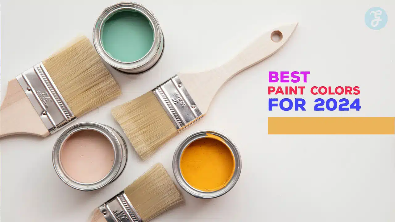
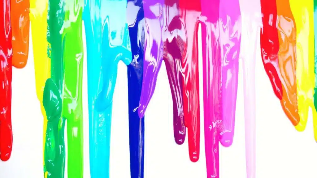
Paint colors can make a big difference in your home. Choosing the right shades can change how a room feels and looks. In 2024, new paint color trends are coming. These trends will give you fresh ideas for updating your walls and spaces.
You might wonder what colors are popular this year. Paint experts and designers have picked out the best paint colors for 2024. These colors range from calm blues to rich greens and warm browns. Each shade can create a different mood in your home.
Hale Navy is a standout paint color for 2024. This deep, rich navy blue can transform any room in your home. It’s a versatile shade that works well in both traditional and modern spaces.
You’ll find Hale Navy has subtle gray undertones. This gives it a sophisticated look that’s not too bright or overwhelming. The color has a light reflectance value (LRV) of 8.36, meaning it absorbs most light and creates a cozy feel.
Hale Navy looks great in bedrooms, living rooms, and even kitchens. It pairs beautifully with white trim for a classic contrast. You can also use it on kitchen cabinets or as an accent wall to add depth to a space.
This color changes slightly throughout the day. In natural light, it appears more vibrant. At night, it takes on a slightly muted tone. This shifting quality adds interest to your walls.
Hale Navy is part of Benjamin Moore’s Historic Color collection. It has a timeless appeal that won’t go out of style. You can trust this color to look fresh for years to come.
When choosing Hale Navy, consider your room’s lighting. In well-lit spaces, it shines as a true navy. In darker areas, it may appear almost black. Test a sample in your space before committing to the full paint job.
2. Sherwin-Williams Alabaster
Sherwin-Williams Alabaster is a top choice for 2024. This warm white paint color brings a sense of calm to any room. It’s not too stark or bright, making it perfect for walls, trim, and cabinets.
Alabaster works well in many spaces. You can use it in living rooms, bedrooms, or kitchens. It creates a clean backdrop for your decor and furniture.
This color pairs nicely with both light and dark shades. You can match it with soft grays or bold blues for contrast. It also looks great with natural wood tones.
Lighting affects how Alabaster looks in your home. In bright spaces, it appears crisp and fresh. In rooms with less light, it takes on a softer, creamier feel.
Alabaster is versatile for different design styles. It fits well in modern, traditional, or farmhouse decor. You can easily change your room’s look without repainting.
When painting with Alabaster, prep your walls first. Use a good primer to ensure even coverage. Two coats of paint will give you the best results.
3. Farrow & Ball Hague Blue
Farrow & Ball Hague Blue is a top paint color choice for 2024. This deep, rich blue adds drama and sophistication to any room.
Hague Blue has an estimated Light Reflective Value (LRV) of 7. This means it’s a very dark shade that absorbs a lot of light.
You can use Hague Blue to create a cozy, intimate atmosphere in your living room. It works well on all four walls for a bold look.
In smaller spaces, Hague Blue can make the room feel more enclosed and snug. It’s perfect for creating a cocoon-like effect.
For a striking contrast, pair Hague Blue with crisp white trim. This combination highlights architectural details and adds visual interest.
Hague Blue isn’t just for walls. It looks stunning on kitchen cabinets, front doors, or even in a home gym for a cool, moody vibe.
If you’re hesitant about using such a dark color, try it as an accent wall. This lets you enjoy the richness of Hague Blue without overwhelming the space.
Before committing, test a sample in your room. The color can look different depending on your lighting and other furnishings.
Hague Blue pairs beautifully with warm metals like brass or gold. These accents add a touch of glamour to the deep blue backdrop.
4. Behr Swiss Coffee
Behr Swiss Coffee is a popular paint color for 2024. It’s a warm white shade that can brighten up any room in your home.
This color has a light reflectance value (LRV) of 84. This means it reflects a lot of light, making spaces feel bigger and more open.
Swiss Coffee has slight yellow undertones. You’ll notice a soft, creamy look that creates a cozy atmosphere. It’s not a stark white, but it’s not too yellow either.
You can use Swiss Coffee in many rooms. It works well in living areas, bedrooms, and kitchens. The color adapts to different lighting conditions, so it looks good all day.
When choosing Swiss Coffee, think about your furniture and decor. It pairs nicely with wood tones and colorful accents. You can use it on walls, trim, or cabinets.
Remember to test the color in your space before painting. Light can change how Swiss Coffee looks in different rooms. Get a sample and paint a small area first.
Behr Swiss Coffee is a versatile choice for 2024. It offers a clean, fresh look without being too stark. Consider this color for a timeless and inviting home update.
5. Benjamin Moore Revere Pewter
Benjamin Moore Revere Pewter is a popular paint color for 2024. It’s a versatile neutral that works well in many homes.
This color is a mix of gray and beige, often called “greige.” It has slight green undertones that give it depth.
Revere Pewter can make your rooms feel cozy and welcoming. It works great in living rooms, bedrooms, and kitchens.
You’ll find this color adapts to different lighting conditions. In bright light, it looks more gray. In dimmer light, it takes on a warmer tone.
Revere Pewter pairs well with both warm and cool colors. This makes it easy to match with your furniture and decor.
When choosing trim colors, white works nicely with Revere Pewter. It creates a clean, crisp look.
This paint color can make small spaces feel bigger. It reflects light well, helping to brighten up rooms.
Revere Pewter is a good choice if you want a neutral that’s not too bland. It has enough character to stand on its own.
Remember, paint colors can look different in your home. Always test a sample before painting the whole room.
6. Sherwin-Williams Repose Gray
Repose Gray is a popular paint color for 2024. This Sherwin-Williams shade offers a versatile neutral option for your home. It’s a light gray with subtle warm undertones.
Repose Gray works well in many rooms. You can use it in living areas, bedrooms, or kitchens. It creates a calm and welcoming feel.
The color has an LRV of 58. This means it reflects a good amount of light. It can help brighten up spaces without being too stark.
Repose Gray pairs nicely with white trim. It also looks great with wood tones and various accent colors. You can easily change the look of a room by switching up decor with this backdrop.
Many homeowners choose Repose Gray for its ability to adapt. It can look different based on lighting and surrounding colors. This makes it a smart choice for open floor plans.
When painting with Repose Gray, make sure to test it first. The color can shift slightly in different lights. Sample it on your walls to see how it looks in your space.
7. Farrow & Ball Stiffkey Blue
Farrow & Ball Stiffkey Blue is making waves in 2024. This deep, rich blue paint color is becoming a top choice for homes and designs.
You can use Stiffkey Blue on walls, furniture, or as an accent. It’s a versatile color that works in many rooms.
The dark blue shade adds drama and depth to spaces. It can make a room feel cozy and elegant at the same time.
Stiffkey Blue pairs well with light colors. Try it with whites, creams, or soft grays for a nice contrast.
This color also looks great with warm metals. Gold or brass accents can really pop against the deep blue background.
For a bold look, use Stiffkey Blue on all walls. Or, paint just one wall as a feature to add interest to a room.
The color works in both modern and traditional settings. It can give a fresh update to older homes or add character to new builds.
Remember to test the paint before committing. Colors can look different in various lights and spaces.
8. Behr Ultra Pure White
Behr Ultra Pure White is a top choice for 2024. This crisp, clean white brightens up any space. It’s perfect for walls, ceilings, and trim.
You’ll love how Ultra Pure White makes rooms feel bigger. It reflects light well, creating an airy feeling. This shade works in any room of your home.
Ultra-pure Pure White is versatile. You can pair it with bold colors or keep things simple. It’s great for modern or traditional styles.
Want to highlight artwork? Ultra-pure Pure White is your go-to. It provides a neutral backdrop that lets other elements shine.
This white paint is easy to maintain. It hides small imperfections and resists yellowing over time. You’ll enjoy its fresh look for years to come.
Behr Ultra Pure White is a timeless choice. It never goes out of style. You can update your decor without needing to repaint.
Consider using it in kitchens or bathrooms. It gives these spaces a clean, hygienic feel. Plus, it makes them look brighter and more inviting.
10. Sherwin-Williams Sea Salt
Sea Salt by Sherwin-Williams is a top paint color pick for 2024. This soft blue-green shade brings a calm, coastal feeling to any room. You’ll love how it changes with the light, sometimes looking more blue and other times more green.
Sea Salt works well in many spaces. It’s great for bedrooms, bathrooms, and living rooms. You can also use it in kitchens or home offices for a fresh look.
This color pairs nicely with white trim and natural wood tones. It also goes well with soft grays and sandy beiges. For a bolder look, try combining Sea Salt with navy blue accents.
Sea Salt has an LRV (Light Reflectance Value) of 63. This means it reflects a good amount of light, helping rooms feel bright and airy. It’s not too dark or too light, making it a versatile choice for many homes.
When you use Sea Salt, you’re bringing the peaceful feeling of the beach indoors. It’s a color that can make you feel relaxed and refreshed. Consider using it in spaces where you want to create a calming atmosphere.
11. Farrow & Ball Railings
Farrow & Ball Railings is a paint color you’ll want to consider for 2024. This shade is more blue than black, giving it a softer look than pure black.
Railings can add richness and depth to any room. It’s especially suited for ironwork, as its name suggests. You might use it on front doors for a commanding entrance.
This color transforms spaces when used in different finishes. Try it in Full Gloss for a bold statement. Or opt for Estate Eggshell to create a more relaxed feel.
Railings works well on woodwork too. It can create striking contrasts when paired with lighter wall colors. You could also use it on walls for a cozy, intimate atmosphere.
This versatile hue fits various design styles. It can look classic in traditional homes or sleek in modern spaces. Railings offers a sophisticated alternative to black that’s on-trend for 2024.
12. Behr Silver Drop
Behr Silver Drop is a soothing, light gray paint color. It has a cool undertone that gives rooms a calm, airy feel.
You’ll find this shade works well in many spaces. It’s light enough to brighten up small rooms. But it also has enough depth to add interest to larger areas.
Silver Drop pairs nicely with white trim and ceilings. This combo creates a clean, fresh look. You can also use it with wood tones for a warmer vibe.
This versatile gray goes with lots of other colors. Try it with pale blues or greens for a soft, natural palette. Or add pops of bright colors for more energy.
In bedrooms, Silver Drop makes a relaxing backdrop. It won’t compete with your bedding or decor. The color helps create a peaceful space for rest.
Kitchens and bathrooms also benefit from this hue. It’s light enough to keep these spaces feeling open and clean. Yet it’s not as stark as pure white.
Living rooms painted silver drop feel welcoming and bright. The color reflects light well, which can make your space seem larger.
When choosing Silver Drop, test it in your room first. Paint colors can look different based on lighting and other factors. A sample will help you see how it works in your space.
13. Benjamin Moore Chantilly Lace
Chantilly Lace is a popular white paint color from Benjamin Moore. It’s a bright, clean white that can make any room feel fresh and airy.
This shade has no strong undertones, making it a true white. It works well in many spaces, from kitchens to bedrooms.
Chantilly Lace reflects a lot of light, which can help make small rooms seem bigger. It’s a great choice if you want to create a blank canvas for your decor.
You can use this color on walls, trim, or ceilings. It pairs nicely with both warm and cool tones, giving you lots of options for your color scheme.
Many designers love Chantilly Lace for its versatility. It can suit modern, traditional, or farmhouse styles equally well.
If you’re looking for a crisp white that isn’t too stark, Chantilly Lace might be perfect. It has just a hint of warmth to keep it from feeling cold or clinical.
This color can brighten up dark spaces or complement rooms with lots of natural light. It’s a solid choice for any room where you want a clean, fresh look.
14. Sherwin-Williams Urbane Bronze
Urbane Bronze is a stunning paint color that’s gaining popularity in 2024. This deep, rich hue blends warm brown and cool gray tones to create a sophisticated and grounding effect.
You’ll find Urbane Bronze works well in various rooms. It can add drama to living spaces or create a cozy atmosphere in bedrooms. The color also shines as an exterior paint choice.
In north-facing rooms, Urbane Bronze leans more gray. South-facing spaces bring out its warmer brown undertones. This versatility makes it adaptable to different lighting conditions.
The color pairs beautifully with natural materials like wood and stone. It also complements lighter neutrals and crisp whites for a balanced look.
Urbane Bronze can make a bold statement on accent walls or built-in shelving. For a more subtle approach, use it on trim or doors to add depth to a room.
This paint color has a low light reflectance value, meaning it absorbs more light than it reflects. This quality helps create a cozy, intimate atmosphere in your space.
You can use Urbane Bronze to highlight architectural features or create a modern, streamlined look. Its neutral quality allows it to work with various design styles.
15. Farrow & Ball Cornforth White
Farrow & Ball’s Cornforth White is a top paint color pick for 2024. This shade sits between warm and cool tones, making it very versatile.
Named after John Cornforth, a famous architectural historian, this color brings calm to any space. It’s not too light or dark, striking a perfect balance.
Cornforth White pairs well with many other colors. You can use it with Wevet for a crisp look. It also goes nicely with Ammonite and Purbeck Stone.
This color works in various rooms. It can make a living room feel cozy or a bedroom seem peaceful. You might even try it in a home office for a focused vibe.
When picking trim colors, white shades often work best with Cornforth White. This combo can make your space feel clean and put-together.
Cornforth White can change slightly based on the light in your room. It might look more gray or beige at different times of day. This subtle shift adds interest to your walls.
For 2024, mixing paint finishes is trendy. You could use Cornforth White in different sheens to create depth in a room.
Understanding Color Trends
Color trends shape our environments and influence design choices. They reflect cultural shifts and impact our moods and behaviors.
How Color Trends Evolve?
Color trends don’t appear out of thin air. They come from many sources. Fashion, art, and nature all play a role. Big events and social changes can also affect color trends.
Experts watch these areas closely. They look for patterns and emerging hues. Paint companies use this information to predict future trends. They create color forecasts each year.
These forecasts guide designers and homeowners. They help people choose colors that feel current and fresh. But trends also build on past favorites. You might see familiar shades return in new ways.
Importance of Color Psychology
Colors affect how you feel and act. This is color psychology. It’s key to understanding trends.
Warm colors like red and orange can make you feel energetic. Cool blues and greens often have a calming effect. Neutrals like gray or beige can feel sophisticated.
Designers use this knowledge to create specific moods. A bright yellow kitchen might feel cheerful. A deep blue bedroom could help you relax.
Color trends often reflect what people need emotionally. In tough times, comforting colors may become popular. During upbeat periods, bold hues might take center stage.
Choosing the Right Paint Color
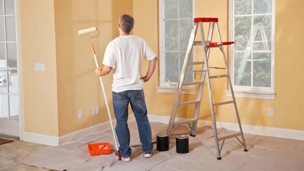
Selecting the perfect paint color can transform your space. Consider key factors and color schemes to make the best choice for your home.
Factors to Consider
Think about the room’s purpose and lighting. Natural light affects how colors look. Test paint samples at different times of day. Room size matters too. Lighter shades make spaces feel bigger, while darker hues create coziness.
Consider existing furniture and decor. Your new paint should complement these elements. Think about the mood you want to create. Calm blues and greens suit bedrooms, while energetic yellows work well in kitchens.
Don’t forget practical concerns. Some colors show dirt more easily. High-traffic areas may need washable paint. Your home’s style is important too. Modern homes often use neutral tones, while traditional spaces can handle bolder colors.
Working with Color Schemes
Start with a color wheel to understand color relationships. Complementary colors sit opposite each other and create contrast. Analogous colors are next to each other and blend well.
Choose a main color, then add accent colors. The 60-30-10 rule is helpful. Use 60% of your main color, 30% of a secondary color, and 10% for accents.
Neutral colors like white, gray, or beige are versatile. They work well with many other shades. For a bold look, try monochromatic schemes using different shades of one color.
Remember, paint colors can affect your mood. Blues and greens are calming. Reds and oranges are energizing. Pick colors that match the feeling you want in each room.
Tips for Sampling and Testing Paint Colors
Want to pick the perfect paint color? Here are some handy tips to help you test samples:
- Get peel-and-stick samples
- Paint large swatches on walls (at least 2 ft x 2 ft)
- Test in different lighting conditions
- Compare options side-by-side
Paint colors can look very different on your walls compared to tiny swatches. That’s why testing is so important.
Start by getting peel-and-stick samples of colors you like. These let you easily move samples around to different spots.
Next, paint large swatches directly on your walls. Aim for at least 2 ft x 2 ft squares. This gives you a much better idea of how the color will look.
Check your samples throughout the day. Colors can change dramatically in different lighting. Make sure you like how they look in both natural daylight and artificial light at night.
Try to narrow down to 2-3 top choices. Paint these options next to each other so you can easily compare. This makes picking your favorite much easier.
Final Thoughts
Choosing the right paint color can make a significant impact on the look and feel of your home. The top paint colors for 2024 offer a mix of bold, soothing, and timeless shades that cater to a variety of design preferences.
Whether you’re drawn to the deep richness of Hague Blue or the calming neutrality of Repose Gray, these trending colors provide fresh inspiration for your home refresh. Remember, the key to achieving the perfect look is to test colors in your space before committing.
With careful selection, you’ll create a living environment that’s not only stylish but also a true reflection of your personality and taste.