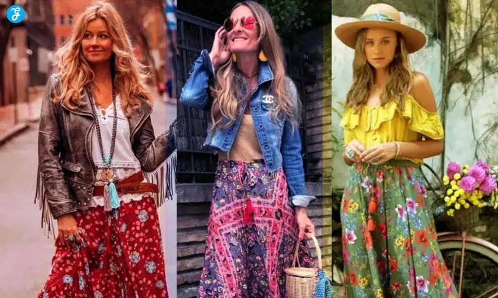
Mixing and matching patterns in your wardrobe or home decor can be a fun, creative way to express your personal style.
However, it can also be a bit intimidating, especially if you’re unsure how to combine different prints without clashing.
Whether you’re updating your wardrobe or redecorating a room, mastering the art of pattern mixing requires an eye for balance, contrast, and harmony.
This guide offers 18 expert tips to help you mix and match patterns like a pro, so you can confidently elevate your style without overwhelming the senses.
1. Start with a Neutral Base
Why It Works:
A neutral base (such as white, beige, gray, or black) provides a clean canvas that allows your patterns to shine without overwhelming the space or outfit.
It helps create a sense of balance and ensures that the patterns are the focal points.
How to Use It:
- In your wardrobe, pair bold prints with neutral pieces like a black skirt or beige trousers.
- For home decor, choose neutral-colored furniture or walls, and add patterned cushions, rugs, or curtains.
Example:
A simple white blouse serves as the perfect neutral backdrop for pairing a bold, patterned scarf and plaid skirt.
2. Stick to a Consistent Color Palette
Why It Works:
Keeping your patterns within a cohesive color scheme helps tie everything together, ensuring that the mix feels deliberate rather than chaotic.
Even when using contrasting patterns, a unified color palette provides visual harmony.
How to Use It:
- Choose one or two main colors and use different shades or tones of those colors across your patterns.
- For home decor, if your primary color is blue, you can mix stripes, florals, and geometric prints in varying shades of blue.
Example:
A floral top with a white and navy color scheme can be paired with navy pinstripe trousers, ensuring the different patterns work together harmoniously.
3. Balance Large and Small Patterns
Why It Works:
Combining large and small patterns creates a dynamic look without overwhelming the viewer.
Too many large patterns can be visually heavy, while too many small patterns can appear too busy.
How to Use It:
- Pair a bold, oversized floral print with a smaller, more delicate geometric or polka dot print.
- In interior design, a large-scale patterned rug can be balanced with smaller patterned cushions or wall art.
Example:
A large floral print blouse paired with a small polka-dot skirt achieves the perfect balance, with the smaller pattern playing a supporting role.
4. Use Stripes as a Neutral
Why It Works:
Stripes are versatile and can be treated as a neutral pattern because of their simplicity and uniformity.
They can anchor bolder, more intricate patterns without competing for attention.
How to Use It:
- Pair a striped top with a floral skirt, or a pinstripe blazer with a houndstooth blouse for a chic, pattern-mixing outfit.
- In decor, striped curtains or rugs can serve as a foundation for mixing with bolder patterns like paisley or ikat prints.
Example:
A navy and white striped t-shirt with a floral maxi skirt creates a balanced yet playful look.
5. Mix Different Textures
Why It Works:
Mixing textures along with patterns adds depth and dimension to your outfit or room, making the overall look more interesting without relying solely on patterns.
How to Use It:
- Combine textured fabrics like velvet, denim, or tweed with bold prints like florals or geometric patterns.
- In home decor, mix a textured throw blanket with patterned cushions or a silk pillow with a patterned rug.
Example:
A chunky knit sweater paired with a smooth satin skirt in a patterned print creates an interesting contrast of textures and patterns.
6. Use a Solid Color to Break Up Patterns
Why It Works:
Adding a solid color piece between two different patterns gives the eye a place to rest, preventing the look from becoming too overwhelming.
It acts as a visual pause between bold prints.
How to Use It:
- If you’re wearing a patterned top and patterned pants, use a solid belt or jacket to break up the patterns.
- In decor, use solid-colored furniture or bedding to complement and balance patterned accents like cushions, curtains, or rugs.
Example:
A bold animal print blouse tucked into a solid-colored skirt creates a clean break before adding a patterned scarf or shoes.
7. Combine Different Pattern Types
Why It Works:
Mixing different types of patterns, such as florals with geometrics, creates visual interest and contrast, making the overall look more dynamic and less predictable.
How to Use It:
- Pair an organic, freeform pattern like floral or paisley with a structured, geometric pattern like stripes or grids.
- In home decor, mix an abstract rug with botanical prints on the walls.
Example:
A floral blouse with a plaid blazer creates an exciting contrast between the structured lines of the plaid and the free-flowing floral design.
8. Keep the Patterns in the Same Tone or Saturation
Why It Works:
When the patterns share the same color intensity or saturation, they feel more cohesive.
High saturation or bold patterns paired with other similarly bold patterns can create a unified look, while softer, muted patterns blend well together.
How to Use It:
- Combine two bold, high-contrast patterns like bright florals and graphic stripes, or pair two soft, muted patterns like pastel polka dots and delicate checks.
- In decor, use soft-toned florals with similarly muted plaids for a calm and cohesive look.
Example:
Pairing a bright, bold paisley print with equally saturated checkered pants keeps the look harmonious, even though the prints are different.
9. Play with Proportions
Why It Works:
Varying the scale and size of patterns keeps the look balanced and prevents it from becoming too monotonous.
Playing with proportions is especially useful when layering multiple patterns.
How to Use It:
- Pair a large, oversized print with a more delicate, intricate pattern to create balance and visual contrast.
- In decor, combine a large-patterned wallpaper with smaller patterned accessories to add interest without overwhelming the room.
Example:
An oversized plaid coat with a small-scale floral dress allows both patterns to stand out without competing for attention.
10. Use Monochromatic Patterns

Why It Works:
Monochromatic patterns involve using different patterns that are all within the same color family.
This approach ensures that even the most intricate patterns work together harmoniously without clashing.
How to Use It:
- Stick to shades of one color, such as black and white, to mix different patterns. For example, pair polka dots, stripes, and houndstooth all in black and white.
- In home decor, use various shades of blue in different patterns to create depth without overwhelming the space.
Example:
A black and white polka dot skirt paired with a black and white striped shirt creates a cohesive look while still offering contrast through different patterns.
11. Start with Accessories
Why It Works:
Accessories are a subtle and effective way to start experimenting with pattern mixing.
They allow you to test combinations on a smaller scale without committing to full outfits or room designs.
How to Use It:
- Pair a patterned scarf with a printed handbag, or mix a polka-dot belt with a floral blouse.
- In decor, try mixing patterned throw pillows or curtains with more neutral or solid-colored furniture before committing to larger pieces like rugs or bedding.
Example:
A leopard print handbag paired with a floral scarf adds a touch of pattern mixing without overwhelming the outfit.
12. Stick to Two or Three Patterns
Why It Works:
Limiting the number of patterns in one look ensures that the overall appearance remains chic and intentional rather than chaotic or mismatched.
More than three patterns can start to feel visually overwhelming.
How to Use It:
- Choose two dominant patterns for your outfit or room and one subtle pattern for balance, like a stripe or solid accent.
- In home decor, mix no more than three patterns, such as florals, stripes, and a small geometric print, to create visual interest without clutter.
Example:
A plaid jacket, striped top, and a solid-colored skirt keep the look balanced while still incorporating pattern mixing.
13. Use Patterns with White Space
Why It Works:
Patterns that have plenty of white space (or any light-colored background) feel less intense and busy.
This white space can act as a buffer, making it easier to mix with bolder or more complex prints.
How to Use It:
- Choose patterns with larger backgrounds and more negative space, such as wide stripes or scattered polka dots, to pair with denser patterns like florals.
- In decor, balance a busy patterned wallpaper with minimalist, white-space-heavy cushions or artwork.
Example:
A wide-stripe dress with ample white space can be paired with a dense floral jacket, creating a balanced and chic look.
14. Play with Contrast
Why It Works:
High contrast between patterns, whether in color, size, or style, creates a bold and dynamic look.
Contrasting patterns can draw attention and make a powerful fashion or design statement.
How to Use It:
- Pair a light pattern with a dark one, such as a pastel floral blouse with a dark plaid skirt.
- In decor, use contrasting colors like black and white in different patterns to create a striking yet cohesive design.
Example:
A pale blue polka-dot blouse paired with a dark houndstooth pencil skirt offers contrast in both pattern style and color, making the outfit stand out.
15. Layer Patterns Gradually
Why It Works:
Layering patterns in a gradual, subtle way allows you to build complexity without overwhelming the overall look.
Start small with just one patterned piece, and then add another layer of pattern to enhance the look.
How to Use It:
- Begin with a patterned accessory like a scarf or shoes, and then gradually add more patterns, such as a printed jacket or skirt.
- In home decor, start with patterned throw pillows and slowly incorporate additional patterned elements like rugs, curtains, or art.
Example:
A solid-colored dress can be paired with a patterned scarf, and later a patterned jacket, to build a layered and stylish look.
16. Mix Prints in Different Scales
Why It Works:
Mixing prints in varying scales prevents them from clashing while creating a cohesive and balanced look.
Larger-scale prints tend to be more dominant, while smaller-scale prints serve as subtle accents.
How to Use It:
- Pair a large floral or abstract print with a smaller-scale geometric or stripe pattern to keep the balance.
- In decor, use large-patterned upholstery and small-patterned cushions to create depth without overcrowding the room.
Example:
A large floral print dress can be paired with a smaller checkered jacket, ensuring that the patterns complement rather than compete with each other.
17. Match Pattern Styles to Your Aesthetic
Why It Works:
Mixing patterns that align with your overall aesthetic ensures that the final look feels authentic and cohesive.
Whether you prefer a minimalist, bohemian, or bold and vibrant style, the pattern combinations should reflect your personal taste.
How to Use It:
- Choose patterns that match your style, such as sleek geometric designs for a modern aesthetic or paisley and floral prints for a bohemian look.
- In decor, match vintage-style patterns with mid-century furniture or modern patterns with contemporary pieces.
Example:
For a minimalist aesthetic, pair sleek black and white stripes with a simple grid pattern for a clean, modern look.
18. Don’t Be Afraid to Experiment
Why It Works:
The key to mastering pattern mixing is confidence and experimentation. Sometimes, the most unexpected combinations can turn into stunning outfits or designs.
Don’t be afraid to take risks and try new things.
How to Use It:
- Experiment with bolder patterns like animal prints, bold florals, or abstract designs, and see how they work together.
- In decor, try combining patterns you wouldn’t normally pair, such as tropical prints with geometric designs, to see what unique combinations you can create.
Example:
Pair a zebra print top with a plaid skirt for a bold and unconventional yet stylish look. Experimenting with different patterns and seeing what works is part of the creative process.
Takeaway
Mixing and matching patterns is an art form that, once mastered, can bring depth, personality, and flair to your outfits or home decor.
By following these 18 expert tips, you can confidently create eye-catching combinations that express your unique style.
Remember, the key is balance—whether through color, scale, or texture.
Start experimenting with small pieces, and as you become more comfortable, take bolder steps toward mastering the art of pattern mixing like a pro.