Web design changes fast. What looked cool last year might seem old today. Many site owners struggle to keep up with new trends like dark mode and glassmorphism. They want modern sites but don’t know where to start.
Dark mode has grown from a nice option to a must-have feature in 2025. Users love dark backgrounds on their phones and computers. Dark screens cut eye strain and save battery life on OLED screens.
This makes browsing more comfy at night.
This post will walk you through the top web design trends for 2025. You’ll learn how to use dark mode and glass effects in your projects. We’ll also show you simple ways to mix these styles for sites that pop.
Ready for a fresh look?
Key Takeaways
- Dark mode has grown from a nice option to a must-have feature in 2025, helping cut eye strain and save battery life on OLED screens.
- Glassmorphism uses frosted glass effects with blur and transparency to add depth to web designs, making content clear without cluttering screens.
- Bold typography is taking over in 2025, with designers using rich serif fonts and chunky slab-serifs to make headers that twist and turn.
- Minimalist maximalism mixes clean layouts with eye-catching details, using plain backgrounds with bright colors or big type.
- Combining dark mode with glassmorphism creates unique interfaces, but designers must ensure text stays readable and pages load quickly.
Dark Mode: A Core Design Element in 2025
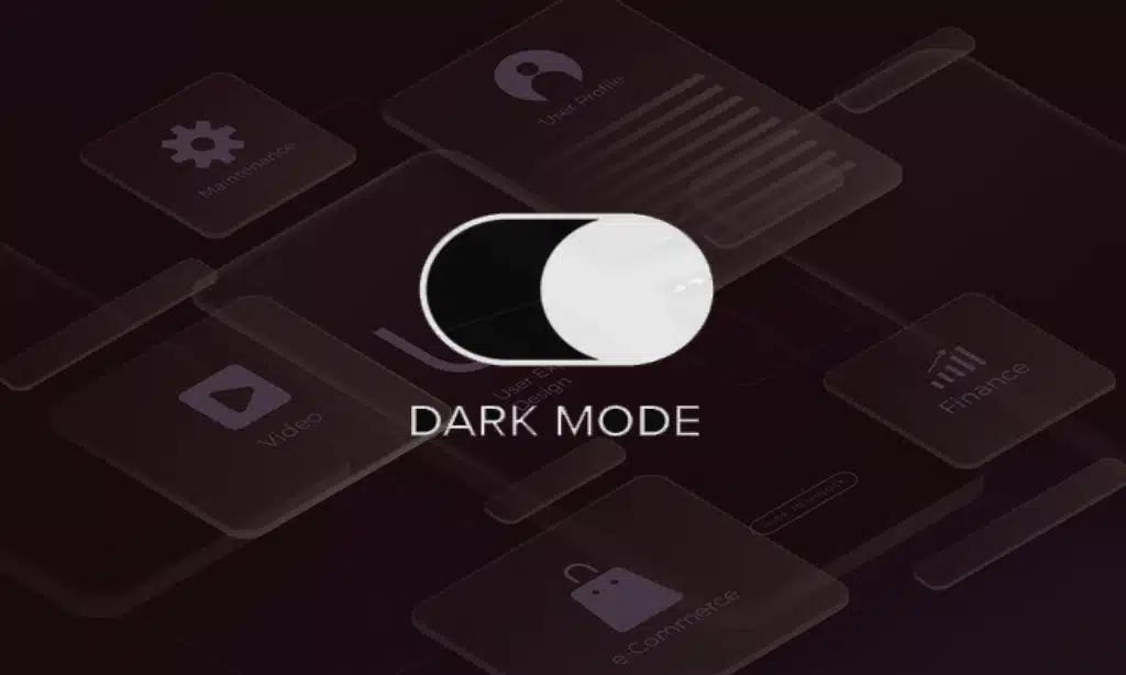
Dark Mode will rule web design in 2025. Users love the sleek look and eye comfort it brings, making it a must-have for all new websites and apps.
Benefits of Dark Mode for Accessibility and User Experience
Dark mode helps many people see better on screens. It cuts down eye strain when you use your phone or computer at night. The black background with light text makes reading easier in dim rooms.
People who get headaches from bright screens love this option. Many users report less digital fatigue after switching to dark themes on their apps.
Your phone battery will thank you too! Dark mode uses less power on OLED and AMOLED screens. This means your device runs longer between charges. The high contrast of white text on black makes content pop for most users.
Bold typography stands out more in dark mode, making important info easy to spot. Apps now let you switch between light and dark with one tap, giving you control over your visual comfort.
Best Practices for Implementing Dark Mode
Dark mode has become a must-have feature for websites in 2025. Users love dark screens that cut eye strain and save battery life on their devices.
- Pick true blacks for OLED screens to save power. OLED displays turn off pixels for black areas, which helps phones last longer.
- Add soft grays for a less harsh look that still feels dark. Mix in deep colors that pop against the dark background.
- Test your text colors to make sure people can read them easily. Light text on dark screens needs more space between lines.
- Create clear borders between sections with subtle shadows. This helps users see where one part ends and another begins.
- Let users switch between light and dark modes with a simple button. Place this button where it’s easy to find.
- Make dark mode work on all screen sizes from phones to big monitors. Test how it looks when people turn their devices.
- Use bold colors as accents to guide the eye to important spots. Red, blue, or green can stand out nicely on a dark screen.
- Keep file sizes small by using smart CSS for your dark mode styles. This makes pages load faster for everyone.
- Add smooth fade effects when users switch between modes. This small touch makes the change feel nice and planned.
- Think about how images will look on dark backgrounds. You might need to add thin borders around light pictures.
Glassmorphism: Redefining UI with Transparency
Glassmorphism brings a fresh take on see-through elements in web design. This style uses frosted glass effects to create depth while keeping interfaces light and airy.
Key Features of Glassmorphism
Glassmorphism creates a see-through effect that makes web elements look like frosted glass. This style uses transparency with blur effects in the background to give depth to flat designs.
The glass-like surfaces have soft shadows that make them float above the page. Many apps now use this style because it helps show content clearly without making the screen too busy.
The magic of glassmorphism comes from its light borders and subtle glow effects. These touches make buttons and cards pop off the screen in a gentle way. Designers love this trend because it works with both simple and bold color schemes.
You can spot this style in many places like macOS Big Sur and Windows 10 interfaces. The best part? It makes text easy to read while still looking modern and clean.
Tools and Techniques to Create Glassmorphic Designs
Creating glass-like effects has become a hot trend in web design. You need the right tools and know-how to make these see-through elements pop on your site.
- Figma offers ready-made glassmorphism components that save time. You can adjust blur levels and transparency with simple sliders.
- Adobe XD lets you build glass effects with its blur features. The program makes it easy to add depth to your user interface.
- Sketch works great for Mac users who want to create glass-like designs. Its blur tools help make realistic transparent elements.
- CSS code is key for web developers making glass effects. The backdrop-filter property creates that frosted glass look.
- Photoshop helps designers add subtle shadows to glass elements. These shadows make the design feel more real.
- Color selection matters a lot in glass designs. Bright colors behind transparent areas create a cool glow effect.
- Contrast checking tools help keep text readable on glass backgrounds. Good contrast keeps your design accessible to all users.
- Glassmorphism.com offers free templates to start your projects. These templates speed up your design process.
- Blur values between 5-15px work best for most glass effects. Too much blur can make your design hard to use.
- Layer management is vital when working with transparent elements. Good layers help you fix problems fast.
- Depth markers help show which glass panels sit on top of others. This creates a more 3D feel in your flat design.
- Testing tools check how your glass effects look on different screens. This stops your design from breaking on phones or tablets.
Other Web Design Trends in 2025
Web design will take wild turns by 2025. Expect to see websites that mix simple layouts with bold choices, giant text that moves when you scroll, and spaces that feel almost real enough to touch.
Minimalist Maximalism
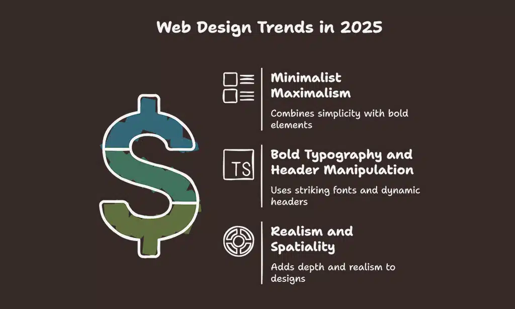
Minimalist maximalism mixes simple layouts with bold elements. This trend takes the “less is more” idea and adds a twist – you get clean spaces plus eye-catching details. Designers now use plain backgrounds with bright colors or big type.
The flat design stays, but gets more life with subtle shadows and bold typography.
Tech startups love this style for their websites and apps. It works great for mobile screens too. The mix helps brands stand out without making users feel lost. This approach also fits with growing concerns about ethics in design.
Many companies now want their digital spaces to reflect their values while still looking fresh and clean.
Bold Typography and Header Manipulation
Bold type choices will rule web design in 2025. We see a big move from plain shapes to rich serif fonts and chunky slab-serifs. Designers now play with pixel fonts for eye-catching headlines that pop off the screen.
Headers no longer just sit at the top – they twist, turn, and break rules. This fresh take on text helps brands stand out in a crowded digital world.
Variable fonts are changing the game too. These smart files pack many styles in one, letting designers create fluid text that shifts and changes. Big, bold letters mixed with tiny details create drama on the page.
The best part? These text tricks work great with dark mode and glass effects. Web pages now feel more like art than just info on a screen.
Realism and Spatiality in Web Design
Web design in 2025 brings real-world textures to our screens. Designers now add light and shadow to make sites feel like things you can touch. You’ll spot subtle shadows that make buttons pop out from the page.
This new style moves away from flat design that was big years ago. Sites now look more like the apps on macOS Big Sur with depth and space that feels natural to users surfing the web.
3D spaces create sites that pull you in like never before. Parallax effects make objects move at different speeds as you scroll, just like in real life. This depth tricks your eyes in a good way! Many dashboards now use rounded corners for a softer look that feels less sharp and more friendly.
These spatial designs work great with voice commands too, making user interfaces both pretty and easy to use. The goal is simple: make websites feel less like flat pages and more like real places.
Combining Trends: Dark Mode and Glassmorphism for Unique Interfaces
Dark mode and glassmorphism work great together. Dark backgrounds make frosted-glass effects pop more on screens. This combo creates cool looks for apps, games, and websites. Many top brands mix these styles in their products.
The dark canvas helps the see-through glass elements stand out with their soft glow and blur effects.
You need to watch a few things when you mix these trends. Keep text easy to read with good contrast. Also, glass effects can slow down some devices. Test your designs on many screens to make sure they look good and load fast.
This mix works well for finance apps, SaaS tools, and fancy portfolio sites where you want to grab attention. The best designs use these trends with care, not just to look cool.
Takeaways
Web design keeps moving forward at full speed. Dark Mode and Glassmorphism will stay hot in 2025, but they work best when they solve real user needs. Smart designers will mix these trends with bold type and 3D elements to create sites that pop.
Figma and Adobe XD remain key tools to master these styles. As screens change and tech grows, the best designs will balance cool looks with how real people use websites. Your next amazing project might just blend these trends in ways we haven’t seen yet!
FAQs
1. What is dark mode in web design?
Dark mode is a color scheme that uses light text on a dark background. It helps reduce eye strain and saves battery life on phones. Many apps like Twitter and Instagram now offer this option for better user experience.
2. How will glassmorphism change UI design in 2025?
Glassmorphism uses subtle shadows and transparent effects that look like frosted glass. This style builds on flat design but adds depth with blur effects. It’s already seen in macOS Big Sur and will grow in mobile development.
3. What role will bold typography play in future web design trends?
Bold typography will grab attention in minimalist UI designs. Designers will use unique typefaces to make statements without fancy graphics. This trend works well with voice assistants and horizontal scrolling layouts.
4. Will minimalism still be popular in user interface design by 2025?
Yes! Minimalism art influences will stay strong in UI/UX design. Simple layouts with fewer buttons make websites easier to use. This clean approach works great with keyboards, mouse inputs, and new passkeys systems.
5. How will artificial intelligence affect web design?
AI will help create dynamic content that changes based on who’s viewing it. It will make Google search results more personal. UI/UX designers will use AI to test wireframes faster and build better user experiences.
6. What is inclusive design and why is it important?
Inclusive design makes websites work for everyone, including people with disabilities. It’s about creating interfaces that adapt to different needs. This approach will become standard on social media platforms and in augmented reality applications by 2025.


