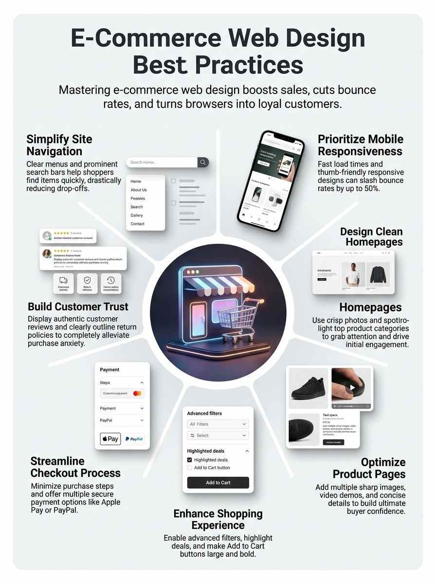
Running an online store becomes challenging when visitors leave due to poor usability. Even great products fail to convert if Web Design for E-Commerce creates confusion or friction. It’s like a poorly organized storefront—customers won’t stay if they can’t easily find what they need. A cluttered or slow website quickly drives shoppers to competitors, reducing both sales and loyalty.
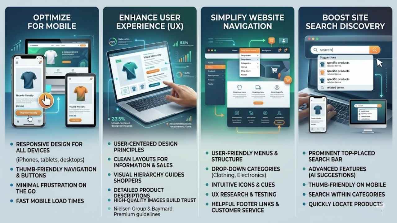
Fast load times and mobile responsiveness are critical. Research shows these factors can reduce bounce rates by up to 50%, highlighting the importance of effective UX design in keeping users engaged.
Strong Web Design for E-Commerce focuses on clear navigation, optimized product pages with high-quality images and videos, and a smooth, secure checkout process.
Building trust also plays a key role. Features like customer reviews, transparent return policies, and compelling offers help increase conversions and encourage repeat purchases.
A well-designed e-commerce site doesn’t just attract visitors—it keeps them engaged and turns them into loyal customers.
Importance of Effective E-Commerce Web Design
E-commerce website design demands careful thought on many factors that boost user experience and lift conversion rates. Think of your site as a busy store where folks browse and buy.
Responsive design fits all screens, from iPhones to tablets and desktops, so customers shop without a hitch. Thumb-friendly buttons and easy navigation make mobile use a breeze, cutting frustration on the go.
Clean layouts serve info and sales at once, like a well-stocked shelf that invites quick grabs. User-centered design shapes every part, putting customers first in structure and features.
Clear paths guide shoppers to products fast, saving time and sparking sales.
Great design is about making other designers feel like idiots because that idea wasn’t theirs. – Frank Chimero
High-quality images show off goods and build trust for smart buys. Detailed descriptions give key facts that sway purchase decisions, much like chatting with a helpful clerk. Fast loads and mobile tweaks cut bounce rates, keeping visitors hooked.
Picture a site that loads slow; folks bail like rats from a sinking ship. Brands like IKEA and Pottery Barn nail this with visual hierarchy and product videos, drawing in online shopping crowds.
Tools from Nielsen Group and Baymard Premium back ux guidelines, proving these steps amp customer experience and retail ecommerce success.
Ever feel lost in a maze of menus on a shopping site, like chasing your tail? Make it easy with clear user interface design and a strong internal site search, plus solid footer links, to guide shoppers straight to what they want, boosting sales without the hassle.
Menus make or break your e-commerce site’s flow, like a roadmap that guides shoppers straight to the goods. Clear navigation keeps customers happy and boosts those conversion rates, drawing from user-centered design principles that put people first.
- Create drop-down menus that group products by categories, such as clothing or electronics, to help users spot what they need without endless clicks, tying into usability testing that shows how quick finds cut bounce rates.
- Place main menus at the top or use footer navigation for extra links, ensuring responsive design adapts them fluidly to desktops, tablets, and iPhones for seamless access anywhere.
- Design thumb-friendly interactions with big buttons and spacing, so mobile users tap easily without frustration, which supports fast load times and improves total user experience on e-commerce sites.
- Add icons next to menu items for visual cues, like a cart symbol for shopping cart design, making the user interface design more intuitive and fun, almost like chatting with a helpful store clerk.
- Test menus through UX research to catch glitches early, incorporating feedback from tools like Google Analytics to refine them, because e-commerce website design demands that careful touch for high conversion rates.
- Include links to help pages and customer service in menus, building trust with clear paths to info, much like how brands like REI or Williams-Sonoma highlight return policies to ease buyer worries.
- Use bold text or colors for key menu sections, applying design standards that mix font style variations and bullets to make elements stand out, helping customers navigate efficiently on product-detail pages.
- Integrate internal site search right in the menu bar, letting shoppers jump to items fast, which aligns with Forrester insights on how this feature enhances the shopping experience and reduces drop-offs.
- Feature call-to-action buttons in menus, such as “Shop Now” for best sellers, drawing from digital marketing experts’ tips to make them prominent and drive sales like pros at Toptal recommend for hire talent in developers or product managers.
- Keep menus clean and focused, avoiding clutter since e-commerce sites handle both info and transactions, using high-quality imagery in linked categories to build confidence and inform purchases.
Include a prominently placed search bar
Place that search bar right up top, folks, where shoppers spot it first. It acts like a trusty sidekick in ecommerce website design, helping customers hunt down products fast without digging through endless pages.
Think about user-centered design principles, they guide this setup to boost user experience and cut bounce rates. Make it responsive too, so it works smooth on iPhones, tablets, and desktops.
Thumb-friendly size matters for mobile users, letting them tap without frustration. Clear navigation like this turns browsers into buyers, blending informational needs with quick transactions.
A well-placed search bar is the shortcut to customer satisfaction, says a UX expert from Kayako.
Incorporate advanced features, say with artificial intelligence for smarter suggestions, to amp up that shopping vibe. Pair it with call-to-action buttons that pop, drawing eyes to key spots.
Sites like Newegg and eBags nail this, showing how it builds brand identity and trust. Fast load times keep things zippy, while clean design focuses on what counts. SEO experts note it helps with rankings too, making your site a go-to spot.
Designing a Clean Homepage
Picture your homepage as the front door to a bustling store, welcoming shoppers with crisp, eye-catching photos that spark curiosity right away. Throw in bold calls-to-action for top categories, like Urban Outfitters does with their quick peeks at trendy gear, and watch visitors dive deeper into your site, eager for more.
Use high-quality images
High-quality images grab attention right away on your e-commerce homepage. They showcase products in sharp detail, like a window into a real store. Think of Urban Outfitters, they use crisp photos that make clothes pop and draw you in.
This builds trust, as customers feel confident about what they buy. Plus, add augmented reality features for virtual try-on, and watch engagement soar.
Pair those images with clean layouts to keep things focused. Fast load times matter too, so optimize files without losing quality. Tools like UX-Ray help analyze how visuals impact user flow.
Throw in a strong call-to-action button nearby, and you guide shoppers straight to deals. It’s like giving them a friendly nudge toward that purchase.
Highlight key product categories
E-commerce sites thrive when they spotlight main product groups right on the homepage. This approach draws in shoppers, boosts engagement, and drives sales like a magnet pulling in metal.
- Place key product categories front and center on your clean homepage to serve both info and buying needs at once, much like a friendly store clerk pointing out the best aisles; think of it as the heartbeat of user-centered design principles that make browsing a breeze, and tie in high-quality images to showcase them effectively, building customer confidence in their purchase decisions.
- Use responsive design so these categories adapt fluidly to all screen sizes, from iPhones and tablets to desktops, keeping things thumb-friendly for mobile users with properly sized buttons and easy navigation elements; sales experts from Fortune 500 companies stress this cuts bounce rates, while fast load times improve the general user experience.
- Make categories pop with font style variations, bullets, line breaks, and spacing in product list design, creating unique and easily recognizable info elements; it’s like giving each group its own personality, and design studio UI/UX pros recommend this for e-commerce sites where clear navigation helps customers find products and details efficiently.
- Add call-to-action (CTA) buttons next to highlighted categories for quick access, turning casual browsers into buyers; imagine a shopper spotting a “Deals” section and clicking through in seconds, which management consultants at CEB note directly impacts conversion rates by simplifying the path to detailed product descriptions.
- Feature product quick-view options within categories to let users peek at high-quality images, videos, and concise details without leaving the homepage; finance experts point out this enhances the shopping experience, reduces steps, and builds trust through user reviews and ratings displayed nearby.
- Outline key aspects like return and refund policies near category highlights to foster trust, as professional services from Newsweek highlight; this empathetic touch, combined with advanced filtering options, makes the site feel reliable, much like chatting with a helpful neighbor about the best buys.
- Draw from project managers’ advice to minimize clutter around categories, ensuring a focused design that handles transactional purposes without overwhelming visitors; it’s a game-changer for reducing bounce rates, and sales experts agree it provides essential info for informed purchasing choices.
Optimizing Product Pages
Picture your product page as a storefront window that draws shoppers in, with crisp photos and quick videos making items pop off the screen. Shoppers love zooming in on details through tools like image sliders, so add those to boost clicks and keep carts filling up.
Include multiple high-quality product images
Show off your products with several sharp photos on each page. Customers love to see items from different angles, like a close-up of fabric texture or a full view of a gadget in use.
This builds their trust, you know, because high-quality imagery lets them picture owning it. Think of it as giving them a virtual try-on, right in their browser.
Pair those images with responsive design so they look great on phones, tablets, or computers. Fast load times keep folks from clicking away, and thumb-friendly buttons make zooming in easy on mobile.
User-centered choices like this boost confidence and help turn browsers into buyers, no doubt about it.
Add videos to showcase products
Videos let customers see products move and work in real life. Place them right on product pages to grab attention fast. Think of it like a quick demo at a store; it helps folks picture using the item at home.
High-quality clips build trust and cut down doubts about buys. Keep files small for speedy loads, especially on phones and tablets.
Mobile users tap screens with thumbs, so make videos easy to play without fuss. Pair them with clear details to guide smart choices. This setup boosts the whole shopping vibe, mixing info and easy buys in one spot.
Shoppers stick around longer when pages feel clean and focused.
Provide clear and concise product details
Product details matter a lot on e-commerce sites. They help customers decide what to buy, like a roadmap in a busy store.
- Customers need essential info to choose wisely, so detailed product descriptions guide them through tough picks, almost like a helpful friend whispering advice in their ear.
- Use font style variations, bullets, line breaks, and spacing in product list design. This makes info elements stand out and easy to spot, turning a jumbled page into a clear path that boosts confidence.
- E-commerce sites juggle info and sales at once, so clean, focused design keeps things sharp. Picture it as a tidy kitchen where everything has its place, making shopping feel smooth.
- Apply user-centered design principles across the site. This puts shoppers first, creating details that feel personal and empathetic, hey, we’ve all been confused by vague listings before.
- High-quality imagery pairs well with concise details. It showcases products and builds trust, like showing off a shiny apple instead of just saying it’s red.
- Fast load times team up with clear details to cut bounce rates. Nobody sticks around for slow, murky info; it’s like waiting in a long line at a foggy window.
- Responsive design adapts to phones, tablets, and desktops. This keeps product details readable everywhere, ensuring thumb-friendly buttons make mobile shopping a breeze, no squinting required.
- Clear navigation helps folks find these details quickly. It’s fundamental, like a signpost in a maze, cutting frustration and speeding up that “aha” moment.
Enhancing the Shopping Experience
6. Enhancing the Shopping Experience: Imagine your online store as a bustling market where shoppers zip around with ease, so add smart filters for colors and prices to help them find treasures fast, spotlight hot deals in a special spot to spark excitement, and paint that “Add to Cart” button big and bold like a neon sign calling their name—stick around for tips on smoothing out checkout next!
Enable advanced filtering and sorting options
Customers love quick ways to find what they want. Advanced filtering and sorting options make shopping a breeze, boosting satisfaction and sales.
- Shoppers use filters for price, color, size, and brand to narrow down choices fast, applying user-centered design principles that help them make informed decisions without hassle.
- Sorting by popularity, price low to high, or newest arrivals lets users organize products their way, which ties into clear navigation that cuts down on frustration and keeps bounce rates low.
- Mobile users tap thumb-friendly buttons for these features on iPhones and tablets, ensuring responsive design adapts smoothly to all screen sizes for easy access anywhere.
- Fast load times matter when filters update results in real time, combining with clean design to handle both info and buying tasks without slowing things down.
- Product lists show up with font style changes, bullets, line breaks, and spacing after sorting, making each item stand out and easy to spot for better user experience.
- Detailed product info pairs well with these tools, giving customers key facts right after they filter, which builds confidence in their picks.
- High-quality images load alongside filtered results, showcasing items clearly to match what users sort for, like best sellers or deals.
Feature a “Best Sellers” or “Deals” section
Spotlight best sellers and deals right on your e-commerce site. This simple move guides shoppers to hot items, like a treasure map leading to gold. Imagine a customer lands on your page feeling overwhelmed by choices.
A clear “Best Sellers” section cuts through the noise, showing what others love most. Add a “Deals” area too, with discounts that pop. These spots boost user experience, spark quick buys, and lift conversion rates.
They fit user-centered design, making info easy to spot with varied fonts, bullets, and spacing.
Keep these sections clean and focused, since your site handles info and sales at once. Place them on the homepage or category pages for easy access. High-quality images of featured products build trust, while fast load times keep visitors hooked.
On mobile, make buttons thumb-friendly for smooth taps. Think of it as rolling out the red carpet for buyers, helping them snag great finds without hassle. This approach reduces bounce rates and turns browsers into loyal fans.
Place that “Add to Cart” button right where customers can’t miss it. You want shoppers to spot it fast on product pages. Size it big, and pick a bold color that pops against the background.
This grabs attention like a neon sign in a dim store. E-commerce sites thrive on user-centered design principles, so apply them here for smooth interactions. Think about thumb-friendly touches too, especially on mobile devices.
Customers tap with ease when buttons feel just right.
Responsive design adapts the button to every screen, from iPhones to desktops. Keep the layout clean and focused, blending info with quick buys. Fast load times help, cutting bounce rates as folks add items without waits.
Picture a frustrated shopper hunting for the button; don’t let that happen. Make it stand out, and watch conversions climb. Clear navigation ties in, guiding users straight to that key click.
Streamlining the Checkout Process
Picture your shoppers, eager to snag that deal, but stuck in a long line at checkout—talk about a buzzkill. Cut those steps down with one-click buying and toss in options like PayPal or Apple Pay, so they zoom through without a hitch, keeping that excitement alive for more clicks ahead.
Minimize steps to complete purchases
Customers hate long checkout lines in stores, and the same goes for online shops. Cut down the steps to buy something. Make it quick, like a sprint instead of a marathon. Shoppers might drop off if they face too many forms or clicks.
E-commerce sites need clean, focused design for both info and sales tasks. Apply user-centered principles to the whole setup. This boosts user experience and lifts conversion rates.
Fast load times help here, especially on phones and tablets. Add thumb-friendly buttons for easy taps. Offer choices like credit cards or digital wallets for secure payments. Responsive design lets the site fit any screen, from iPhones to desktops.
Shoppers finish buys faster this way, and bounce rates drop. Imagine a buyer ready to pay, but the process drags; don’t let that happen.
Provide multiple secure payment options
Shoppers love choices at checkout, and offering various safe ways to pay keeps them happy. This approach builds trust and boosts sales, like giving folks their favorite flavor of ice cream.
- Offer credit cards from big names like Visa and Mastercard, which let buyers pay fast and feel secure with built-in fraud protection that e-commerce sites need for smooth transactions.
- Add digital wallets such as Apple Pay or Google Pay, perfect for mobile users who want thumb-friendly taps on iPhones and tablets, cutting down steps and improving the shopping experience.
- Include PayPal as an option, a trusted tool that handles payments without sharing bank details, helping build customer confidence just like high-quality images do for products.
- Provide bank transfers for those who prefer direct methods, ensuring the site adapts to desktops and other devices with responsive design that loads quickly to reduce bounce rates.
- Accept cryptocurrencies like Bitcoin if it fits your crowd, adding a modern twist that shows you apply user-centered principles to make the checkout feel personal and efficient.
- Use secure gateways like Stripe to process all payments, which tie into clear navigation and fast load times, making the whole site more reliable for informed buying choices.
- Show security badges from tools like SSL certificates right at checkout, much like displaying reviews, to outline safe policies and encourage folks to complete their purchases without worry.
Building Trust with Customers
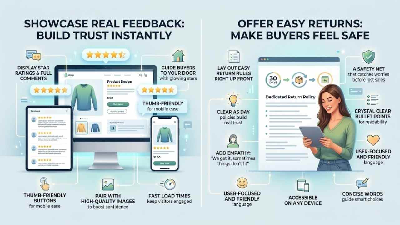
8. Building Trust with Customers: Show off those glowing five-star ratings from happy shoppers, like stars in a night sky guiding buyers to your door. Lay out your easy return rules right up front, clear as day, so folks feel safe hitting that buy button.
Display customer reviews and ratings
Customers love seeing what others think before they buy. Show reviews and ratings right on your product pages. This builds trust fast, like a friend sharing their story. Use stars for quick glances and full comments for details.
Make sure the setup fits all devices, from iPhones to desktops, with responsive design. Thumb-friendly buttons let mobile users tap easily. High-quality images pair well with these reviews to boost confidence.
E-commerce sites thrive on user-centered design principles. Place reviews where folks spot them without hunting. Clear navigation helps customers find this info quick. Detailed product descriptions work hand in hand with ratings to guide choices.
Fast load times keep visitors engaged, cutting bounce rates. Think of it as rolling out the welcome mat, making shoppers feel secure and informed.
Clearly outline return and refund policies
Show your return and refund policies right up front. Place them in easy spots, like the footer or a dedicated page. This simple step builds real trust. Shoppers feel safe knowing they can return items without hassle.
Think of it as a safety net that catches worries before they turn into lost sales. Clean design makes these policies pop, blending info with smooth buys. High-quality images nearby boost that confidence too.
Make policies crystal clear with short bullet points. List time frames, like 30 days for returns, and steps to follow. Add empathy here, saying something like, “We get it, sometimes things don’t fit.” This keeps things user-focused and friendly.
Fast load times help folks read them on any device, cutting frustration. Detailed yet concise words guide smart choices, turning browsers into buyers.
Final Thoughts
Great e-commerce sites thrive on simple navigation, clean homepages, sharp product pages, smooth checkouts, and trust-building features like reviews. You can apply these tips fast, with tools like Google Analytics to track what works best.
Imagine your online store as a welcoming shop window; responsive design cuts bounce rates and lifts sales big time. Check out resources from Shopify’s blog for more UX tricks, or chat with a web pro for custom tweaks.
Go ahead, tweak your site today, and watch customers flock back like bees to honey.
Frequently Asked Questions (FAQs) About Web Design for E-Commerce
1. What’s the top best practice for e-commerce web design?
Keep it simple and user-friendly, folks. Think of your site like a welcoming store window that draws people in without overwhelming them. Fast loading times and clear calls to action make all the difference in turning browsers into buyers.
2. How do I make my e-commerce site mobile-friendly?
Mobile optimization is key, because most shoppers use their phones these days. Test your design on different devices to avoid those pesky glitches.
3. Why focus on secure checkout in web design?
A secure checkout builds trust, like a sturdy lock on your front door. It protects customer data and reduces cart abandonment, keeping everyone happy and safe.
4. What’s a smart way to handle product images in e-commerce design?
Use high-quality images that zoom in for details; it’s like giving shoppers a close-up view without leaving home. Pair them with quick descriptions to boost engagement and sales.