
In the increasingly competitive world of business, every tool and methodology that aids strategy and decision-making can be significant. One such important tool is the Pareto Chart. But what exactly is it, and how can it be beneficial to your business? Keep reading to find out.
Understanding the Concept of a Pareto Chart
A Pareto Chart is a type of vertical bar graph used in statistical analysis and project management for decision-making. Developed by economist Vilfredo Pareto, this chart is primarily used to prioritize work by identifying the largest contributing factors to a problem.
The chart is based on the famous Pareto Principle, also known as the 80/20 rule, which says that 80% of outcomes are typically derived from 20% of causes. When you want to know What is a Pareto Chart, you should familiarize yourself with the Pareto Principle first.
Essentially, Pareto charts give a visual representation of data to help determine which factors are the most significant. They are quite versatile and can be used in a variety of fields, including quality control and customer feedback analysis.
More fundamentally, a Pareto chart helps businesses focus their efforts effectively and efficiently by targeting the problems that cause the most damage.
The Significance of the Pareto Principle in Business Analysis
In business analysis, the Pareto Principle is a vital tool. This principle can help to highlight the most critical problems or opportunities by showing which issues to prioritize for the maximum impact.
For example, a business may discover that a majority of its customer complaints stem from a small number of root causes. By focusing on rectifying these few issues, the business can significantly enhance customer satisfaction and retention.
In many cases, organizations spread their resources too thin, trying to address all problems simultaneously. Adopting the Pareto Principle can provide them with a more strategic approach to problem-solving, thereby enhancing their efficiency and effectiveness.
The Pareto Principle, depicted in a Pareto chart, is an ingenious way of turning raw, unsorted, and sometimes, overwhelming data into meaningful and actionable insights.
How a Pareto Chart Works: An Insight into its Structure
ALT: Visual representation of a Pareto chart highlighting the most significant factors contributing to an observed effect
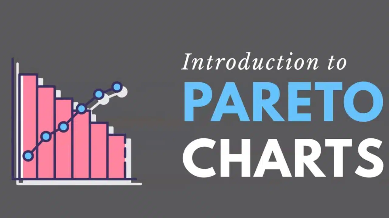
A Pareto chart consists of two basic components: bars and a line. The bars represent individual values (problems, issues, causes), and their height depends on their incidence rate. The bars are arranged in descending order starting from the left, with the highest incidence rate first.
The line chart, plotted on the secondary y-axis, represents the cumulative frequency of the problems. The line starts from the first bar and ends at 100% on the secondary y-axis, indicating that all problems have been represented.
This structure allows for an easy visual comparison of different problems, enabling decision-makers to quickly identify the most significant issues that need to be addressed first. Additionally, the accumulation line provides an overview of the cumulative impact of fixing the problems in order.
Understanding the structure of a Pareto chart is vital in using it effectively and interpreting the data correctly.
The Process of Constructing a Pareto Chart
The construction of a Pareto chart starts with identifying a list of problems, errors, or causes. Afterward, data is collected to represent the frequency, cost, or count of each problem. The higher the count or cost, the more significant the problem would be considered.
Next, the problems are sorted in descending order, and a cumulative sum is calculated. Drawing the bars and the cumulative percentage line completes the construction of the Pareto chart.
When constructing a Pareto chart, accuracy is critical. It’s important to ensure that the data is correct and relevant to ensure that the resulting chart is a faithful representation of the situation.
Incorrect or skewed data can lead to misinterpretation of the issues, resulting in ineffective strategies and wrong business decision-making.
Role of a Pareto Chart in Identifying Problem Areas
ALT: Close-up of a Pareto chart showcasing the 80/20 principle in data analysis
In identifying problem areas, a Pareto chart plays an important role. By prioritizing issues based on their occurrence frequency, the chart helps organizations focus their resources and attention on the most significant problems.
For instance, in a manufacturing company, a Pareto chart might reveal that a significant portion of product defects arise from a certain process. By addressing this process, the company can drastically reduce the defect rates.
Pareto charts go beyond merely identifying the issues – they also provide insight into the relative impact of each problem on the bigger picture. This enables businesses to make decisions that could have the most impact on their performance.
Moreover, Pareto charts are not static; they evolve as data is updated, allowing for ongoing analysis and adjustment of strategies.
Overall, Pareto charts are a potent tool for businesses, providing a simple and visual way to prioritize and address problems effectively. By avoiding common mistakes and leveraging these charts wisely, you can stay a step ahead in today’s competitive business landscape.