Do you know the importance of typography in web design? Beyond branding aesthetics, typography profoundly impacts web design effectiveness by facilitating scanability, amplifying messaging, building user trust and driving desired actions from engagements to conversions. Strategic font selections contribute to constructing cohesive website experiences and objectives.
This guide will uncover the many reasons thoughtful typography proves essential for optimizing online presentation and performance through enhanced readability metrics and seamless user flows, directly elevating bottom-line business results. Read on to start intentionally applying type design to website success!
Content Highlights
- Typography creates a visual hierarchy, distinguishing informational importance, gradients and flow.
- Readability and scanability rely on comfortable, careful spacing, sizes and style selections.
- Brand identity and psychology leverage proven typeface associations and emotions.
- Call-to-action prominence improves through strategic font treatments and demand responses.
- Findability, accessibility and conversion goals are all partially dependent on typographic components.
- Applying core spacing and sizing guidelines prevents common readability pitfalls, undermining positive user experiences.
- Prioritizing typography Early website planning ensures cohesive presentations, informed structures and impactful, precise messaging.
Why does Typography Matter in Web Design?
Typography refers to selecting appropriate fonts and applying them to enhance textual content presentation. On websites, effective type choices assist in visually communicating ideas easily through good readability and appropriate styling, conveying brand personality or urgency for desired messaging objectives like encouraging purchases. Poor readability from overly decorative fonts or weak visual hierarchy between headings causes confusion.
Since written ideas influence visitor behaviors, presentation and readability profoundly impact outcomes. From aesthetics setting first impressions to emphasizing call-to-actions, typography constructs experiences, not mere decoration. Hence, strategic font pairing with genuine content requires equal planning and designing pages effectively.
Optimizing typography intentionally maximizes positive user engagements and conversions that are measurable and aligned with business goals. This offers tremendous value, especially for informational sites or e-commerce stores reliant on on-page interactions. Beyond facilitating readability through good design principles like scale, spacing and color contrast, psychology influences perceptions based upon typeface characteristics.
Let’s examine ten reasons why thoughtfulness in selecting and applying web typography plays a pivotal role in furthering website objectives, including:
Top 10 Importance of Typography in Web Design
1. Sets a visual hierarchy
Different font sizes, colors and weights applied to titles, subtitles and body text establish an intentional ranking distinguishing main ideas from supporting details so users rapidly comprehend main topics and flow seamlessly from section to section.
2. Enhances readability
Leading, line heights, spacing, widths and typefaces themselves significantly affect scanability and comprehension speed, facilitating or hindering consumption. Optimized spacing between enough suitably sized content improves retention.
3. Reinforces brand identity
Font pairing, styles and certain characters convey brand personality through the aesthetics and emotions evoked; repeated exposure cements recognition, triggering specific associations. Custom logo letterforms are also trademark businesses.
4. Amplifies Call-to-Actions
Strategic typographical treatments using size, color contrasts, negative space and urgent style forms like italicization make desired goals like email signups or purchases stand out, strongly encouraging visitor engagement.
5. Improves findability and accessibility
Proper heading tag implementation for screen readers and visible emphasis through styled, larger text assist search engine optimization efforts by signaling relevant quality content to bots while accommodating disabled visitors.
6. Establishes credibility and trust
Hard to read, oddly styled or inappropriate fonts Instill uncertainty, hampering messaging effectiveness. But a clean, bold, legible type builds confidence, projects professionalism and encourages ongoing engagement and commerce.
7. Sets Appropriate Tones
Typeforms bring emotions ranging from silly and informal scripts to commanding bold extended serif fonts and elegant transitional roman letterforms suitable for aligning different site objectives, be that levity or gravitas through impressions made.
8. Reflects Modern Relevance
Pairing classic typeface roots respecting legibility with contemporary leanings, perfect vertical rhythms and geometric styles prevents visually dating websites important relating to youthful, forward-looking demographics like millennials.
9. Facilitates scanability
Online behaviors demand easily skimmable content. Stylistic treatments optimizing scanability through paragraph spacing, highlighted keywords and simplified fonts assist information foraging so users can access data rapidly.
10. Guides Users Towards Conversions
Since typography builds experiences, not just text containers, thoughtful selection strategically orients attention in desired directions through flow and prominence. This facilitates micro-conversions like newsletter signups and macro-revenue-generating actions via intuitive journeys.
Well-executed typography integrates seamlessly, furthering website messaging through presentation and readability, and optimizing behaviors for measurable business objectives. Bad typography risks disengagement, misunderstandings and distractions, hampering outcomes.
The Alphabetic Rundown
Examine characters themselves, discovering how principles establish hierarchy and personality for textual content.
Type Classifications
Font “families” contain a variety of styles and weights sharing characteristics called typefaces distinct enough for classification into one of these major categories:
- Serifs: small, extended ending strokes accent characters. Connote tradition and sophistication. Example: Times New Roman
- Sans Serifs: Plain letterforms lacking serifs. Modern, clean and simple. Example: Arial
- Script and Display: Simulates handwriting and specialized decorative purposes like titles. It evokes elegance, personalization and visual intrigue. Example: Brush Script
Additionally, wider classifications help categorize stylistic patterns:
- Transitional: Blend traditional serifs with more delicate bracketing and strong vertical stress. Timeless versatility. Example: Bookman, Old Style
- Slab Serif: heavier serifs and high contrast thick and thin strokes. Connotes bold authority. Example: Rockwell
- Geometric: shapes based on circles and triangles. Feel rational, stable and objective. Example: Futura
Character Case Styles
- Uppercase: Capital letters (all caps) convey importance given difficulty reading and are best used for accents like slogans.
- Lowercase: Read faster to improve scanability through fluid shapes in body text.
- Small Caps: Uppercase letters scaled to lowercase height are useful for cleaner-styled acronyms.
Alignments
- Left: Western eye tracking makes this default. Justified risks include odd spacing.
- Right: used sparingly since backwards eye flow feels unnatural.
- Center: Draws emphasis, so aligns titles and call-to-actions. Avoids paragraph use that causes “rivers.”.
- Justified: aligns left and right margins. Improves aesthetics but not readability at small widths.
Leading
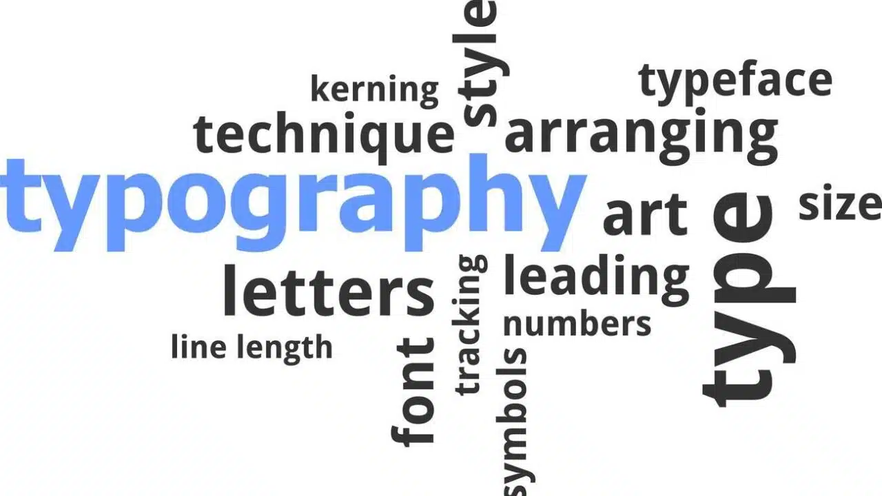
Leading (rhymes with sledding) refers to vertical distances between successive lines of type, also known as line-height, allowing easier distinction while scanning text vertically and preventing cramping. Ideal leading stays around 120% of the current font size. Excessive spacing disorients flow, while too little strains readability, and eye fatigue risks squishing descenders and ascenders together.
Best Practices Typography in Web Design
Follow these key guidelines for strengthening websites through typographic excellence:
Keep Body Text Left Aligned: Favoring left alignment facilitates smooth linear eye tracking, which is critical for readability. Centered paragraphs cause “rivers” between words, distracting from scanning left-to-right. Reserve center alignment for titles and featured quotes.
Limit Font Variety: Too many fonts confuse, dilute brand cohesion and introduce performance inefficiencies. Usually, two complementary fonts appropriately establish hierarchy (one display/header and one body text). Reputable paid fonts ensure consistent renderings across devices.
Mind Line Length: Keep body content line measured between 45 and 90 characters, optimizing readability, avoiding overly long spans, straining continuation, finding next lines or very short uncomfortable jumps increased by extra line returns. Responsive designs adjust accordingly.
Use Legible Fonts: While creative display styles tantalize for prominent highlighting needs or logos, reserve easily deciphered, clean fonts for lengthy body areas, promoting comprehension and supporting goals over “looks first” novelty.
Establish a Strong Visual Hierarchy: Strategically signify importance through scaled differentiation. Page titles are largest, section headings are smaller, and body text is the smallest. Support variations using weight, color and treatments like underlining and highlighting specific copy.
Improve Readability with Letter/Word Spacing: Minor microspace adjustments between problematic letter pairings (Ll, Aw) and slight increased word spacing ease processing dense content patches into visually palatable blocks, encouraging continued engagement.
Use images to break up typographically heavy areas: Extended, lengthy textual content risks reader fatigue and opportunities for losing interest. Insert explanatory graphics demonstrating key points for effective visual relief, resetting mental focus.
Fine details distinguishing great typography transfer knowledge while allowing personalized expression that website owners hope convey through polished presentation. Mastering core foundational guidelines elevates projects from shortchanging crucial considerations; typography affords every site’s success.
Conclusion
As the primary visual communicator beyond explicit graphics and imagery, confident command over typography, optimizing readability and amplifying messaging proves utterly foundational to securing positive website user experiences and attaining quantitative business goals relying upon fostering engagement sequences prompting measurable outcomes.
Regrettably, typographic considerations frequently fall short of being dismissed as mere styling embellishments, which should be corrected later should issues emerge. But strategically addressing type selections early in the website planning stages ensures cohesive experiences resonating with audiences through informed structural decisions and impactful, precise messaging that best reach and motivate target demographics.
The difference between a visually appealing yet difficult-to-digest site failing conversion funnels and seamless, high-converting online properties comes directly from the quality user experience constructed through typography, excelling readability and strategic type treatments. Give fonts priority.
FAQs About Importance of Typography in Web Design
What are the best fonts for websites?
Top font recommendations for websites include Arial or Helvetica (sans-serif body), Open Sans, Lato, Roboto and Oxygen as accessible and readable alternatives. Modern yet legible options like Work Sans and Inter UI also work well. Display fonts might include Bebas Neue, Oswald, Playfair Display, Roboto Slab or Splash.
What makes typography good?
Effective web typography offers strong readability through clean letterforms, appropriate word and line spacing, adequate sizes, and maintaining hierarchy, conveying the appropriate tones aligned with branding across entry points and fostering positive ongoing engagement with site goals and messages through desirable psychological impressions evoked.
What is the most readable font?
The highest-rated fonts for readability and legibility, retaining clarity across digital displays, include Verdana, Georgia, Arial, Tahoma and Times New Roman, minimizing character confusion while sustaining smooth flow through excellent hinted renderings that assist in consistently parsing complex group letters efficiently.
What does bad typography look like?
Poor web typography strains reading through inappropriate variant selections. cluttering pages rather than strengthening hierarchy, utilizes overly elaborate decorative fonts, sacrificing legibility even for short bursts of text, applies centered body text alignment, creating disjointed “rivers,” uses excessive variety, diluting brand cohesion, or forces users to squint through tiny sizes, hampering comprehension.


